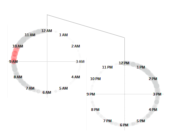
For this blog post, I’m going for a bit of a rewind: my application. During the first week of dataschool, I had to reviz my application viz and one part which I focused on improving was the intuitiveness of my clock chart. I split it into two 12 hour clocks and utilised floating and shapes to clarify order to read each.
Creating New Axes with Trigonometry
First thing I need to create my clock is a calculation of the portion that a given minute is to the whole. To do this I need to first create a “Minutes since Midnight” field to track what each minute is into a day.
Minutes since Midnight
DatePart(“hour”,[Date/Time])*60 + Datepart(“minute”,[Date/Time])
Then I need to calculate the total possible minutes for half the day, this is just a constant.
Minutes in half a day
60*12
Next, I need to convert this into the proportion of the circle.
Angle
2*PI()*([Minutes since Midnight]/[Minutes in half a day])
Now all that’s left is to create my new axes to impose on Tableau.
X
COS([Angle])
Y
SIN([Angle])
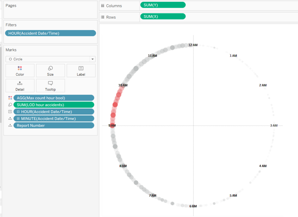
Place X on rows, Y on columns, minute on detail (and any other fields you need to disaggregate records on detail), hour on label and set label to min/max->min on minute field. Set an hour filter to 0-11.
Duplicate this sheet and then change the filter to exclude on the second. Now build a dashboard and add whatever elements you want to guide your user in using your clocks!