


On the first day of Dashboard week, DS18 looked at EPA Environmental Regulations.
After reading some of the documentation, I started downloading the main data-set which included data for the whole of the US. However as the file was so large, the download was taking a while so I decided to scale down and look at only 1 state: Texas.
There were 8 different files within the download. 1 master file and 7 other files that you could join to add more context. I found the files quite challenging and spent a lot of time trying to understand the data and the approach I wanted to take.
I decided to start by joining the master file which contained general information about each facility site with data about the environmental permits and regulatory programs that apply to
the facility site. This would give me a more detailed understanding of the different permits each site has.
I then explored different files that i could join. I initially went down the route of looking at the organisations that have roles at each facility site and also looked into the different industrial activity that occurred at each facility site but didn’t end up using these (i’ll explain why later!)
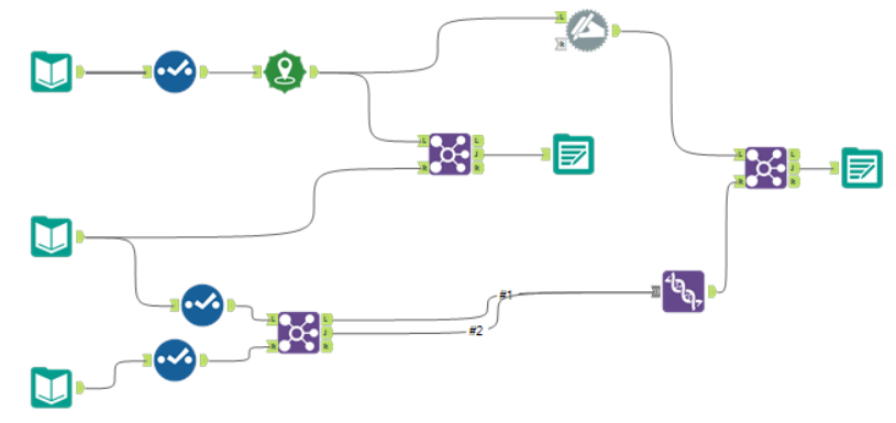
My Final Alteryx Workflow:
Bringing this into Tableau, I started building different charts and eventually decided to focus my Dashboard on 1 particular Environmental Permit Type about Water Pollution (called NPDES). When I was initially reading through the documentation and trying to make sense of the data, I had read that Texas was one of the worst water polluters in the US so I decided to focus my analysis around this. As I was building my dashboard, I struggled to find insight from the organisation/industrial activity data that I had joined earlier so didn’t end up using this.
I wanted to explore how NPDES (Water Pollution Permit Type) compared to other permit types in Texas and whether there was any trends in where these facilities were located.
A few hours later, I had finished my dashboard:

Link to viz: https://tabsoft.co/32KP9Ql
During my analysis I discovered that although NPDES is the 3rd largest permit type in Texas, it is considerably below the first. In addition, the density map shows that NPDES facility sites seem to populate specific areas. I wanted to demonstrate this using the bar chart below which shows the countys that have the largest number of these facility sites as a percent of total. I was surprised to see that 45% of the facility sites are located in just 10 countys within Texas and added interactivity so the user can see how this links to the map.
Any feedback welcome!