


This time we want to build a bar chart, that shows a percentage of the total, based on a different measure. This can be useful, for example, if we want to see, how many people from certain region have bought certain product category. The chart should look like this.
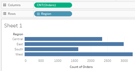
To start, we can put CNT(Orders) in columns, and Region in rows, for example. Then you will have your starting bar chart, that shows the number of orders for each Region.
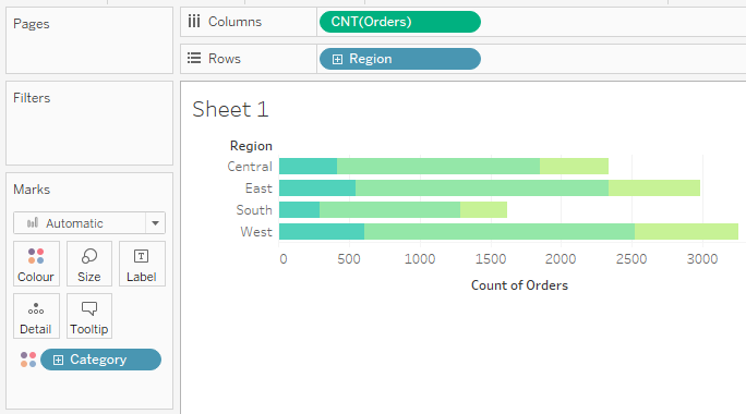
An additional step would be putting a measure we want our percentage calculation based on, in the color pane. That way we will build a stacked bar chart, which should look like this.
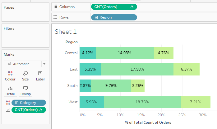
After we have this stacked bar chart, we want to right-click on the CNT(Orders) pill, and choose Quick Table Calculations - Percent of Total. Your bars will now show percentage number instead of the number of orders, which you can see in the x-axis ticks. Or if we want the percentage number shown along with the bars, we can always put the CNT(Orders) in the Label mark. It should look like this.
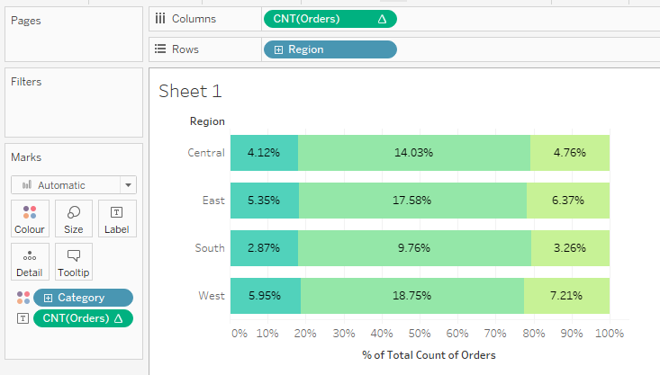
The last thing to do is to turn the bar into full-lengthed bars that show the percentage of total based on the category, just as we want. It goes with a few clicks: right click on the CNT(Orders) pill, click "Compute Using", then choose "Category".
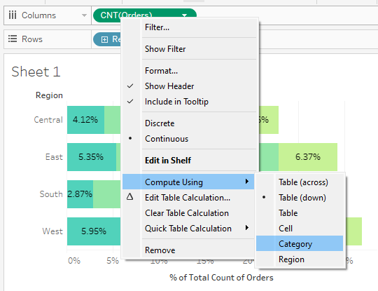
It then transforms into what we want to build: Stacked Bar Chart - Percent of Total.
I hope this can be a good learning reference for you. Have fun!