


We’re on the last stretch of (Don’t) Show Me and for this final demonstration, I will demonstrate how to construct Gantt charts.
Gantt charts are used to show duration across a variety of dimensions. For example, let’s say you want to create a view showing the average time it takes to ship a product across all ship modes used in your company. If we try to do this with Show Me, we get the following:
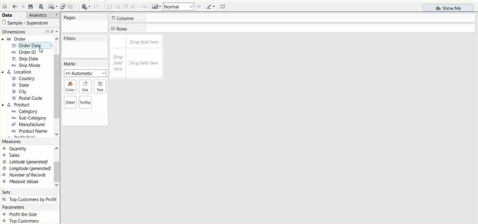
This isn’t a very useful or understandable view, and this is one of the cases where using show me or constructing things from scratch is pretty much the exact same in terms of the time and process. If we want to create the same view that Show Me has created, we would do this:
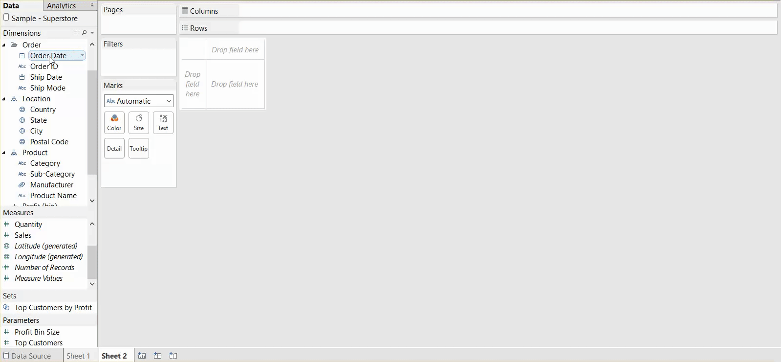
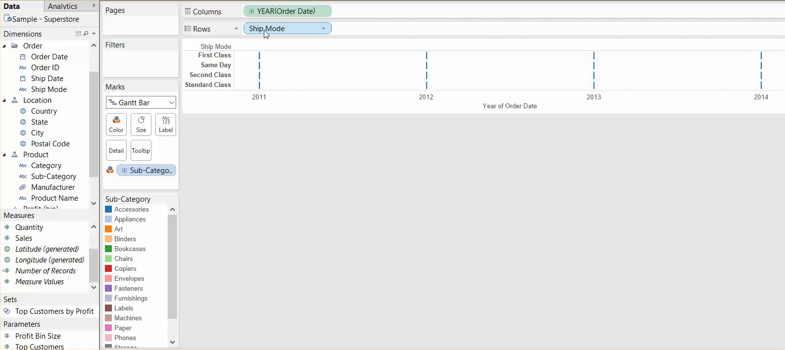
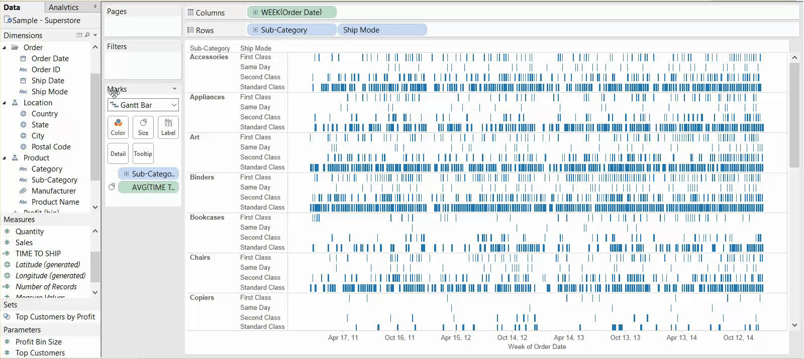
From here, whether you have used Show Me or created things from scratch, you’re going to have to do a couple of things. These are outlined in Tableau’s Online Help article (link) and repeated here. First, change the level of granularity for your date in the column shelf and add sub-category to rows so it shows up in the view:
Next, create a calculation for the time it takes to ship a product (a DATEDIFF calculation between order date and ship date). Drag this to size and change it to an average:

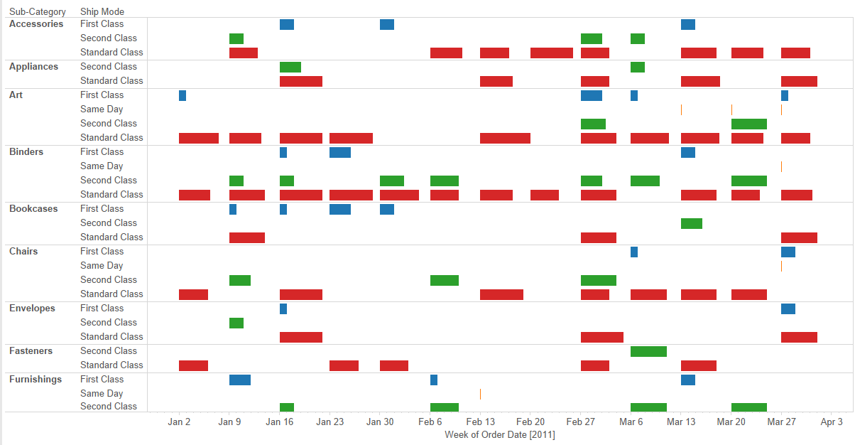
Last, to make the view clearer and reduce the marks in view, filter to a specific date range and colour your marks by Ship Mode:
That’s all it takes, and it’s one of those cases where you can either create things from scratch or use Show Me and essentially end up with the same thing. Unlike histograms and Box-and-Whisker Plots, you aren’t really able to customize things too much beyond what Show Me already does, and similarly, Show Me doesn’t cut down a lot of your construction time.