


This week I’ve been demonstrating how to create certain graphs without Tableau’s “Show Me” feature. Why? Well first, it’s always good to dig down and figure out exactly how Tableau creates the views that it does, based on what data and calculations. Second, creating these graphs from scratch allows you greater control in customization, not just in terms of how things are formatted but also in terms of how data is structured and manipulated. Check out PART 1 here where I demonstrate how to create box-and-whisker-plots from scratch.
Today I’ll be going through histograms. Like box-and-whisker plots, they’re a great way to show distribution of data. However, they’re a bit simpler than box-and-whisker-plots and much easier for the average Joe viewer to interpret.
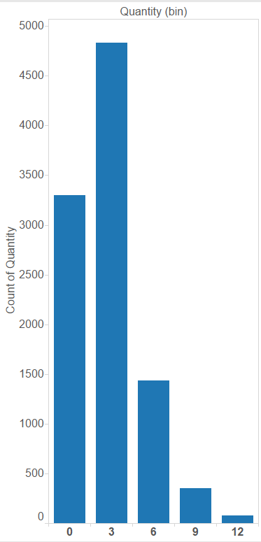
When you use show me to create a histogram in Tableau, all you need to select is one measure value. Tableau will then automatically create bin groupings of this data on columns and assign a count aggregation of the measure to rows:
As you can see in the demonstration above, Tableau has automatically created bins spaced between two counts (i.e. 0-1, 2-3. 4-5). But what if you wanted to create your own bins?
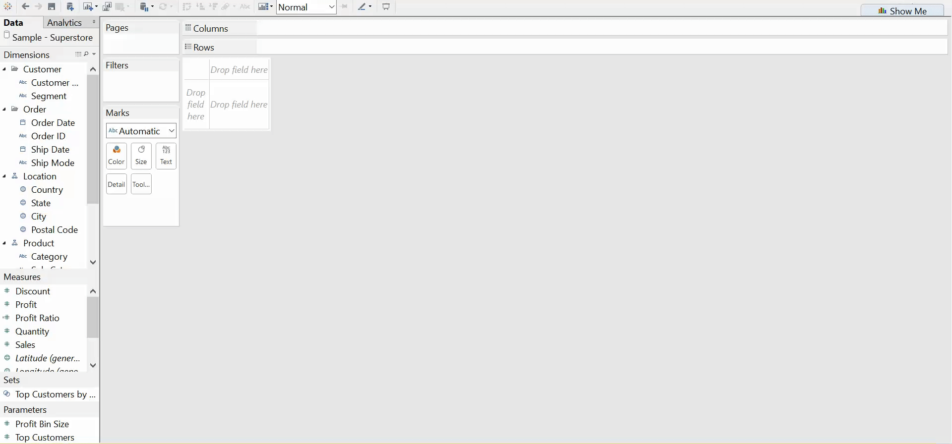
In order to create your own histogram from scratch, you will have to create your own bins of a measure. You can still ask Tableau to automatically suggest a bin size if you so desire:
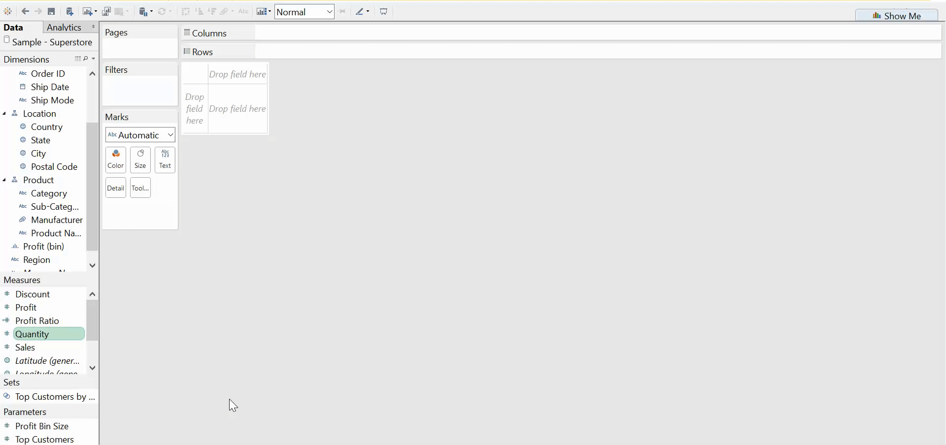
The last thing you have to do is drag a count of your measure to the rows shelf. Of course you could change this aggregate to a sum, average, or count distinct depending on what you’re trying to demonstrate. A few more clicks than show me, but still simple and sweet.