


This was a quick Makeover Monday, completed in less than an hour. For my take on this dataset I wanted to highlight the difference in representation across the employment levels. I initially included the trend between the two years given as well but felt then that this was not the part of the data that I wanted to focus on. There are multiple studies that show not only hiring bias against women but also promotion bias and while there have been small improvements in the representation of women at all levels this is still far below what it should be. It felt more important to me to highlight the disparities rather than the small changes.
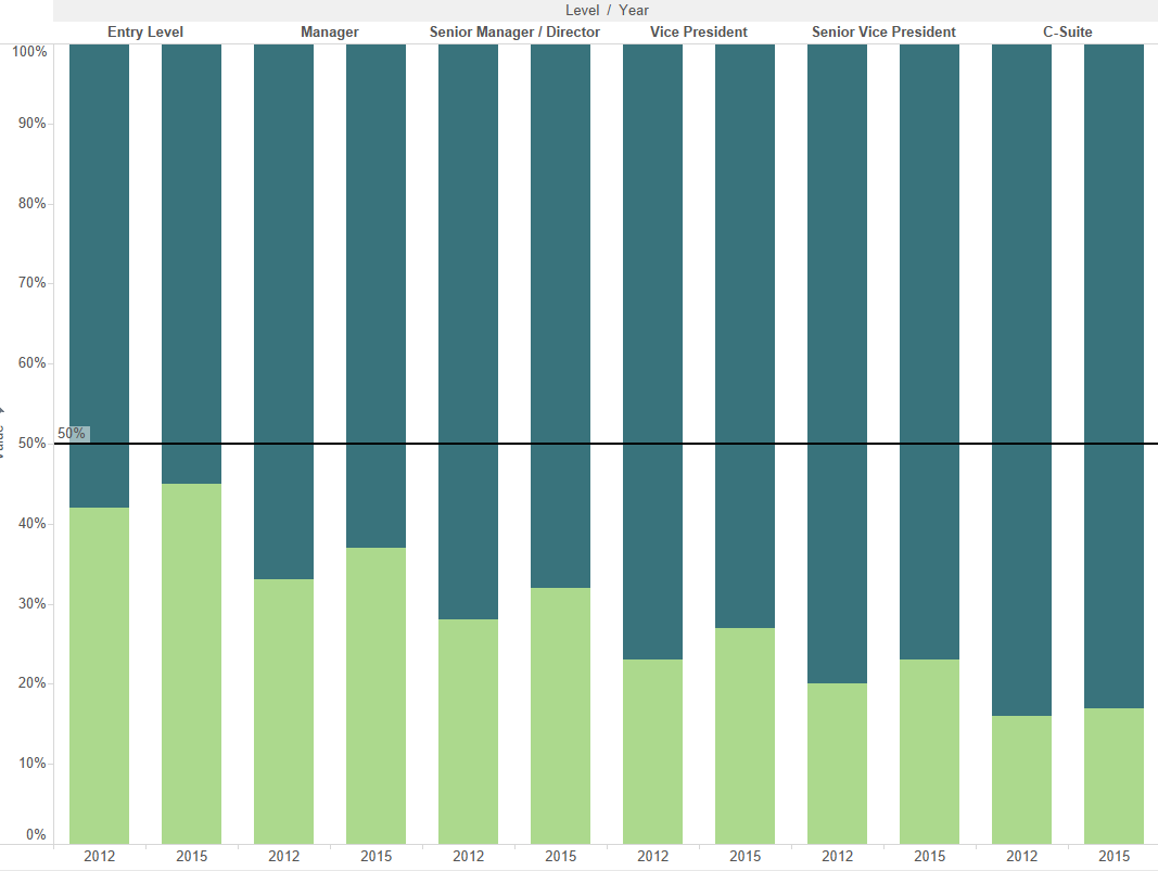
In my first draft I used bar charts, that showed the proportion of men and women at each level across the two years, with a reference line at the 50% mark.
This didn’t convey the message as clearly as I wanted to and I went through some more iterations, ending up with a slope chart. This is filtered to just show the most recent year, 2015. It shows clearly that the percentages for females are below those for males at all levels. I created a calculated field to get the rate of males to females at each level (avg[male]/avg[female]) and used this to colour the lines. This highlights that the largest difference is between the levels of males and females in the C-suite. I like the simplicity of this, and I kept the dashboard compact in order to ease mobile presentation. You can see the original here.