


Parameters are extremely useful tools in Tableau and they have many uses. One such use is the ability to switch the measures of scatterplot axes, so that users can view the relationships between different variables.
To start, place any random measures on the worksheet (green fields) and add a dimension to 'detail' in the marks card to create a scatterplot. These will be changed later.
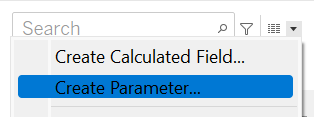
To change the measures of the axes, two parameters are required; one for each axis. Create a parameter by clicking the arrow icon (in the data pane) and select 'Create parameter'.
The parameter pop-up box will open. We need to:
- Rename the parameter e.g. 'X Axis'.
- Change the data type to 'String'.
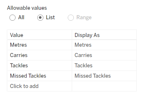
- Change 'Allowable Values' to 'List'.
- Within this section, write down the values of the measures you will be using (see example). Make sure you remember the spelling you used or the parameters will not work.
Duplicate the parameter but name it 'Y Axis'.
Next, right-click the newly created parameters and select 'Show Parameters'. You can select different measures but this won't yet work as parameters are created independent of the dataset. So now a calculated field has to be created to link the parameter to the dataset.
Create a Calculated field by selecting it from the arrow dropdown (in the data pane).
This is the calculation for the X Axis (see example below). A CASE statement is required. A CASE statement simply matches a value to the corresponding return value. For example, when the user selects 'Metres' in the parameter list it will return the values of the 'Metres' measure. It will do this for all the values you wrote in the parameter list.
Using an IF statement would also produce the same result but we are using the CASE statement for simplicity.
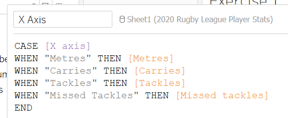
The calculation is essentially saying when the user selects the value 'Metres' then link it to the measures field 'Metres' and this is the same for the rest of the values. This is why the spelling of your values are important. If the spelling in the calculation field is different to the spelling in the parameter, no link will be created between the parameter and the measure field and it will not work.
For the Y Axis, duplicate the calculated field but don't forget to rename it and rename the parameter to [Y Axis].
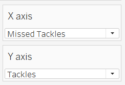
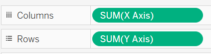
Remember the random measures you used to create the scatterplot? Take the newly created calculated fields created and replace the measures in the X and Y Axis. These will be automatically aggregated.
Now you can select any measure from the parameter dropdown and the values in your scatterplot will change accordingly. Have fun switching the measures and discovering the different relationships between them!