


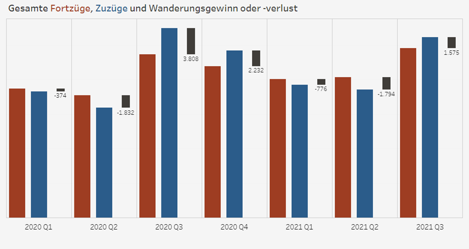
For today’s dashboard, I built a bar chart with candlesticks showing difference between bars. This blog is a tutorial on how to do this in Tableau.
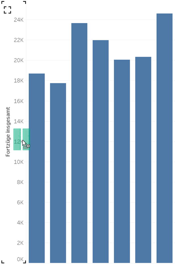
1. Build a bar chart (one axis)
Tip: Drag the second value in the axis to have Measure Values and Measure Names
2. Duplicate the Measure of the blue bar. Because we want the candlestick right next to it.
3. Put the copy measure in Rows next to Measure Values. Make them dual axis and synchronize the axes.
4. In the mark card of the copy measure, change Gantt Bar.
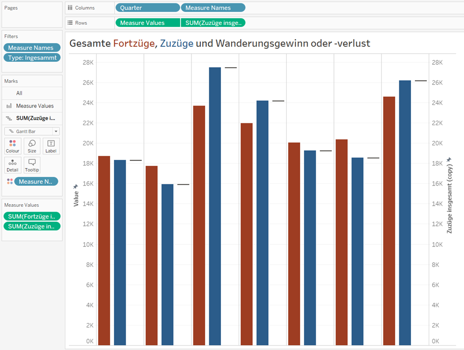
5. Create a Calculated Field for the difference:
Difference = Red Bar – Blue Bar.
The reason is that starting point of the candlestick is the Gantt Line.
6. Put the Difference Field to the “Size” of the Gannt Bar.
7. Label: the label in my chart is calculated in the opposite way compared to the Difference field because here I want to compare the blue bar with the red one. The calculation depends on what you want to compare with what.
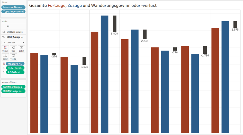
Here is our final product. I hope it is helpful for you.