


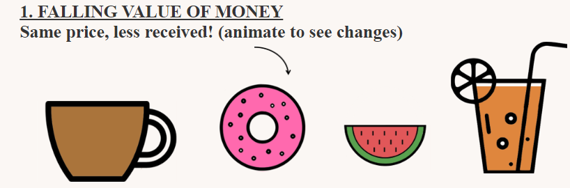
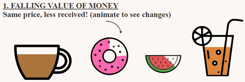
In a visualization, I played around with filled shape charts. I want to explain inflation in a simple way: with the impact of inflation, you can buy less through time, paying the same amount of money.

Inflation | Nhung Le | Link
Actually they are easier to make then you think. Here is the secret:
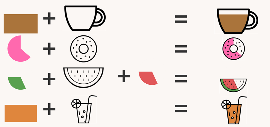
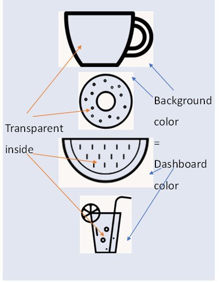
They are nothing more than bar charts and pie charts laying under images. Now, the main secret is to make the inside of the shape transparent (where do you want the chart content to be seen) and the outside of it (image background) the same color as your dashboard background.
The images will lay floating over the charts.
Hopefully you get the idea with the following image:
How did I do the Watermelon?
Among those shapes, the watermelon is a bit more stricky to make. While you can plainly use the measure value for other charts, there are a few simple calculation calculation needed to be done here.
They are two pie charts, the green for the skin and red for the flesh. The trick is to make them all in bottom haft. You need to make the first and fourth quarter empty (25% of the pie each). Look at the demonstration below:
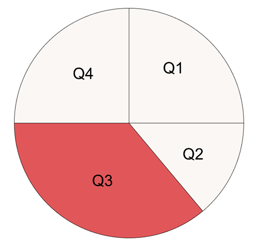
Q1 = 0.25
Q2= 0.5 -Q3
Q3 = Measure Value * 0.5
Q4=0.25
You can create Q1 and Q4 by two calculated fields: (Q1=0.25) and (Q4=0.25). The number 0.25 stands for 25% or 1/4 of the circle. Change the color to the background color.
The measure value will now only be on the bottom haft of the pie. Divide the value by 2 we have Q3 (50% of measure value).
And Q2 is the different from Q3 to 50%. Color it also with the background color.
Don’t forget to put Q1-Q2-Q3-Q4 in the right order.
The green part will be on the bottom, then comes the floating red part and finally the watermelon image.
I hope the blog gives you the concept behind filled shape chart. Good luck and have fun.