There are often situations when a dashboard needs to be completely interactive. Using a colour legend assigned to a specific chart represents the colours you use, but it is often necessary to dig in deeper without necessarily using the chart to isolate a specific category. As an illustration, I’ll be using the superstore dataset available on Tableau.
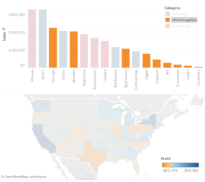
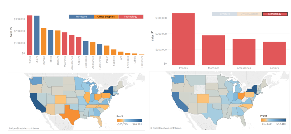
A normal colour legend only enables highlighting of the chart to which it belongs (figure below). it is possible to create an interactive colour legend as a filter over the whole dashboard which enables the user to dig deeper into his/her data.

By creating an additional sheet to use as a colour-legend, it is possible to create an interactive colour-legend.
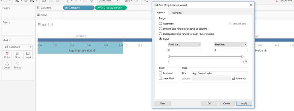
- Place the dimension in question in the ‘Columns’ pane (for this example: the ‘Category’ dimension).
- Create a calculated field with a value of 1.
- Using the average of the newly created field, place it in the columns pane, next to the dimension.
- Change the axis of the bar so it is fixed between 0 and 1 and remove the axis header.

- Place the dimension used for the colour legend (Category) in the colour mark and increase the size of the bar to its maximum.
- Place the same dimension on the label mark to label each of the colours.
- Hide the field labels and headers for the columns and centre-align the labels.

- Create the dashboard with all the required sheets (including the newly created colour legend) and close the automatically generated colour legend.
- Resize your new colour legend as required. Select the new colour legend and select Fit -> Entire width.
- Under the same menu select the ‘Use as filter option’.

Congratulations! You now have an interactive colour legend. Using the same concept, it is possible to create any type and any format colour legend you require for your dashboard.
