


Today we got a task to make a dashboard using world happiness from Kaggle (source) . The dataset is not difficult at all. Some cleanings are need here and there. BUT, it should be done in Power Bi! Last time we used PBI was a month ago. All knowledge feels dusty, though.
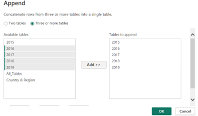
After investigating the dataset, I cleaned it and made a union. There are two ways one can make union in PBI:
1. Navigate to the Table View - Click on the New Table – Write function UNION(‘all table name separated by commas).
2. Navigate to power query – Click on Home – Append Queries – Append Queries As New as shown below
After doing union, you have big table to work with and don’t need to consider all those table parts.
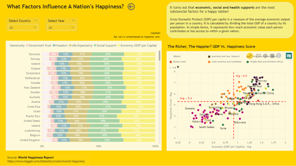
I had two main questions to be answered:
1. Which country is the happiest?
2. what factors make a happy nation?
I quite struggled to gather pieces of PBI leftover knowledge in my brain. At the end of the day, my dashboard looks like this
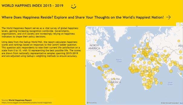
I just found out that yellow is actually colour happiness 😊
There is one big mistake that I did for the second time here. I downloaded visual that is not free! It means that when you need to upload it publicly to server, you have to buy the license or it will not be shown. Es ist einfach dumm von mir ☹
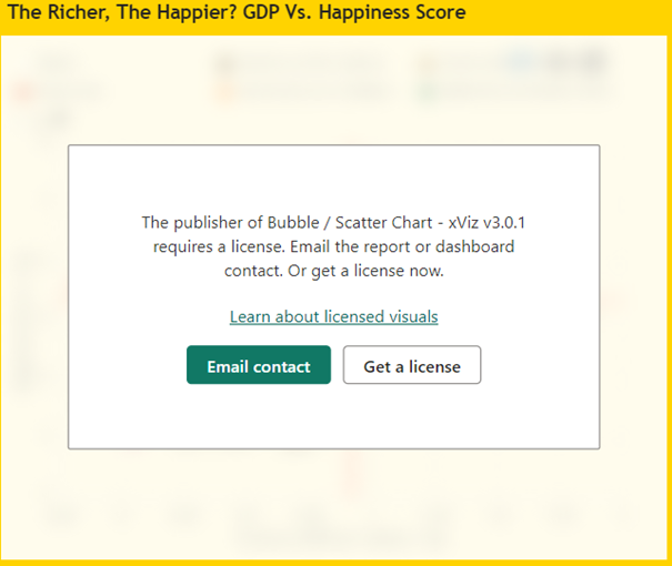
I hope my stupidity teaches you something. Check always before using visuals from PBI Appstore.
Cheers,
Nuki