


One of the perks of being in the Data School, is that we are spoiled by teachers, both from within TIL and from outside. On Tuesday we were lucky enough to have a session on infographics with Caroline Beavon. I thought I’d share a little of what we learned here…

Image: dirkcuys
Viz or Infographic?
If studying philosophy taught me one thing, it’s that before you do anything you need to define your terms. What is an infographic? – An infographic is a visual representation of data. However, that definition applies pretty well to vizzes, so what’s the difference between them? There is a bit of a fuzzy border between them, but the best way to differentiate is to look at their scope. Vizzes tend to be more all-encompassing than infographics.
A viz:
- Will tend to use the entirety of a data set
- Will show most of the data
- Might tell multiple stories
- Might have multiple user needs
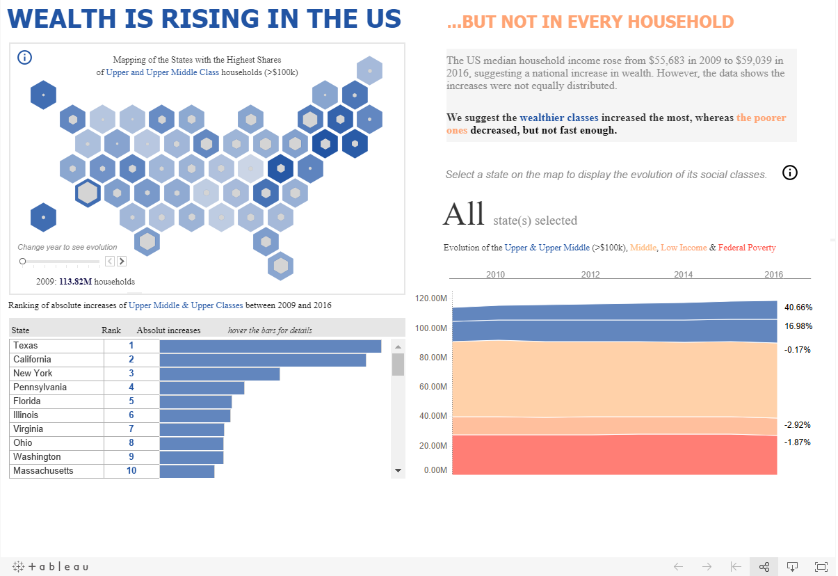
Viz: Gauthier
An infographic:
- Will use elements of the data set
- Will only show some data
- Will tend to tell one story
- Will tend to have a single user
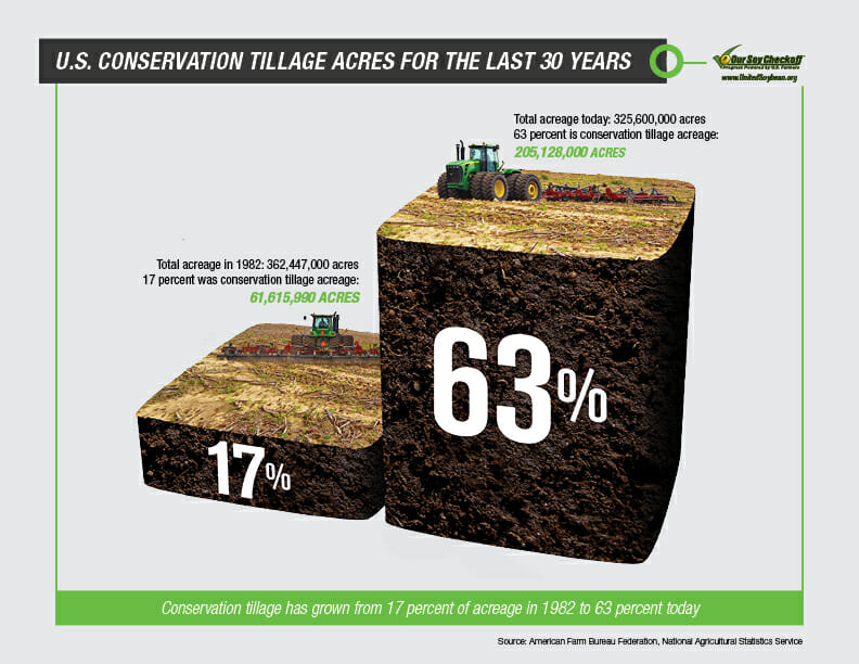
Image: The United Soybean Board
How to make an infographic
We spent a lot of the day thinking and talking about the process of designing an infographic. We looked at a panoply of well designed infographics (and a fair few bad ones too) and broke the design process down into this step-by-step guide:

Image: Fredrik Rubensson
Step 1 – Structure your thoughts
Before you even contemplate building your inforgraphic, you need to answer three questions:
What’s your aim?
What are you trying to do? Are you persuading people of an argument? Highlighting an important issue? Calling people to action? Reassuring them?
Who’s your audience?
Who is going to see your infographic? What is their knowledge base? What are their expectations of the infographic? Will your infographic be viewed on print or screen? In what format will most people see it?
What’s your data?
What kind of data do you have? Does it lend itself to specifc types of charts/graphics? Does it relate to concepts/people/places in the public consciousness? Are there any obvious connections which you could leverage when you make your infographic?
You should have the answers to these questions in mind at every step of making your infographic. They will keep you and your work focussed and relevant.
Step 2 – Post-it notes
Grab some post-it notes and write 1 idea/statistic/detail on each one. This forces you to be selective – if you can’t be bothered to physically write it on a note, then it’s probably not worth going in your infographic. This also makes your ideas mobile and disposable – you can move the notes around or even scrunch them up if they don’t work.

Image: Dean Hochman
Step 3 – Force your hand
Set a timer on your phone for 5 minutes. Draw a grid of 12 boxes. Fill each one with a rough sketch of a different infographic idea. This puts pressure on your creativity, but I promise you will surprise yourself. At the end of the 5 minutes, look through what you’ve drawn; critique them and see which one suits your purposes best. Maybe one of yours stands out amongst the rest, or maybe you’ll want to combine a couple of your ideas. Either way it’s time to:
Step 4 – Storyboard
At this point you’ll be raring to get started, but before you touch a computer you need to go old school. Take your post-it notes, a fresh sheet of paper and get to planning. Arrange the notes on the paper in a way that tells your story. Move them around, try different orders and combinations until you’re happy with your masterpiece. Then one by one replace your notes with a graphic. It might seem like overkill to draw your infographic by hand before you make it ‘for real’, but this is such an important step. It crystallises your ideas, but also allows you to change things which don’t quite work. I’m sure we’ve all tried to force data into an ill-suited viz because we’ve spent ages making it and goddamnit we’re not going to admit all that work was for nothing. I’ve certainly found that it’s much easier to throw away a piece of paper than delete a file.
Step 5 – Go Forth
Now you’re ready for technology. You know exactly what your aim is. You know what your audience’s needs are. You know the best way to show the important bits of your data. You know how you want everything to look and fit together. Having done these steps your creating process will be soooooooo much more efficient, and your final result will look all the better for it.

Image: Don Gunn
Some Final Tips
Finally here are a few miscellaneous kernels of wisdom that Caroline gave to us.
- When making your infographic, put your title in the form of a question to easily allow you to check what you’re making is relevant.
- Use colour sparingly and it will be all the more powerful.
- Be mindful of the cultural connotations any icons or colours you use may have.
- Know where your audience will encounter your work – and know how much time they will probably have to view it.
- Always ask whether every single part of your design adds to its impact. If any don’t, then take them out or replace them.
All that’s left for me to do is to thank Caroline for all her inspiration; and, if you haven’t seen Caroline’s stuff, then check out her twitter or instagram. As always you can find me @olliehclarke.