


Slope charts are essentially line charts, but ones which only show two points. They’re really useful for showing overall trends without letting fluctuations disguise the big picture. To make them you want to take a designated start and end date and then cut out everything in between. In this edition of Just The Tips I’ll show you how to make them in literally 3 clicks. Method courtesy of Carl Allchin who super casually dropped this in front of us the other day…
Setup
Using our old friend Superstore, I’ve plotted sum of Sales against year of Order Date and put Region on colour. For this tip to work, make sure that your date field is discrete.
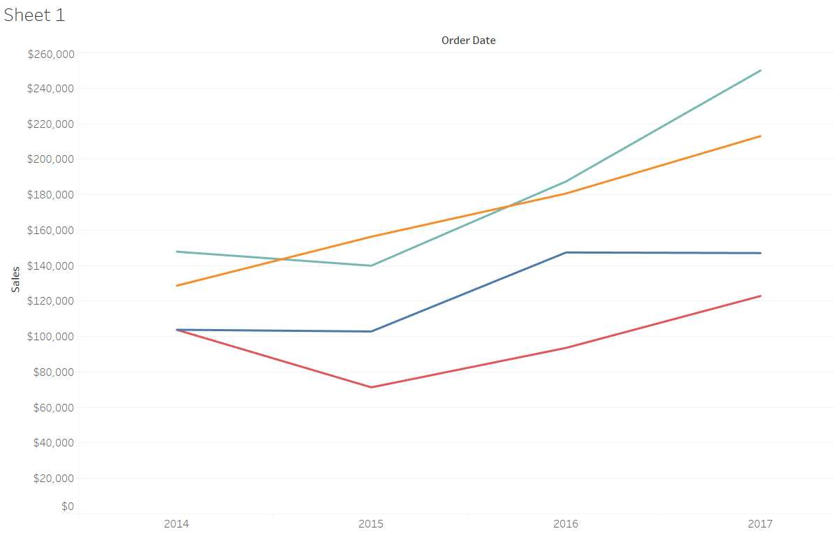
Probably one of the most viewed charts in the world
Easy as 1,2,3
Now since we only want to keep the first and last years, we simply click the most recent unwanted year (click 1), shift+click the earliest unwanted year (click 2) and then click ‘exclude’ (click 3).
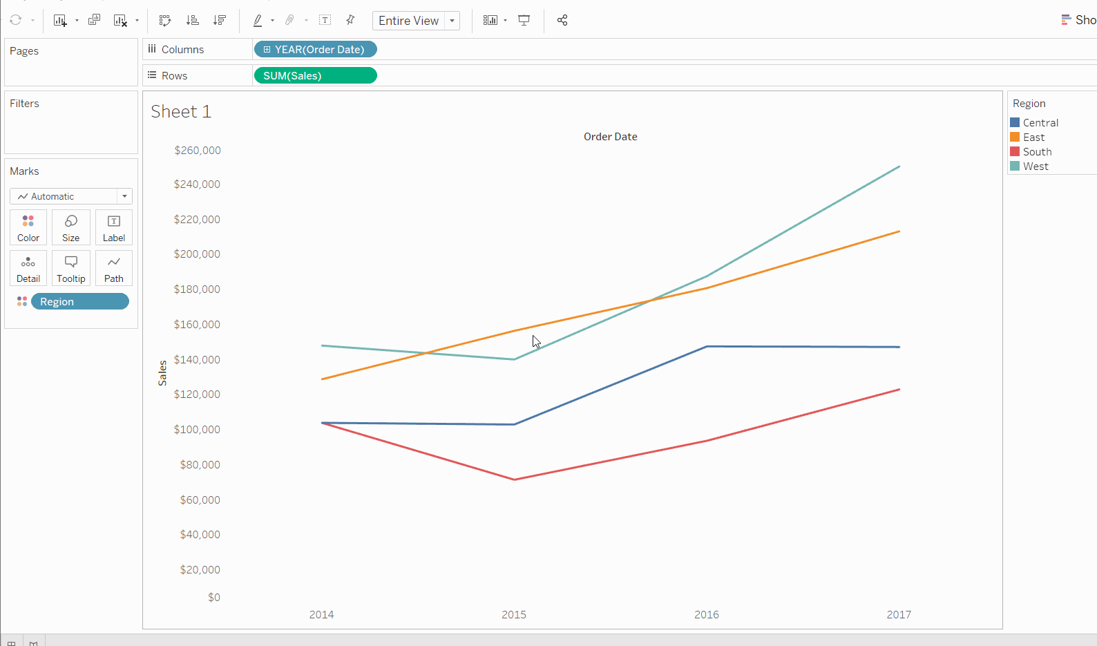
Alternatively you could add YEAR(Order Date) to the filters card, and then deselect the unwanted years, but that takes more clicks…
If you have any other quick fixes then let me know @olliehclarke.