


To kick off my series of blog posts about my training at the Data School, I want to give you a brief look into the daily tasks we tackle as aspiring Data Consultants. Moving forward, I’ll be regularly sharing my experiences regarding visualization, software, technical skills, and project management.
As a little warm-up, I’ll show you my first attempts at creating sketches in Excalidraw to quickly capture ideas or annotate existing visualizations.
Excalidraw is an intuitive, browser-based whiteboard tool characterized by its hand-drawn sketch style. It is highly valued in the tech industry for creating diagrams, wireframes, or mindmaps collaboratively and in real-time. Thanks to its ease of use and open-source nature, ideas can be visualized and shared instantly without complex menus. → excalidraw.com
The Starting Point
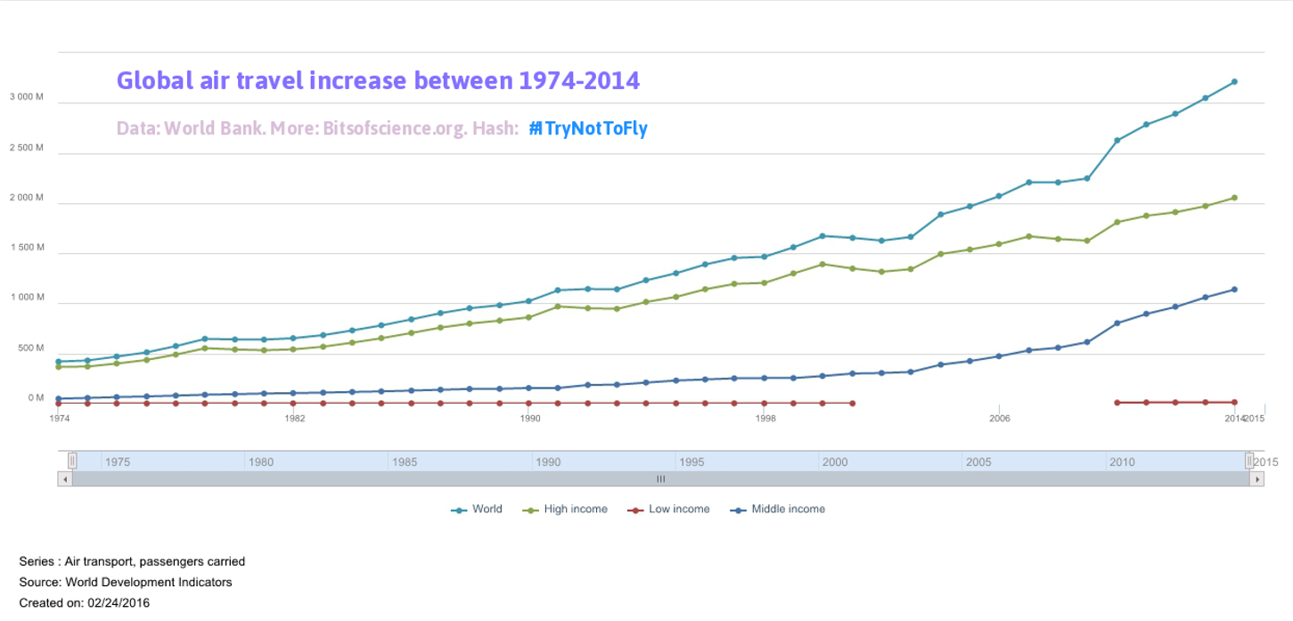
The starting point for one of our first assignments was a visualization showing the development of global passenger air traffic.
In the first step, I brainstormed how to simplify the graphic to communicate the message better, easier, and faster. Here were my initial thoughts:
- Simplify axis labels (e.g., converting units from 3,000M to 3B).
- Remove individual data points along the trend lines.
- Clearly mention the income-level breakdown in the header.
- Simplify colors for the header and lines → e.g., the top line represents total global passengers and should stand out more than the three lines representing different income levels.
- To communicate the message more directly, I used the phrase "accelerating increase" in the title to describe what the data actually shows.
- Important: To better highlight this surge in passenger numbers, I divided the display into 10-year intervals and added the percentage increase.
The Revision
Here is my first sketch of the revision:
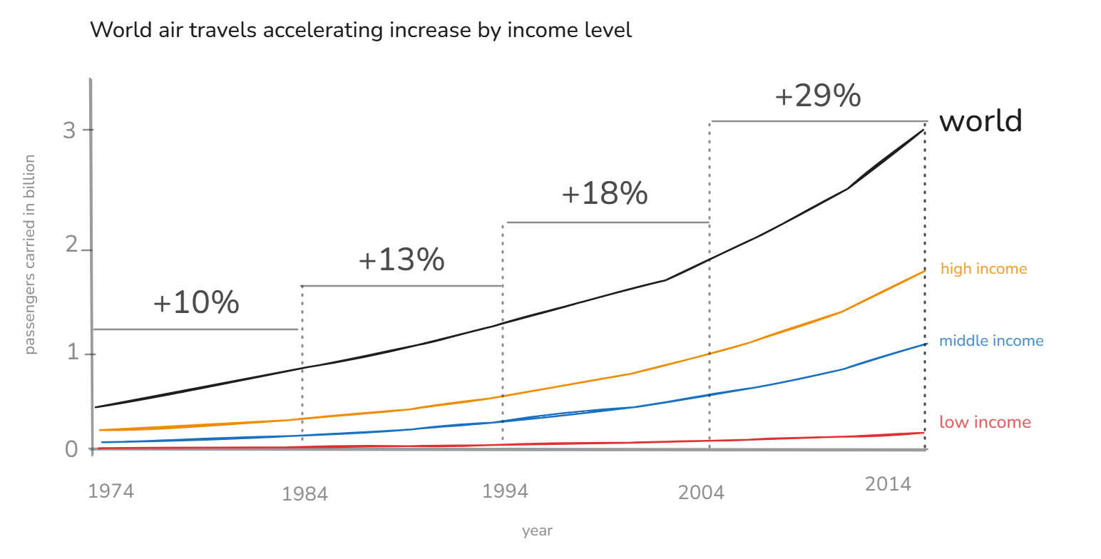
The layout is now much cleaner, and the accelerating increase in passenger numbers for high- and middle-income levels is more apparent. So far, all historical data is included, but I wonder if the representation can be simplified even further.
Simplification
What if I focus only on the most recent figures and reduce the data points further? I decided to narrow the focus to the data from 2009 to 2014.

The Final Result
In this version, I reduced the data to the years 2009 and 2014. I chose a slope chart as the visualization format. Placing the labels directly next to the lines significantly improves readability. The share of different income levels in global air traffic becomes very clear. In my view, the core message is much better conveyed in this format.

Closing
I’m looking forward to many more of these challenges in the coming weeks at the Data School. It’s exciting to develop such a wide range of new skills. With this sharpened eye for what truly matters, we’ll soon be excellent Data Consultants.