


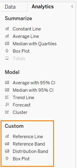
In Tableau, we have four different options to reference our graphs: Reference Lines, Reference Bands, Distributions, and Box Plots. Each of these tools helps with data interpretation by providing visual context. Today, we will take a closer look at Reference Bands and their role in data analysis.
What is a Reference Band?
A Reference Band is a shaded area in a visualization, defined by two reference lines. It is used to highlight a specific range within the data. Typical use cases include:
- Marking a target range within which values should fall
- Highlighting fluctuations in a dataset
- Supporting interpretation by visually categorizing values
How to Use Reference Bands in Tableau
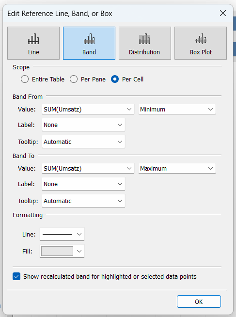
In the Edit field, you can choose where your Band shall start, which value you want to use, and you can customize the label, tooltips, and formatting to your liking.
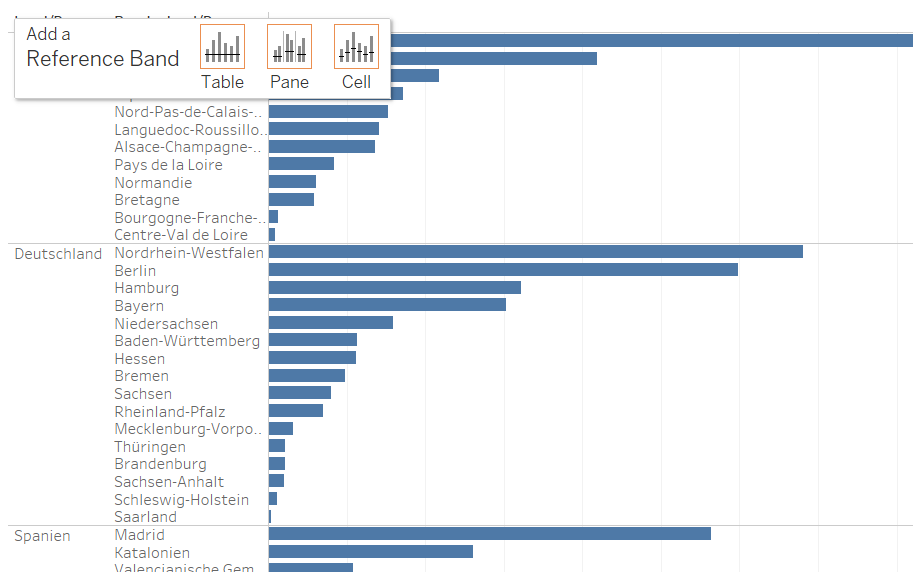
To add a Reference Band to your visualization, simply drag it into your view. Tableau will present three different options for applying the Band: Pane, Table, and Cell.
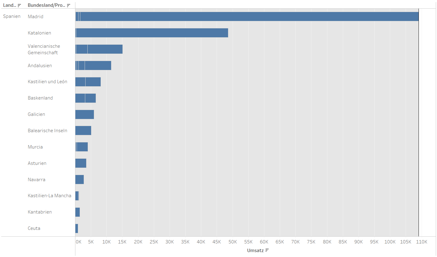
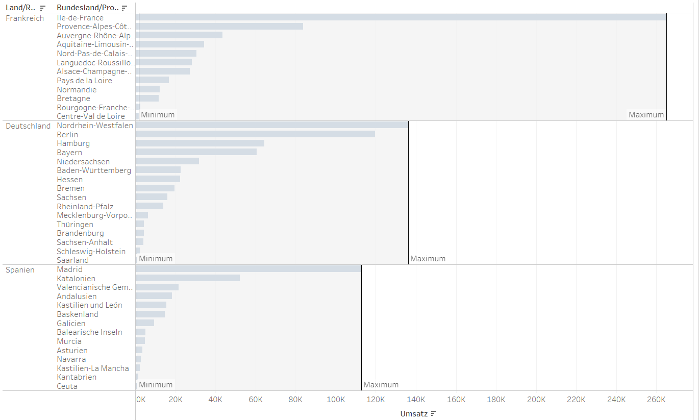
Example Use Case: Sales Data Across Regions
Let’s assume we are analyzing sales data for three different regions: France, Germany, and Spain. If we want to visualize the minimum and maximum sales per region, we can drag the Reference Band onto the Pane.
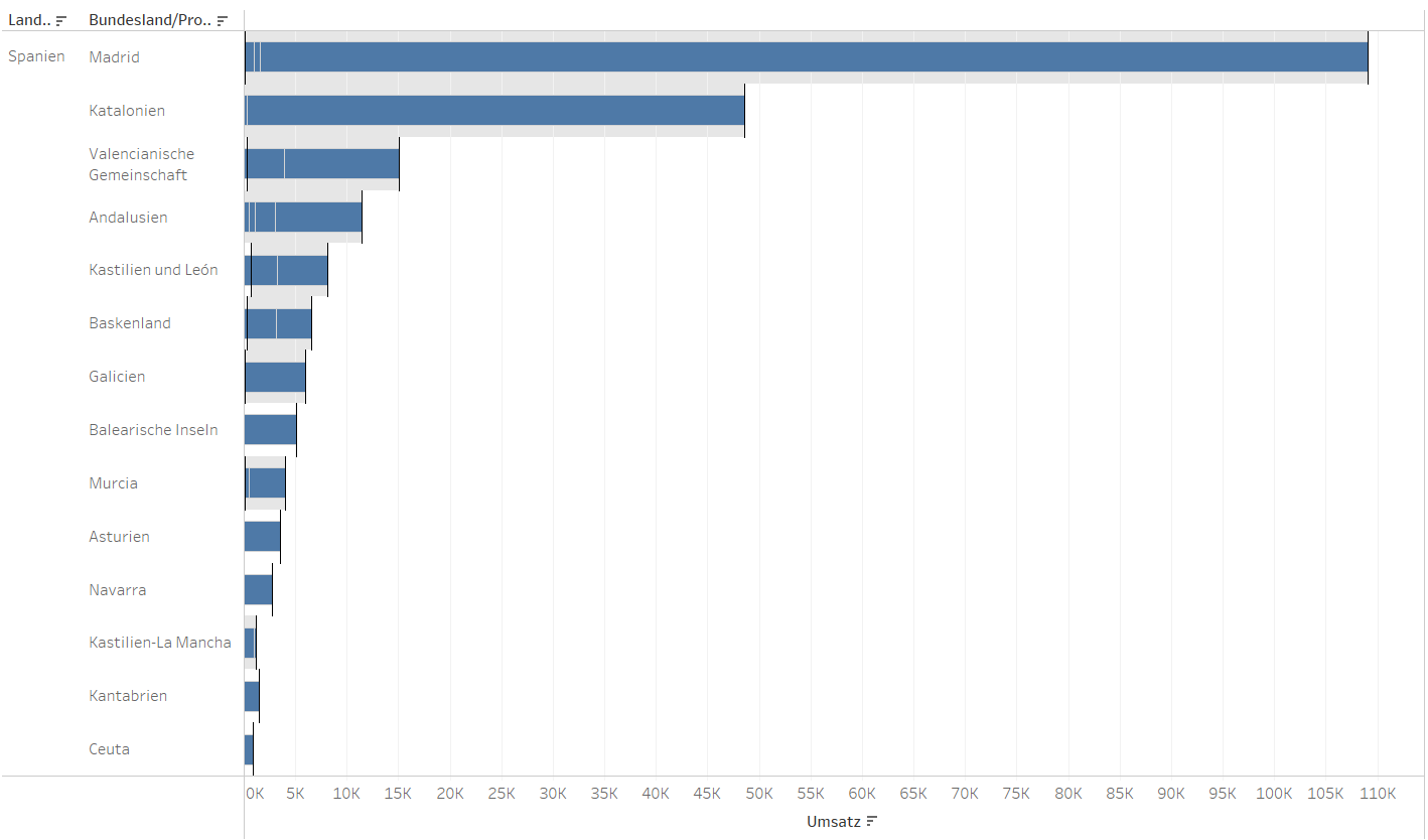
Understanding the Three Placement Options
Table: The band is applied across the entire table, allowing us to compare minimum and maximum sales across all regions. This is useful when we want to identify overall trends and outliers.
Pane: The band starts at the lowest sales value within a sub-region and extends to the highest sales value within the same region. This helps in understanding the variation in sales within each region.
Cell: The band is applied to individual cells, making it most useful for analyzing variations within each sub-region separately rather than across regions. While not ideal in this example, it can be useful when working with more granular datasets.
Reference Bands are a great way to add more context to your data and make trends easier to spot. Whether you're comparing regions, tracking fluctuations, or setting benchmarks, choosing the right placement Pane, Table, or Cell can make a big difference. Try out different options and see what works best for your specific analysis! 🧪