


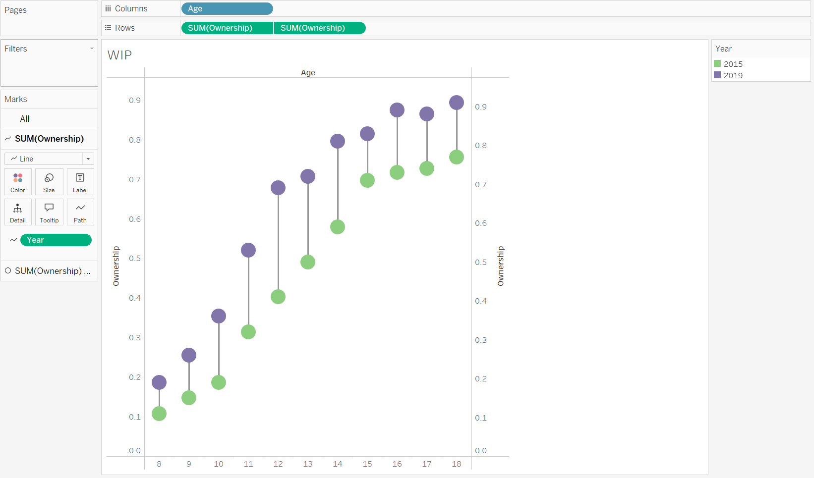
Today's blog is based on a WOW challenge we were set as part of training (WOW2022 W32), which challenged us to build a dumbbell chart for comparing youth cell phone ownership by teens and tweens. It is a simple but visually effective way of comparing cell phone ownership in different ages between 2015 to 2019, and takes a just a little bit of engineering to achieve the result. I am going to use this exact challenge to guide you through making the dumbbell chart, but you can apply the steps to your own dataset to create a similar result.
First, you want to import the data in (on the linked page above) and drag ‘Age’ and changing it to a ‘Dimension’ as well as into a ‘Discrete’ data type. Then drag 'Ownership' onto the Rows twice, meaning you end up with two bar charts. Then you can right click on the lower axis and change it to a ‘Dual Axis’. The points then become circles, and you can then drag Year onto the Colour box on the Marks card, making sure it is on the ‘All’ Marks card. That leaves you with two dots, one colour for 2015 and one for 2019.
Then drag ‘Year’ onto the ‘Path’ option of the top SUM(Ownership) card on the Marks card, and changed the Mark type to a line, which gives you a straight line between the two circles.
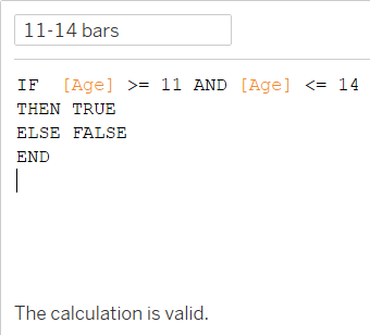
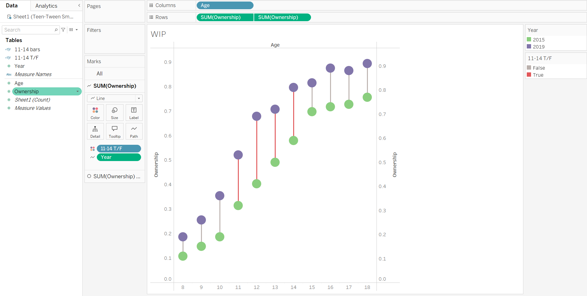
The brief also asked for those bars for ages 11-14 to be manually highlighted, as they have seen the highest increase between 2015 and 2019. This requires creating a Calculated field on the Data pane, and then dragging that onto the Marks card we are using for the line onto the Colour option. You can then change the true and false colours it has given you, and it leaves you with the bars for ages 11-14 highlighted in your chosen colour.
Then for the second SUM(Ownership) card in the Marks card, drag on Ownership to a Label to obtain text labels of the values for the points. Reformat it in the formatting pane to centre the text so that they are in the circles, and change the data type to Percentage instead of Numbers, and change that to one decimal place.
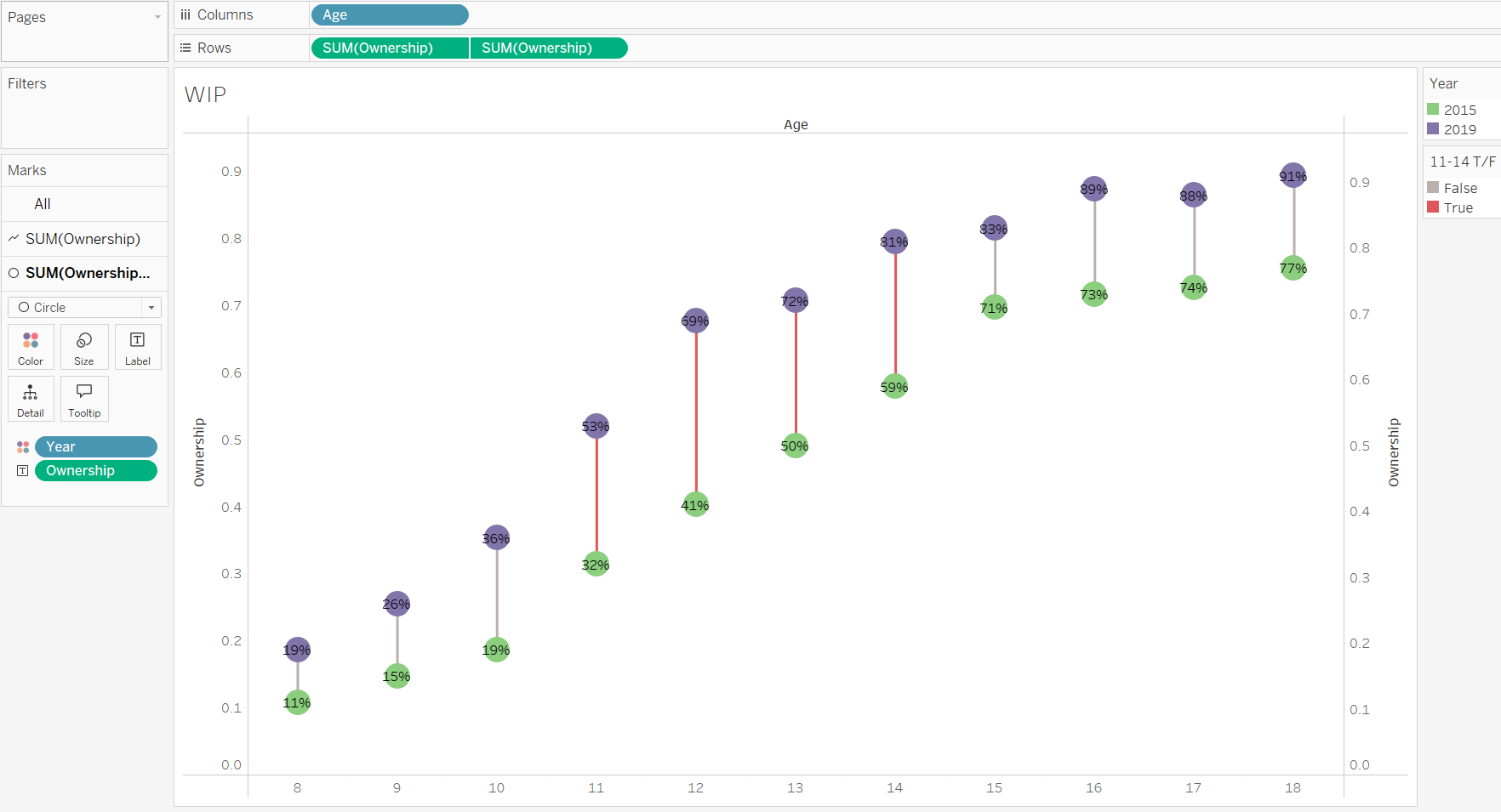
You can then adjust the size of the circle and line marks to look a bit better, and changing the circle size helpfully automatically changes the font colour to white to be able to see those percentages a bit better.
Then you can make any visual adjustments you would like to make. I removed all of the grid lines and moved the X-axis to the top (Tip: Analysis > Table Layout > Advanced, unchecking the "Show innermost level at bottom” option).
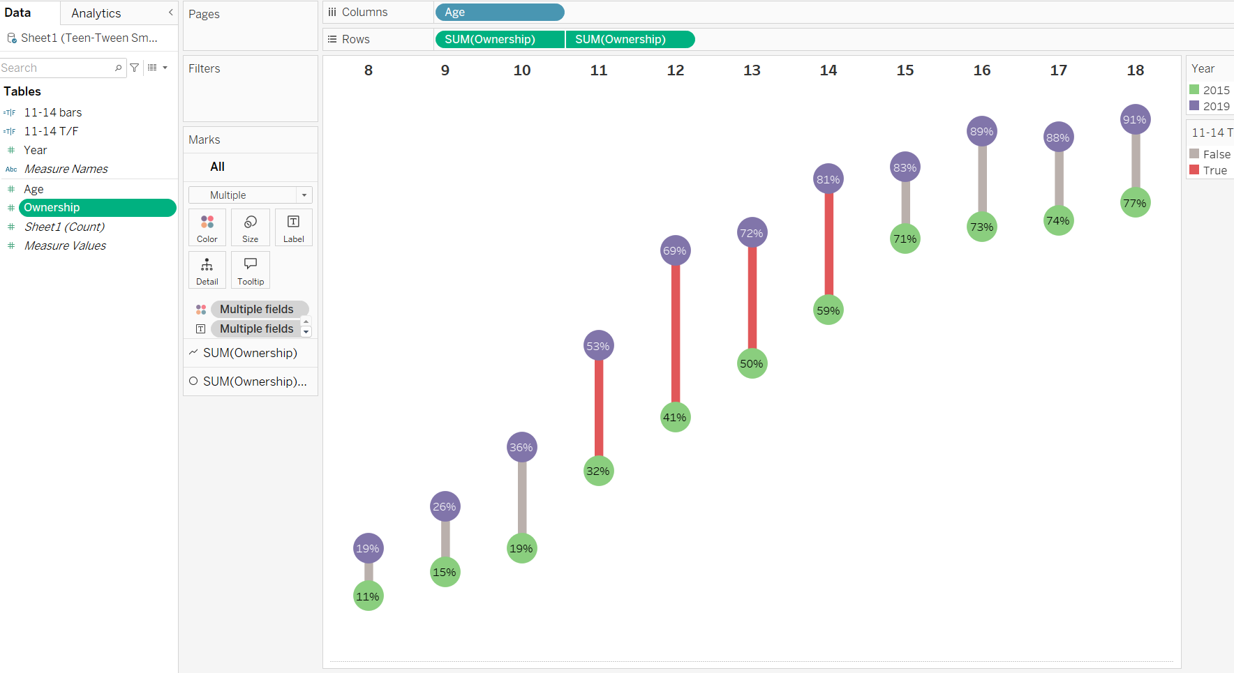
And there you should have your Dumbbell chart which shows you the change between two points of data by whatever metric you desire, and the length of the line (i.e. the bar), showing you how much those points have changed between the chosen metric.