


For day 3 of dashboard week, DS53 will took on The Data Lab Data Visualisation Competition 2025 challenge. The brief was to communicate the co-benefits of climate action using the dataset from the UK Co-Benefits Atlas. We needed to choose one or more co-benefit categories, and select a specific audience to persuade (e.g. councils, businesses, a local community, climate skeptics). Then tell a clear story using data and build a polished infographic-style dashboard (static or interactive) in Tableau/Power BI. This challenge focused on persuasion, clarity, and insight, not just charts.
My Approach
I went with Tableau, targeting local communities while also including per capita views (per community member).
Prep Flow:
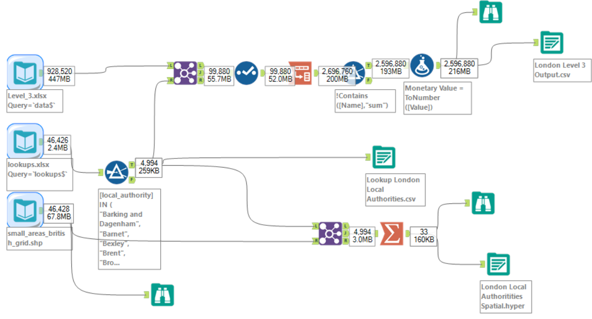
I joined the main dataset to a London-filtered version I created of the lookup so that only London remained, then pivoted years to rows and fixed some strings to be numbers. I combined polygons in the shapefile to become whole local authorities and summarised spatially. This gave me three outputs which I could then relate in Tableau without needing to change levels of aggregation, since each dataset was at slightly different levels.
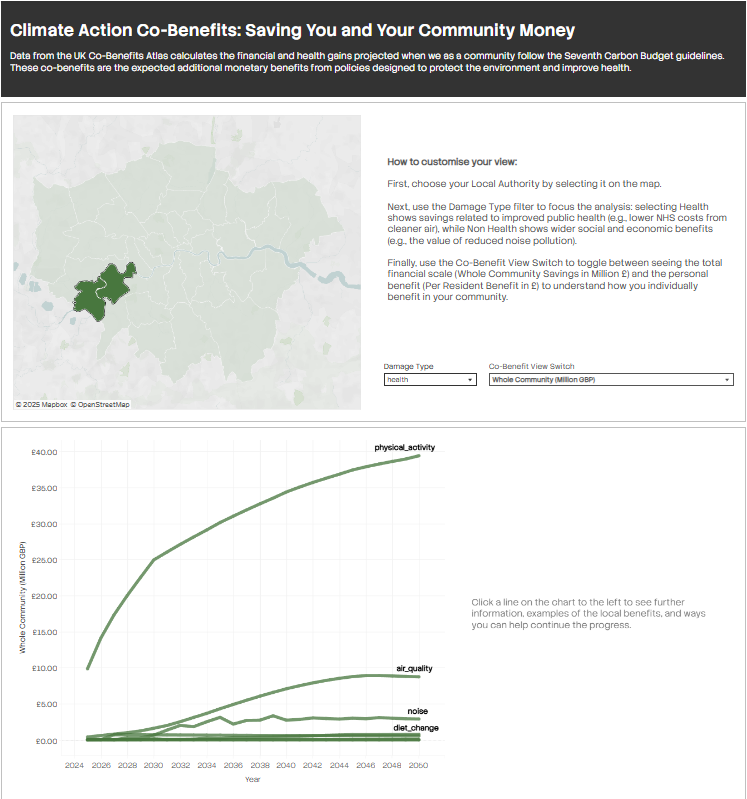
Here is the finished product:
Reflection/Things I Would Tell Future DSers Doing a Challenge Like This:
- Missing the infographic vision: Although I did a good amount of work, it didn't quite meet the infographic part of the brief
- Writing out a clearer user story as part of my plan would have helped with vision and direction, which were unclear from the start
- The final product doesn't have that infographic feel design-wise, so I needed to spend more time finding inspiration and studying what actually makes a good infographic. For example, I had planned to include KPIs but ran out of time, but really, I should have prioritised them since big numbers are central to infographics
- Create a visual plan to present: Making a visual plan that I can show everyone means they can see what I was aiming to do. Then the dashboard becomes a presentation of where I got to, rather than just showing the dashboard with no context. This makes the work feel more complete and intentional, even if I didn't finish everything