


These are often used in an industrial context to see when certain dates fall outside predefined accepted limits over a period of time.
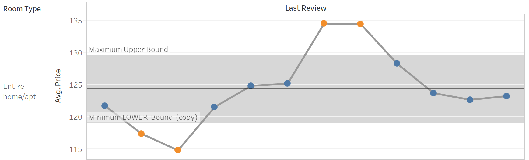
We can on the image above that we have a point for each month and the average price. We have set the average price twice on a duel axis one as a line one as a circle and then synchronized, as illustrated in the image below.

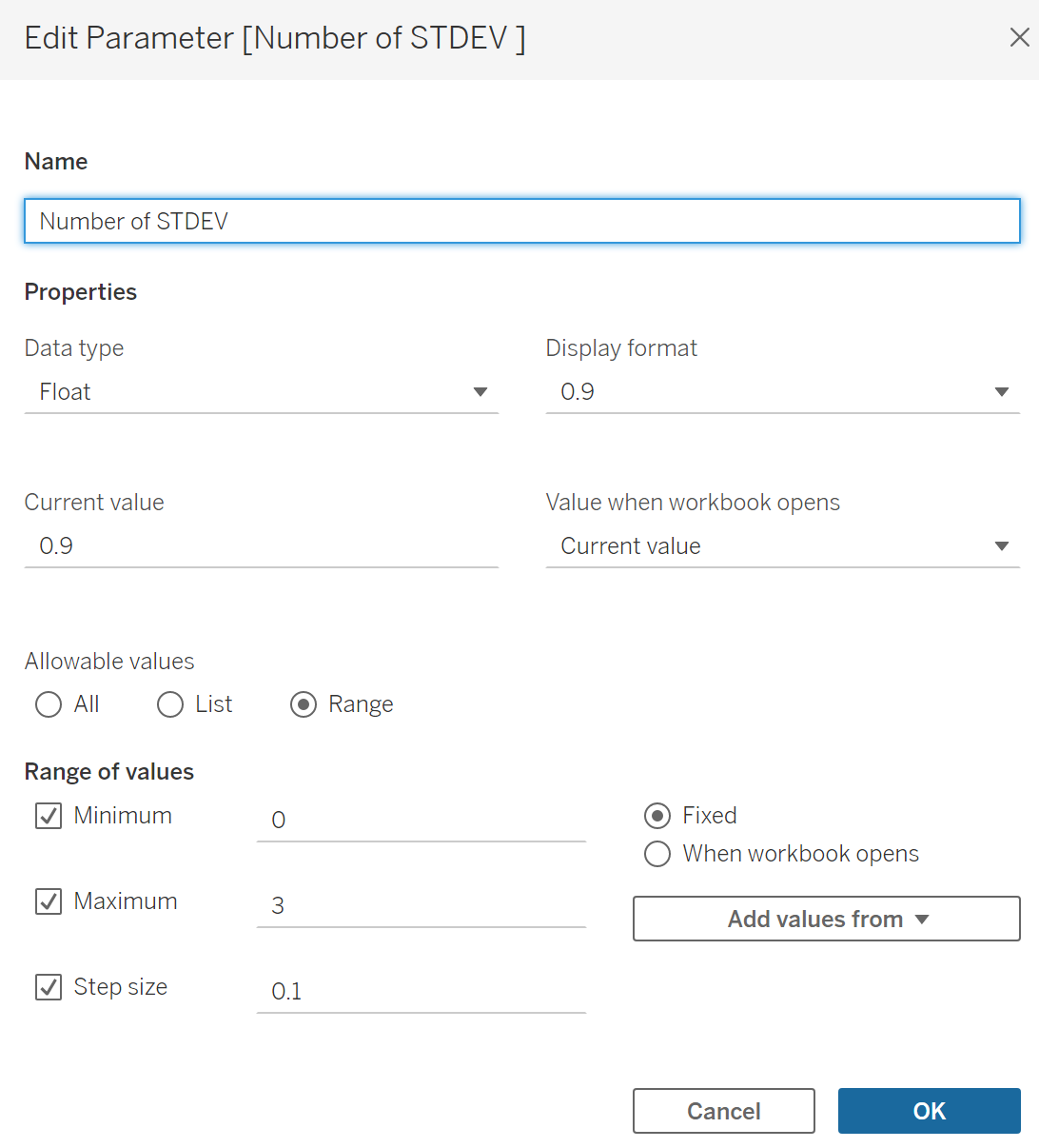
We could drag on lines from the analytics page but these would be hard-coded in. We would like to be able to change these values so we need them to be calculated.
We can calculate the average by using the WINDOW_AVG calculation
WINDOW_AVG(AVG([Price]))
We can then create our parameter which will enable us to choose the Upper and Lower bounds
We set the Minimum and Maximum as well as a step size.
We then turn to setting up our upper and lower bounds we need to reference our average line and the parameter by making two calculated fields.
We can do this for the upper bound
[WINDOW AVERAGE]
+
[Number of STDEV ]*WINDOW_STDEV(AVG([Price]))
and the Lower Bound
[WINDOW AVERAGE]
-
[Number of STDEV ]*WINDOW_STDEV(AVG([Price]))
This enables us to change the upper and lower bounds by changing the parameter.
We can then drag the distribution band and set the upper and lower bound as the Max and the Min.
The final stage is to add the calculation on top color this will enable us to see easily if a point is inside or outside of the data
IF AVG([Price]) >= [LOWER Bound (copy)] AND AVG([Price])<= [Upper Bound ] THEN TRUE
ELSE FALSE
END
This calculation then needs to be dragged onto the marks card for the circles
This will color the inside and outside of the bands differently .