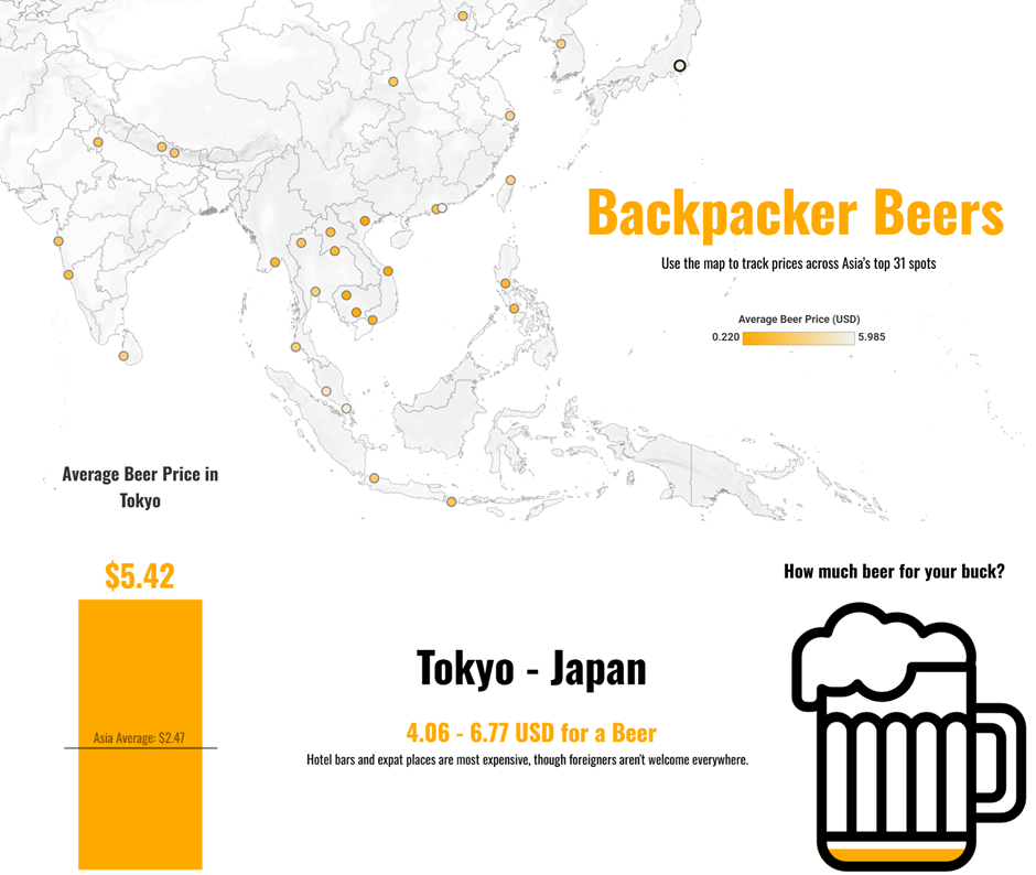
For the first day of Dashboard Week, I decided to explore something light-hearted yet surprisingly insightful for travellers: the price of beer in 31 popular backpacking destinations across Asia. While it may sound like a novelty topic, understanding how far your money goes - especially when it comes to daily expenses like a cold beer - can be genuinely helpful when planning a trip on a budget.
Approach & Process
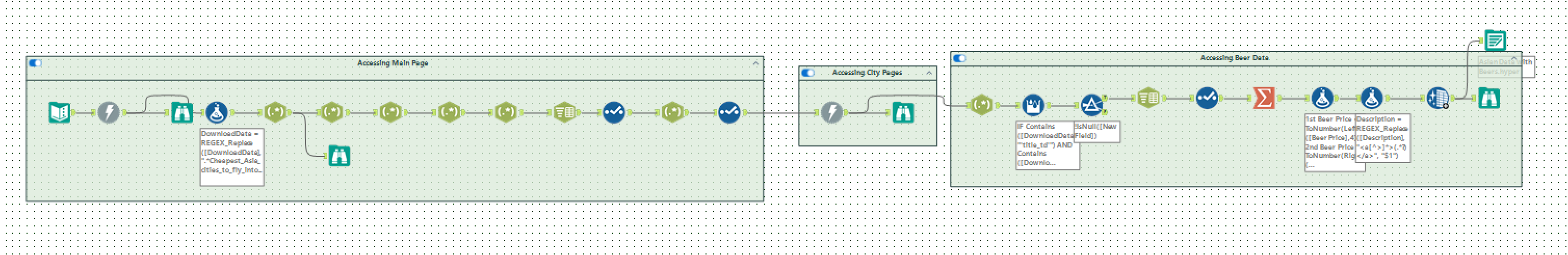
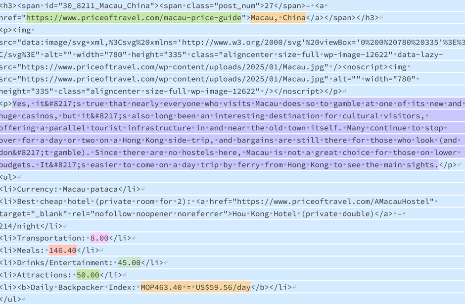
I started the day by web scraping the homepage data using Alteryx. The data I needed was spread across individual city-specific webpages, so I used a download tool to retrieve the HTML content for each one. Once I had all the raw HTML, the next step was to extract the actual beer price and description fields — which meant diving deep into REGEX, and using a second download tool to retrieve the HTMLs for each city's individual page - this is where the beer prices are found.
Challenges
This was far more challenging than expected. Each city page used slightly different HTML structures, so my first few regex patterns missed some of the key data. I ended up spending a good chunk of the morning debugging and refining the expression to account for these inconsistencies. One of the most helpful tools during this process was Regex101. Being able to test and preview the regex against live HTML snippets saved me loads of time and helped me isolate where things were going wrong.
Eventually, I got the pattern working reliably across all cities and then cleaned and organised the extracted data into a tidy table ready for Tableau.
Things I Learnt
What stood out to me most was the huge variation in beer prices across Asia. From dirt-cheap draft pours in Vietnam to higher prices in more touristy destinations, there’s a big range in how far your backpacking budget can stretch. To highlight this variation, I decided to try a new Tableau technique — the filled shape chart.
This involved overlaying a transparent image of a beer glass on top of a simple bar chart. To make it work:
- I used a white background and ensured the areas outside the glass were fully solid white.
- I then positioned the bar chart underneath the glass image.
- As the bars rise, it creates the illusion that the glass is “filling up” with beer, depending on how much you can get for your money in that city.
It’s a simple trick, but visually engaging and perfect for this kind of playful topic.
Explore the Dashboard
Take a look at the final product here:
Backpacker Beers – Tableau Public