The Brief
Today’s challenge focused on accessibility. I was tasked with creating a dashboard tailored for keyboard-only users, particularly those with visual impairments. The use case was a consultant assessing the inclusivity of London’s top attractions and transport links. The key requirement: the dashboard must be fully navigable without a mouse — using only keyboard controls such as Tab, Enter, Shift and Spacebar.
My Approach
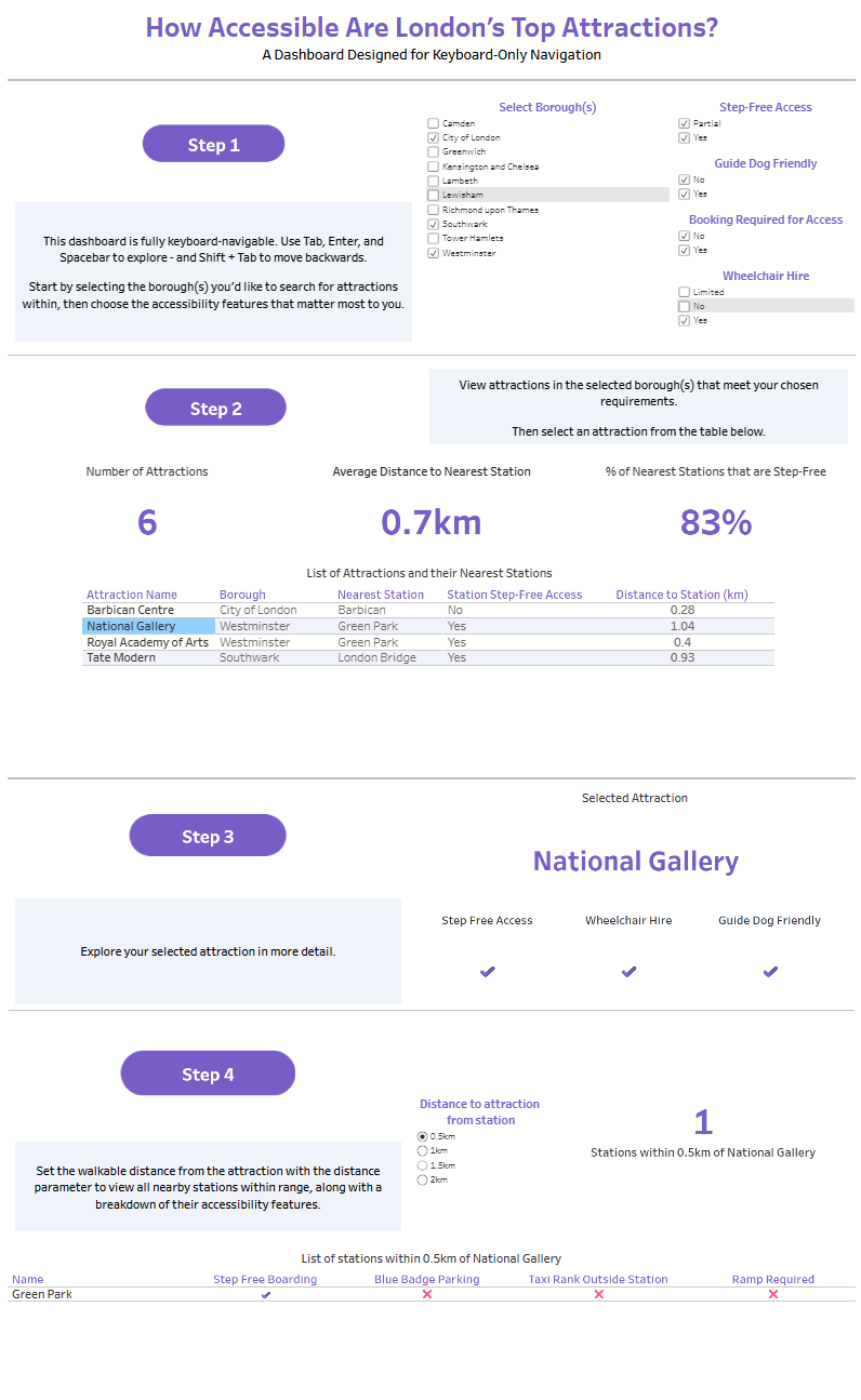
I focused on the 19 attractions listed in the dataset and used them as the entry point for the user. First, the user selects the borough(s) they’re interested in, and then applies any accessibility filters, such as:
- Step-Free Access
- Accessible Toilets
- BSL/Audio Guides
- Sensory-Friendly Options
- Guide Dog Friendly
- and more.
Once an attraction is selected, a spatial parameter lets users choose how far they’re willing to walk. This triggers a table listing all nearby TfL stations within the selected distance, along with a breakdown of their accessibility features.
I also included key KPIs like:
- Number of attractions matching the filters
- % of step-free stations nearby
- Average distance to nearest stations
And, crucially, I provided clear text instructions and logical tab order to make the dashboard as intuitive as possible for keyboard users.
Challenges
This task introduced some new constraints I hadn’t worked under before:
- Ensuring keyboard-only navigation: Most dashboards are designed with mouse interaction in mind. So, it was a challenge to make sure all filters, parameter controls, and charts could be accessed using only the Tab key and spacebar, this required lots of testing.
- Designing without maps: Maps are great visually, but they aren’t easily navigable via keyboard. I opted for a table-based approach instead, which allowed users to view nearby stations in a structured format that screen readers and keyboard users can interact with easily.
- Creating a spatial parameter setup: This was a great use of spatial functions in Tableau. Linking attraction locations with nearby TfL stations based on distance required some careful calculations and testing.
Learnings
- Accessibility-first design is a mindset as much as it is a technical skill. Creating a dashboard that's easy to use with a keyboard helped me understand the experience of users who rely on assistive technologies.
- Spatial functions in Tableau are incredibly powerful when you want to create context-aware KPIs (e.g., stations within 5km of an attraction).
- Dashboard instructions matter. Clear, short text can guide users more than we often give credit for — especially when mouse interaction isn’t possible.
Find my Tableau dashboard here.