For Day 3&4 of Dashboard Week, we were given a really exciting brief — a challenge set by Tableau themselves as part of the Data + TV campaign. The task was to find a compelling data story using IMDb data, focused on a TV series or trend we love. The visualisation had to be styled as an infographic, using Tableau Prep for data cleaning and Tableau Desktop to build the final dashboard. To make things more interesting, the theme was Summer, and everyone had to choose different shows
Initial Ideas and Changing Course
I originally wanted to base my dashboard around the long-running Aussie show Bondi Rescue. It felt on-theme with summer and had a large number of episodes. But after digging into the IMDb data and the website itself, I quickly found that there was barely any data available — most episodes had no ratings, and the overall series information was sparse. So unfortunately, that idea was quickly scrapped.
From there, I pivoted to something much more familiar and much more data-rich: David Attenborough documentaries. However, it soon became clear that trying to cover his entire career in a single infographic was just too ambitious for a one-day build. There were simply too many titles, too much data, and not enough space.
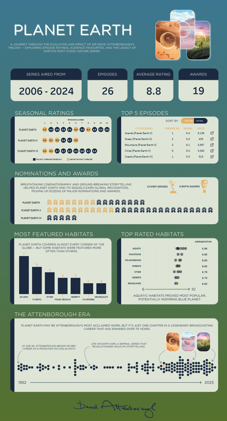
Instead, I narrowed my focus down to his most iconic and highest-rated work — the Planet Earth trilogy. With data spanning from Planet Earth (2006) through to Planet Earth III (2023), this gave me a clean narrative arc and plenty of data to work with: ratings, episode summaries, release dates, and awards.
Highlights and Design Choices
One of my favourite elements from this build was the career timeline at the bottom of the dashboard, where I visualised Attenborough’s major works as a beeswarm plot using hexagons. It’s a really clean way of showing the wider context of his career, while keeping Planet Earth front and centre.
For the rest of the dashboard, I focused on:
- Most filmed habitats across the series
- Highest-rated habitats (e.g. aquatic, polar)
- Summary stats like total episodes, average rating, and number of awards
- A vertical timeline structure showing each series with IMDb ratings and summaries
- Tooltips with light interactivity and a consistent colour palette of greens and blues, echoing the show’s tone
Challenges
The biggest challenge for me was trying to keep the dashboard summer-themed, as per the brief. Although I started with Bondi Beach in mind, once I pivoted to Planet Earth it became quite tricky to keep that seasonal connection going. In the end, I decided to prioritise creating something polished and data-rich over forcing a seasonal link that didn’t really fit. It was a bit of a shame, but I’m still really happy with the end result.
Final Thoughts
I really enjoyed this challenge — especially the opportunity to build a data story around something I genuinely love watching. The structure of the Planet Earth series, the strong IMDb dataset, and the visual flexibility of an infographic format made this a really fun project. It also pushed me to be more intentional with design choices, balancing aesthetics with clarity.
You can check out the final viz on my Tableau Public here.
#DataPlusTV