For today’s challenge, we were asked to dig into LEGO data from Rebrickable with a summer twist. The task involved uploading datasets into Snowflake, building SQL views to clean and structure the data, and then connecting to that Snowflake data in the visualisation tool we haven't used this week — in my case, Power BI.
The Brief
Objectives:
- Upload all provided tables to your own Snowflake schema
- Clean, join and create structured SQL views
- Identify summer-themed LEGO sets using keyword filtering
- Analyse trends across sets, parts, colours, and themes
- Visualise the data using a tool different from Monday’s challenge (Tableau)
- Document findings and organise files, SQL queries, and dashboards
Structuring the Data in Snowflake
The first major step was deciding how to reshape the Rebrickable schema. With over a dozen tables provided, it initially felt overwhelming trying to work out what I needed.
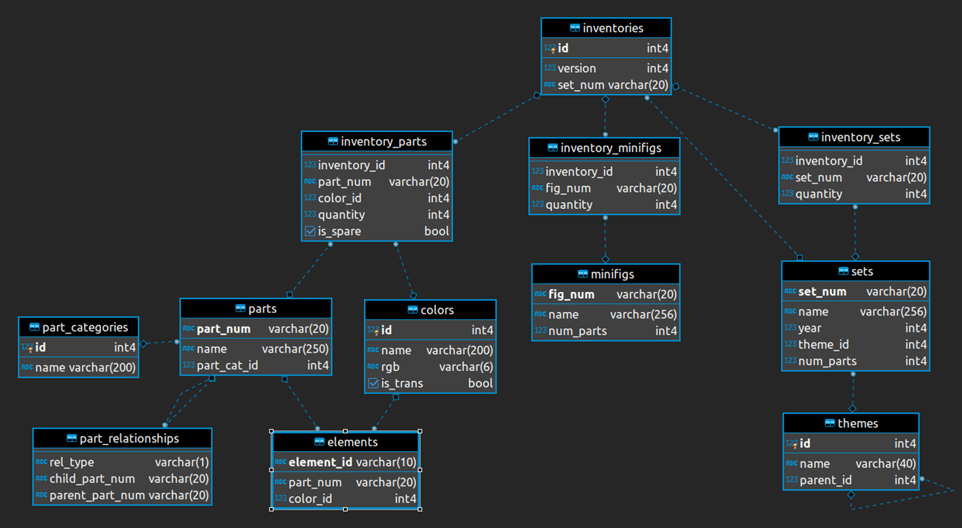
After spending time exploring the data, I decided to create three key SQL views, each combining multiple tables to serve specific purposes:
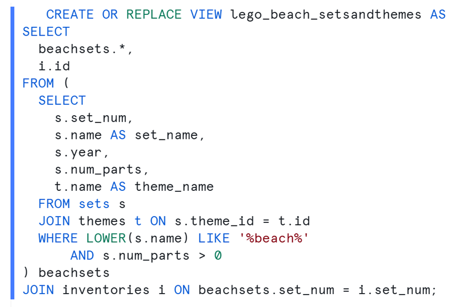
1. lego_beach_setsandthemes
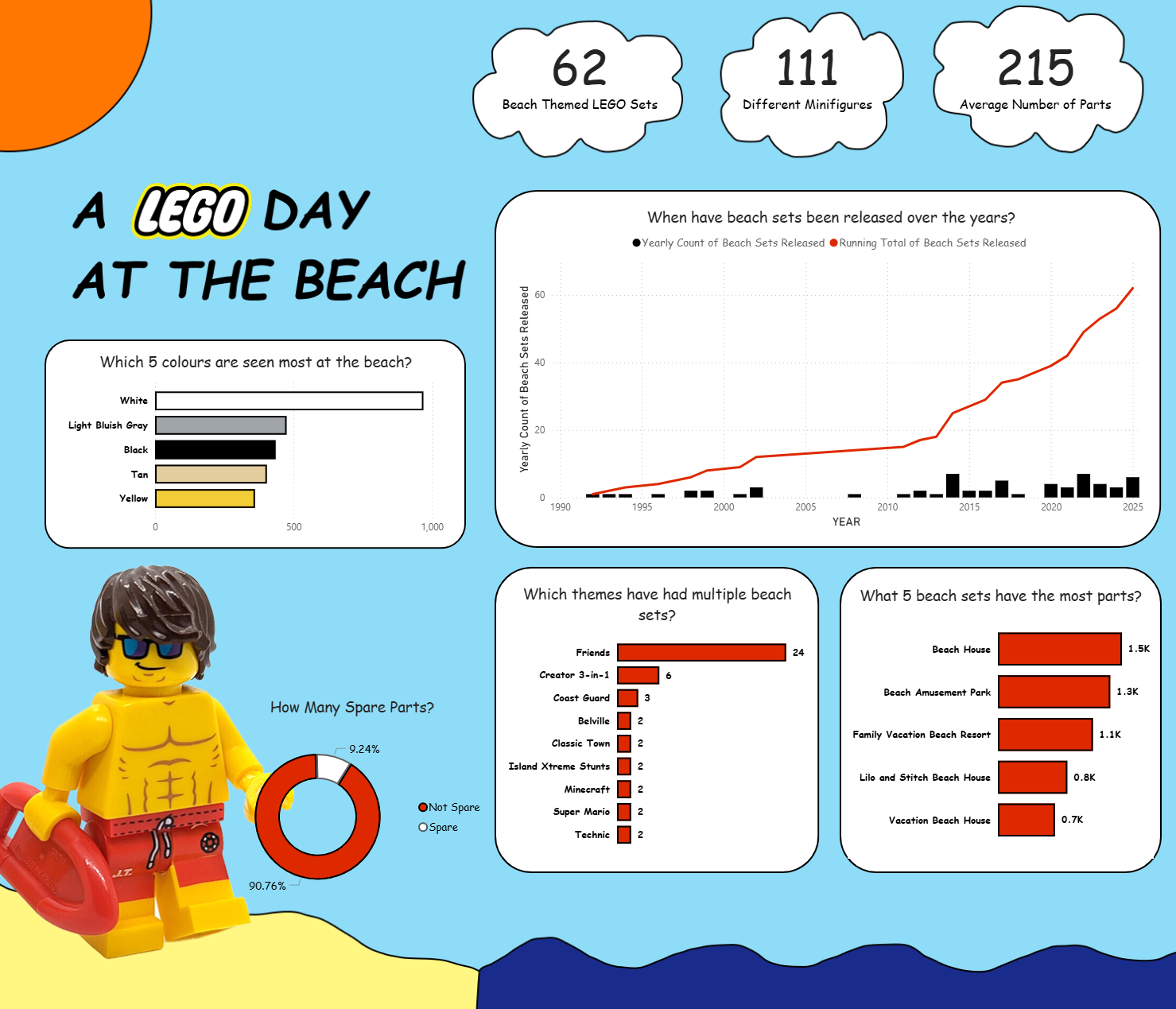
This view joined the sets, themes, and inventories tables — giving me a base for filtering summer sets and analysing yearly trends. This is where I applied keyword filter LIKE “beach” on the set names, to get the LEGO beach sets.
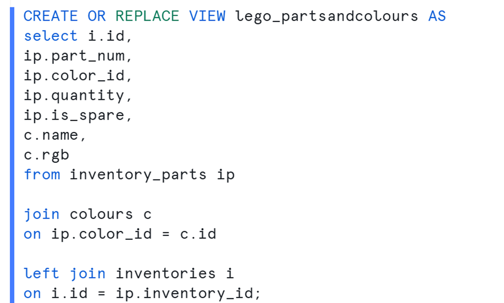
2. lego_parts_and_colours
This view connected inventory_parts, colours, and part_categories, enabling analysis of the most common part types and colours used in summer sets.
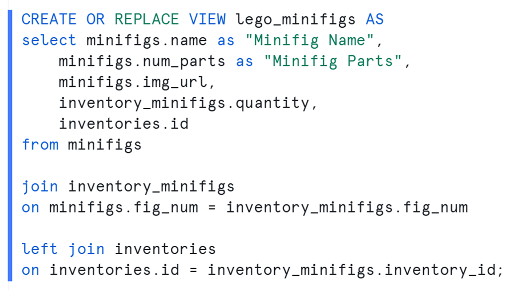
3. lego_minifigs
To round out the detail, this final view pulled in minifigures from each set, via inventory_minifigs, as well as the specific parts associated with them.
Challenges Along the Way
Today was one of the more technically demanding days.
- Getting Started: It took me a while to understand which tables were relevant and how they linked together. It was like putting together a LEGO set without the instructions.
- SQL Rustiness: I hadn’t written SQL in a while, so building the views took longer than expected, especially when ensuring fields like
color_idandinventory_idaligned across tables. - Snowflake + Power BI Issues: Once I had my views ready, I hit a brick wall trying to connect Power BI to Snowflake. I ran into OAuth token errors that ate into valuable time — eventually managing to connect, but with only a couple of hours left to build the dashboard.
The Final Dashboard
Despite the time constraints, I built an interactive Power BI dashboard focused on summer-themed LEGO sets.
Key features included:
- Set releases over time, showing a steady trickle of summer sets with spikes in certain years
- Popular part colours, dominated by yellows, blues, and whites — classic summer shades
- A donut chart designed to look like a lifeguard's rubber ring.
While the visual polish wasn’t as refined as I’d have liked, I’m proud of what I pulled together with the time I had.