


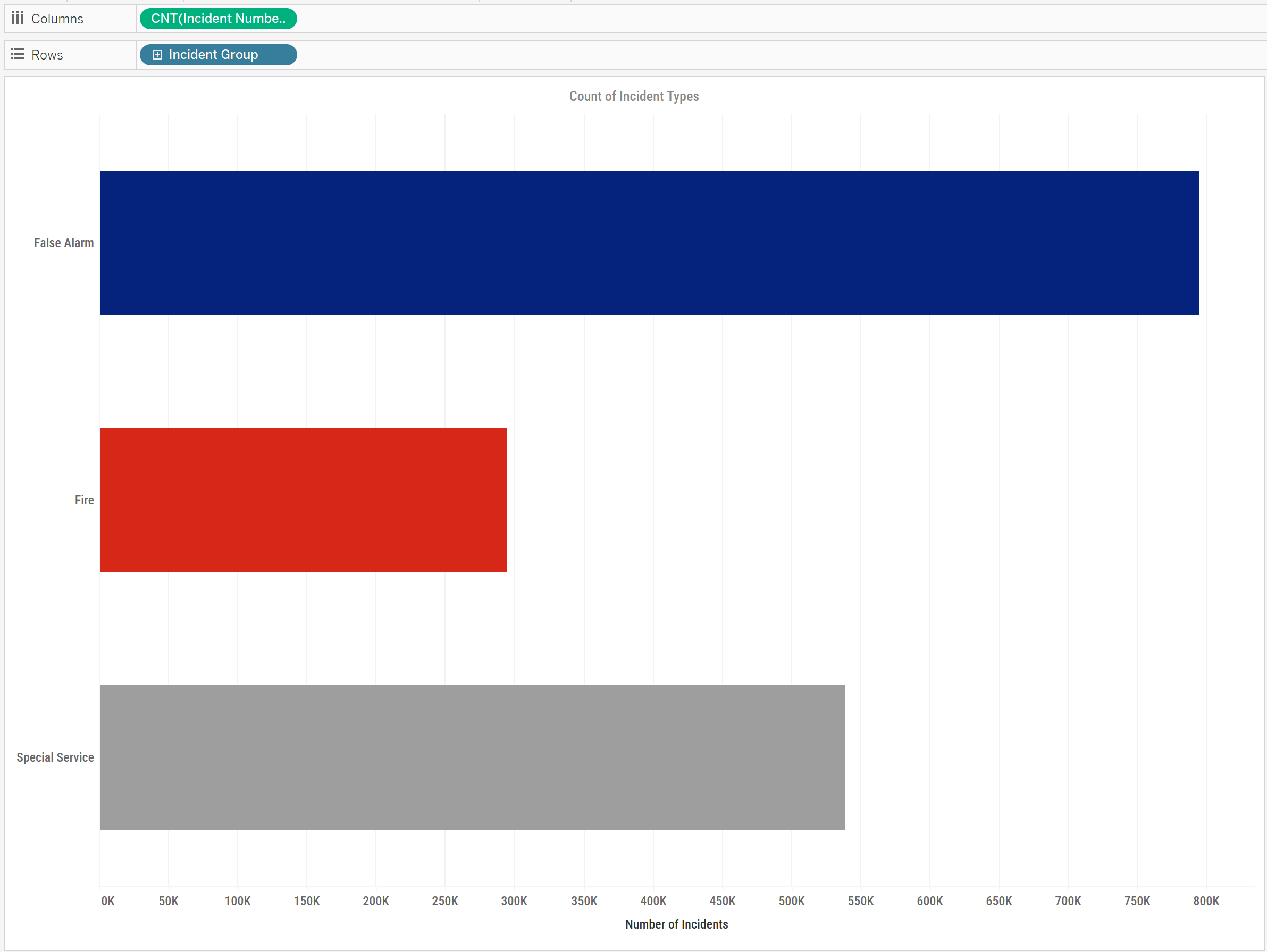
In a recent dashboard, I wanted to create a clean and simple drilldown bar chart that let the user explore a breakdown of incidents by group — and then drill into more detail with a single click. I then wanted the user to be able to drill back up to the higher level of detail, so added a Reset button. Below is the simple bar chart I wanted to drilldown:
Step 1: Setting Up the Parameter
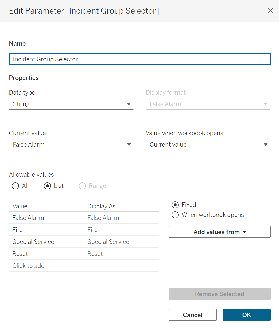
First, I created a string parameter called Incident Group Selector. This contained four values:
False AlarmFireSpecial ServiceReset
This parameter would control what the user sees in the view — whether they’re looking at all incidents grouped by type, or drilled into the details of a specific group.
Step 2: Controlling the Drilldown Display
We then need a calculated field to bring this parameter into the view:
IF [Incident Group Selector] = [Incident Group]
THEN [Incident Details]
ELSE ' '
END
Bring this into your Rows. This is what will change your chart as the parameter changes. This returns the detailed breakdown (e.g. subtypes of incidents) only when the corresponding group is selected. Otherwise, it shows the higher level of detail.
I used this field on the view so that when the parameter matches the incident group, it reveals the breakdown below that bar. You can test this step by bringing the parameter into your toolbar.
Step 3: Adding Dynamic Labels
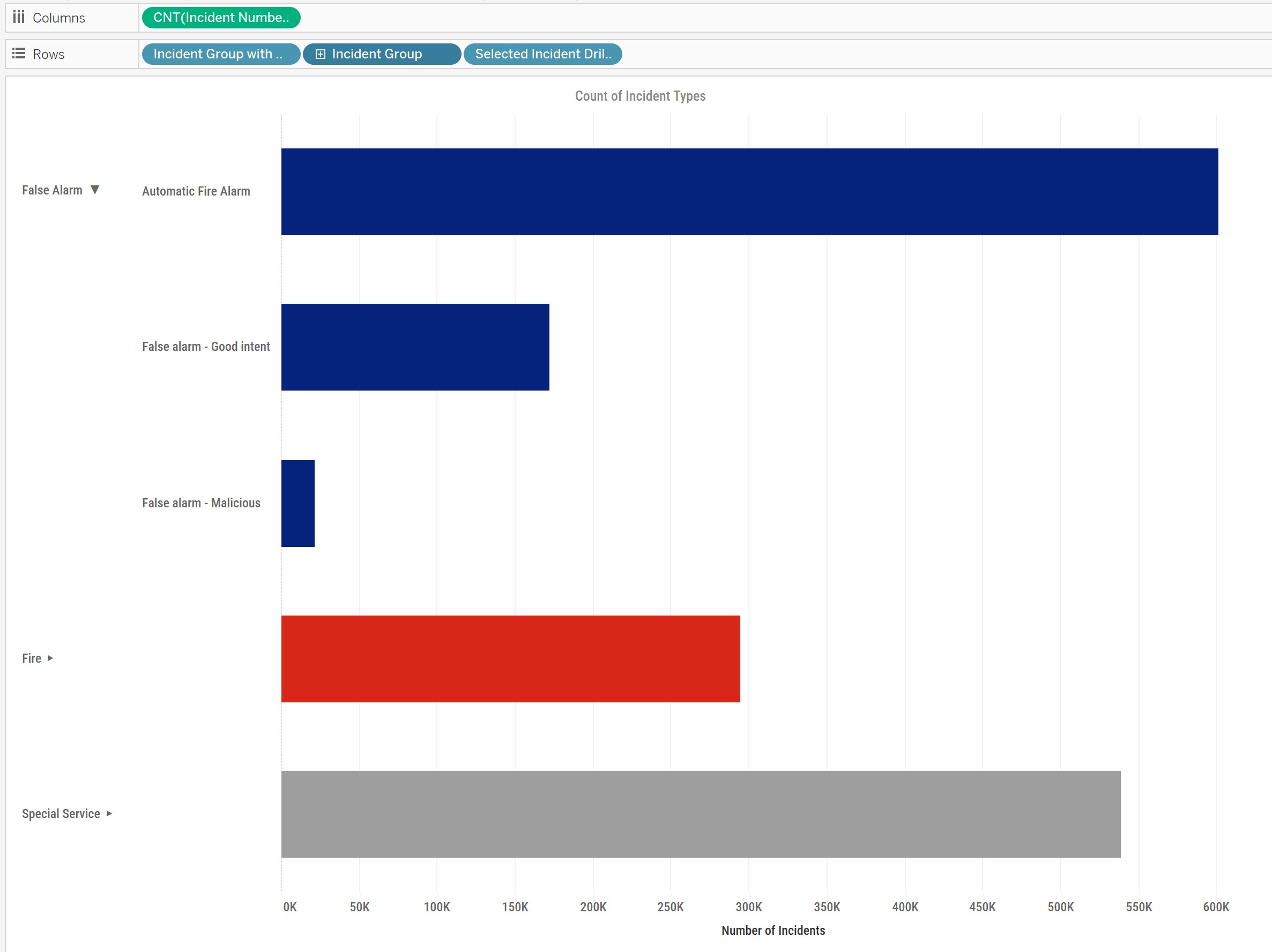
To make the interaction more intuitive, I added an arrow next to each incident group label — so the user knows which section is expanded. This was done with another calculated field, Incident Group with Labels:
IF [Selected Incident Group] = [Incident Group]
THEN [Incident Group] + " ▼"
ELSE [Incident Group] + " ▶"
END
I used this field as the label on the main bar chart. To do this, bring it into Rows on the left hand side, and then hide the header for your original field on Rows. You should now have something that looks like this:
Step 4: Creating the Drilldown Action
Once in a dashboard, I added a Dashboard Parameter Action:
- Run action on: Select
- Target parameter:
Selected Incident Group - Source field:
Incident Group(from the bar chart)
Now when a user clicks on a bar, the parameter updates to that value — and the chart updates to reveal the detail underneath. You can also do this in worksheet actions, but you'll have to repeat the process if you add it to a dashboard.
Step 5: Adding a Reset Button
To let the user return to the top-level view, I created a simple calculated field:
Reset Button: "Reset"
I built a small worksheet with this field dragged to Text and styled it as a reset button.
Then I created another Dashboard Parameter Action:
- Run action on: Select
- Target parameter:
Selected Incident Group - Source field:
Reset(from the reset button worksheet)
When clicked, this sets the parameter to "Reset" — which effectively collapses all sections.
I adjusted tooltips, tidied up the layout, and styled the reset button to be clear and clickable. The result is an intuitive and interactive experience that lets users dive into the data — and then return to the overview just as easily. You should now have your finished chart!
![Recording 2025-07-01 090450.mp4 [video-to-gif output image]](https://s7.ezgif.com/tmp/ezgif-70eb466cc5d504.gif)