


Today we were set the challenge of completing, and blogging about this weeks Makeover Monday, which looks at how salaries differ between male and female workers. My approach was to focus on the overall difference for each year, to help highlight the fact that on average, male teachers have earned more than female teachers since 2010.
The Original
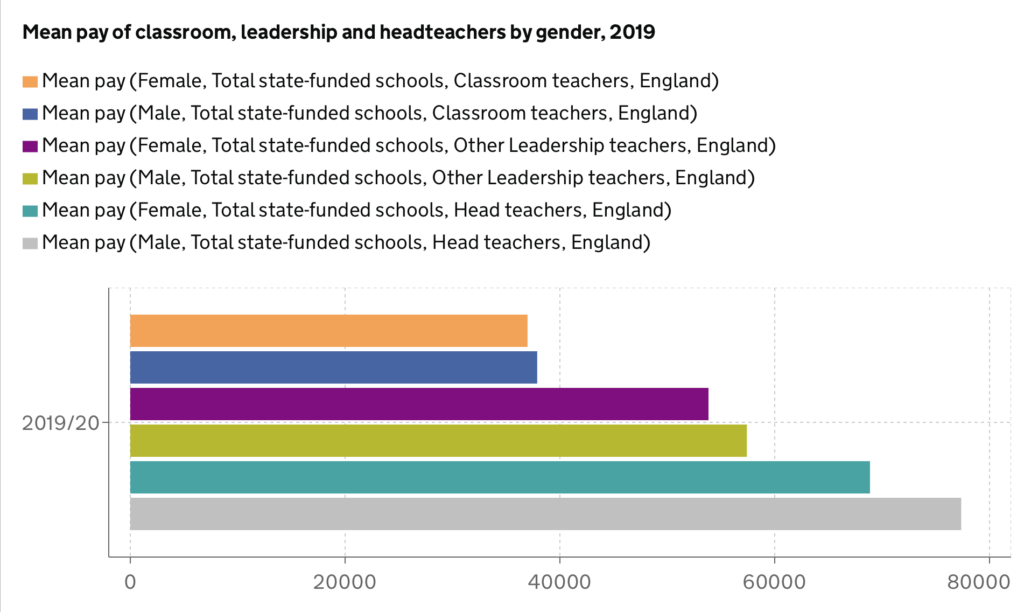
What works and what doesn’t work
I think one of the biggest problems with this visualisation is that the viewer constantly has to refer back to the colour scheme in order to make sense of the graph. While the visualisation conveys clearly that male teachers earn more than female teachers in equivalent roles, the message could be conveyed in a much better way. Maybe the use of a filter to select a different job level may help deliver this message in a clearer way, instead of using just one chart for all job levels.
While the original visualisation focuses on just 2019/20 data , the Makeover Monday dataset provided data since 2010, and I thought this could be used to understand how salaries have changed over time, and if the gap between male and female workers has widened or not over time.
My approach
The main objective of my visualisation was to highlight the gap between male and female teachers, and I decided to experiment with using a dumbbell chart to help emphasise this message. Dumbbell charts allow you to plot dots for individual values, with a line connecting them. The longer the line between the two points, the more of a gap existed between salaries. Alongside this, I decided to explore level of detail expressions in order to calculate and label the difference between these salaries, which helped me feel more comfortable with LODs in general.
To set up the LOD expression, I used the following formula:
{ FIXED [Year]: AVG(
IF [Gender] = ‘Female’
Then [Average Mean]
END
)}
This process was repeated to calculate the average salary per year for males too, and then I took the difference between these values and added them to the dumbbell chart to allow the user to quickly see the difference in salaries.
Something I also wanted to do was to use a colour scheme that was not stereotypical towards genders, which regularly occurs when visualisations focus on comparisons between differing genders. In order to provide the viewer with a simple way of knowing which colour referred to which gender, I colour-coded the title which acted as a legend for the dumbbell chart.
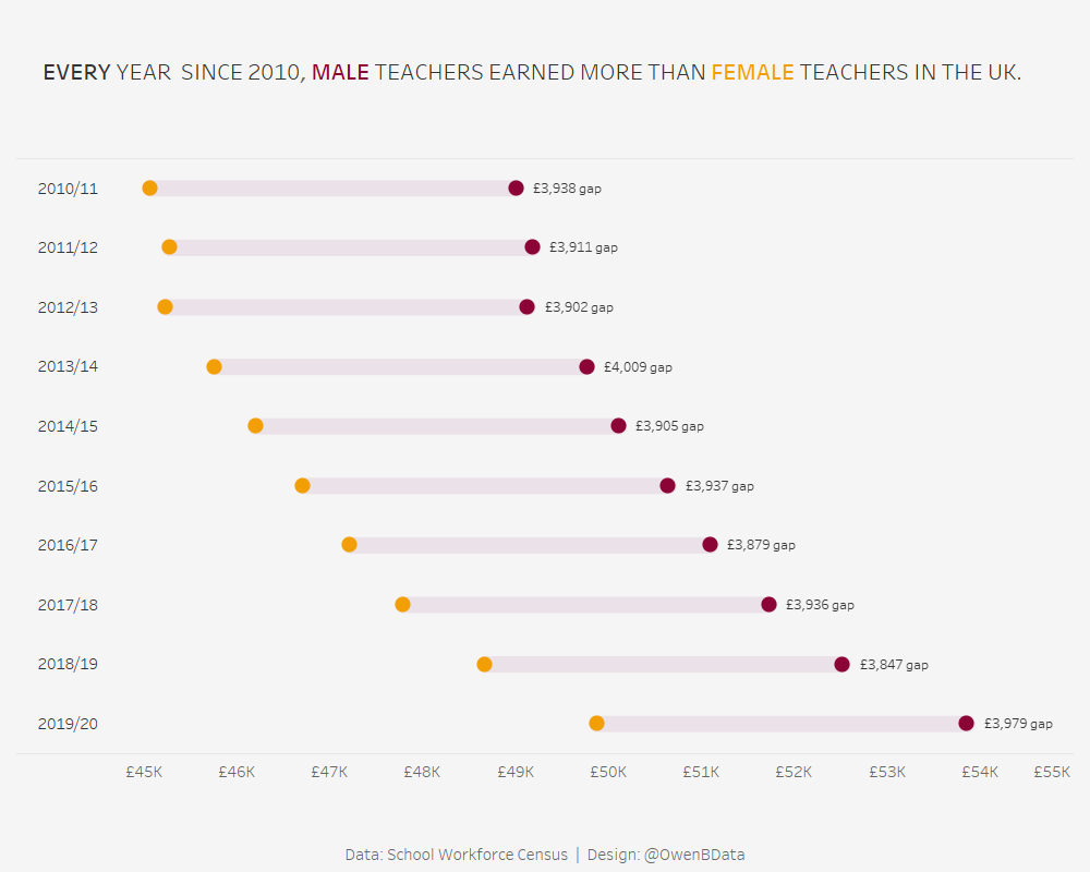
I enjoyed this Makeover Monday, and I think my visualisation helps to clearly show how salaries are different between male and female teachers. I think I could improve this visualisation in the future by providing the ability to filter by differing job level (such as head-teachers, classroom teachers), however I was unable to work out how to implement this alongside my LOD expression!