


Today, instead of teaching, Andy assigned us the task of exploring, critiquing, and re-designing one of his old visualisations. The visualisation assigned to me was looking at Vaccine Preventable Outbreaks from 2008-2014. The visualisation was provided for the council on foreign relations, looking at major diseases that have occurred, alongside their classification on an impact scale, and various metrics such as fatality rate, cases, and total deaths.
The Visualisation
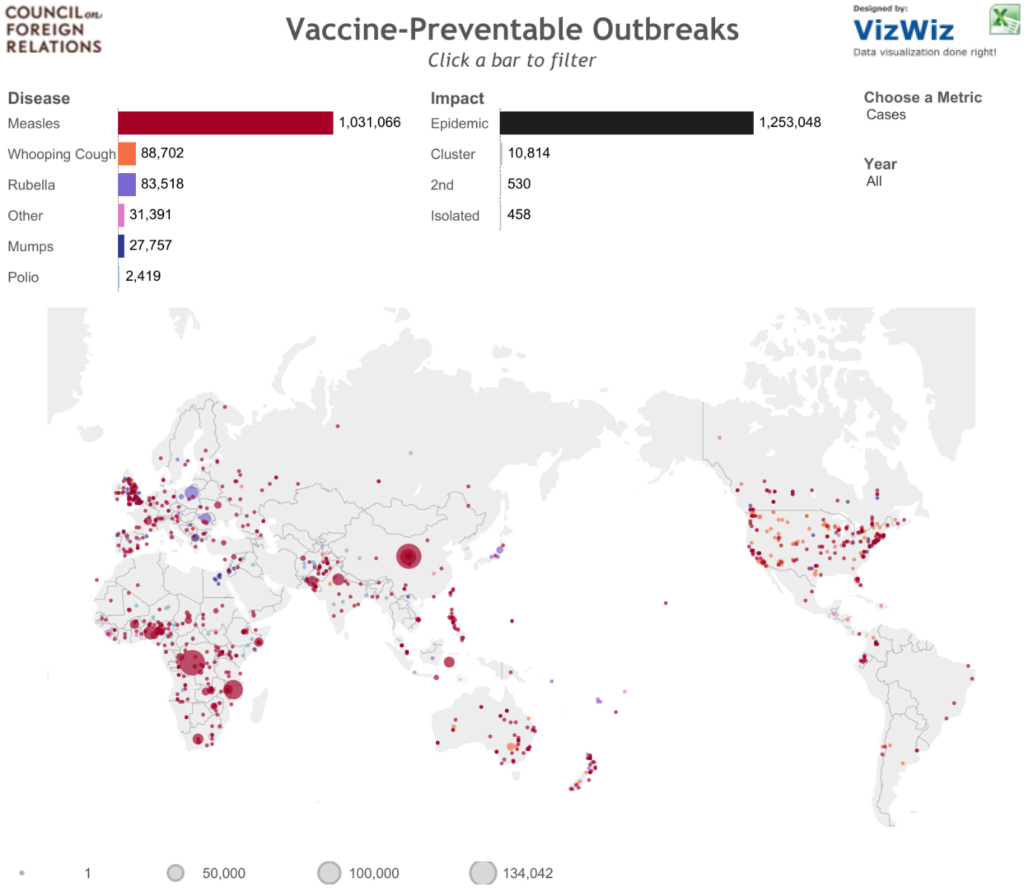
The visualisation consists of a large map, and two bar charts. The map allows users to visualise the differing diseases separated by colour, with the size of individual points indicated by either cases, deaths, or mortality rate. This is controlled by filters provided that included metrics, and what year the outbreaks occurred. The bar charts also acted as filters; one bar chart allowing to filter by disease, the other being able to filter by impact scale. The chart showing diseases had a different colour categorically assigned for each type of disease (Measles, Mumps, etc) while the chart indicating impact scale was coloured by the size of the metric, in greyscale where darker shades indicated higher values.
This was a highly interactive visualisation, making it possible to really explore the data and gather some insights quite quickly. For example, within minutes I noticed that Measles caused the largest amount of problems throughout the years. All in all, I think the interactivity is one of the best parts of this viz, and one that should be kept in the re-design process.
However, there were a few bugs I discovered that occur when you apply filters in specific circumstances. For example, when filtering by ‘fatalities’, other than when looking at all years available, the ‘Disease’ graph disappeared. The same thing happened with fatality rate, despite the graph indicating that the bar chart should have been populated.
The Review
One of the tasks set by Andy was to critique the visualisation based off a number of criteria. I have chosen a few of these to focus on, and will hopefully be able to improve upon some of them in my re-design.
Colour
Generally, I liked how there were different colours for different types of diseases, this made the ability to locate different diseases on the map easily. The only problem I did find though, was that the choice of colours could be clearer. For example, red (which dominated the visualisation due to the amount of measles outbreaks) clashed with Whooping Cough; the same happened with Rubella & Mumps. Using green may help to solve this issue.
Titles
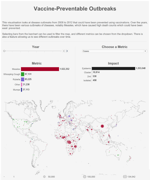
I liked that the title was clearly visible, and that titles for graphs were smaller than the main title. However, one problem I found was that the second graph, indicating impact scale, was hidden by a sort icon, making it impossible to read it. I think this was caused by the layout of the visualisation, namely fitting in the filtering options along the same container. An option for solving this may be to give bar charts individual titles, and hiding the row header.
Text & Annotations
A problem I immediately found which hindered user experience of this visualisation was the lack of text beyond simple titles. There was little explanation about what the visualisation showed (other than the title), causing the user to have to work it out themselves. I assume this may be because the target audience of this visualisation already have background knowledge of the topic, but other audiences may struggle without information. This could be solved by a brief introduction to the topic, and some more concise instructions of how to navigate the filters.
Another problem due to the high interactivity of the chart, is that none of the elements stay consistent while filtering. This makes the opportunity for annotations very limited, which explains why there are none on the visualisation. Spatially, there is little room for the annotations, and since the map is not fixed in place, annotating the map may be tricky. However, I think it could have been useful to annotate the graphs, noting that for the impact scale graph, Epidemic dominates the graph other than when looking at the fatality rate as a metric.
Filtering & Interactivity
One thing this visualisation does very well is offer extensive interactivity. It is possible to gain some incredible insights from using this tools, such as that Measles was heavily prominent in regions such as Africa and Asia (mostly India) consistently, and that there were larger outbreaks of Measles in the UK during 2012 and 2013. I think with a little more explanation, the filtering abilities of the visualisation could be greatly improved.
Context
One thing we were introduced to during our viz 101 class was that context is essential. For example, how does the insight you are sharing compare to a previous value? What is the significance of the information you are conveying. I think this would be something I would try to improve, however with the complex filtering of the viz and limited time scale, I would struggle to be able to provide any meaningful context to this visualisation.
Graph Choice
I think the choice of graphs here was correct, and the choice of using dots on a map instead of a filled map makes more sense since there is fine granularity from this dataset that is important to preserve. Something I think that has been harnessed well here is the ability to use Tableau’s map feature well, and the dynamic legend for the metric is really helpful for the user to view. For example, when there is no zoom on the map, big points are emphasised, and when zooming in, the scale for size of points changes that allows us to see bigger, local outbreaks.
Similarly, Bar charts clearly convey the information without over complication, which may be encountered if using alternative chart types such as bubble plots, or pie charts. Since there are labels on the individual bars, the decision to remove axis labels and grid lines was justified.
Layout
I think the layout will be a big part of the visualisation that I will be changing. Despite different elements being clearly distinguishable, I think making the graph longer, with more spacing may be advantageous. This would make room for titles to fit graphs, and the addition of text to help explain to the user how to use the filtering tools. This, combined with some simple separators to divide sections of the visualisation may be beneficial.
The Re-Design Process
I decided to focus on a number of elements to improve, and preserve all features of the visualisation as I believe the elements work very nicely. To start, I began drawing out how I think the visualisation may be better. My first iteration involved moving around different graphs, and seeing if a wider format would work. After 2 more iterations, I realised that the best approach would be to increase the height of the visualisation, and adopt a long-style approach.
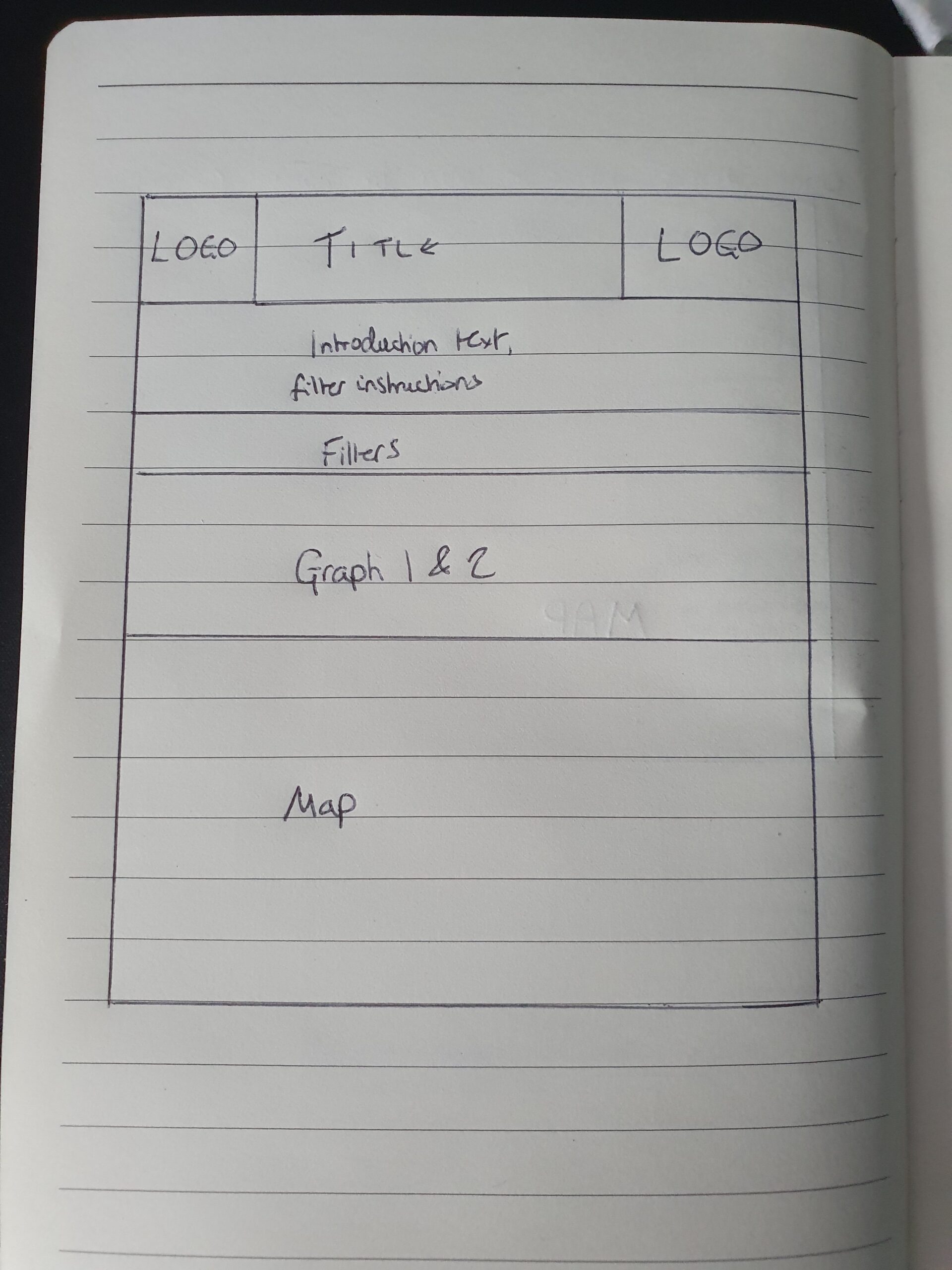
Once I had the layout sorted, I decided to rebuild the dashboard, focusing on ensuring there was equal spacing, dividers that separated sections with lines, and ensuring that relevant sections had titles.
Another change I made was one I recently explained, which included hiding row headers on the bar charts, and adding a separate title. This solved the issue of hidden row titles; which I coupled with right-aligning row names, which allowed me to fit ‘Whooping Cough’ onto the chart without it cutting out.
Finally, I added some text below the title that explained what the visualisation was showing, and further instructions for how to filter the map. I believe this was a positive change as it helped guide the viewer. Furthermore, I added green to the metric chart, which allowed viewers to more clearly differentiate between metrics.
Future Improvements
Generally I think this redesign process went well, but there are definitely some more improvements I would make. It would be useful to add more context to the visualisation, and the addition of BANs could work quite nicely to provide instant summary statistics. It was difficult finding too many faults with the visualisation and I think the graph choice needed no change!