Continuing from my previous blog post, I take a look at how I approached the makeover to my initial application to the Data School. In our very first week of the Data School, we learned a lot on data visualisation best practice – thinking about your audience and making your designs easy to understand. Our very first project was to do a ‘makeover’ of the initial application and present the re-visited work at the end of the week. So let’s take a look at the first attempt with data visualisation best practice in mind and see what works and what doesn’t.
What’s good
- Using only two chart types – I resisted the urge to make lots of charts and stuck to two simple charts, one which presented all the data, and one which summarised it to highlight the point being made.
- Interactive features – the tool-tips are laid out with explanations of the data points to help clarify the story
- Use of text and layout to tell the story the design reads simply from top to bottom and has an introduction, some text in the middle guiding the reader onto the conclusion, and a summary to finish.
What’s not so good
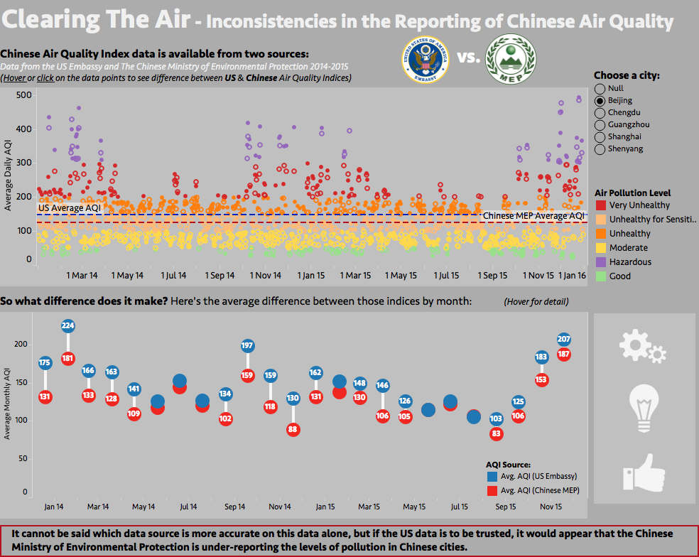
- It’s not totally clear what the first chart represents without the reader exploring the data points themselves. The tooltips reveal what each point means, but that requires some effort from the reader. The marks for the US and Chinese differ by being filled circles and outline circles, but they are so small that this can’t really be seen initially.
- Although there is a city filter, there is no way to compare the cities together.
- The buttons on the left allowed me to get more information in, but aren’t really necessary in conveying the message. The grey background was chosen simply as the theme of the viz was pollution so a smoggy background made some sense, but again isn’t completely necessary and with the bright colours in the top chart makes the viz a little too jazzy perhaps. There are other formatting niggles to correct too.
The Makeover
The main criteria I decided on for the makeover were the following:
- Clean up the story – make the message clearer and guide the reader through the story
- Allow comparison of cities throughout
- Do not rely on user interaction (dashboard actions, filters, tooltips)
I chose to use Tableau story points to guide the reader through the story with minimal effort and maximum clarity.
There are 5 story points as follows:
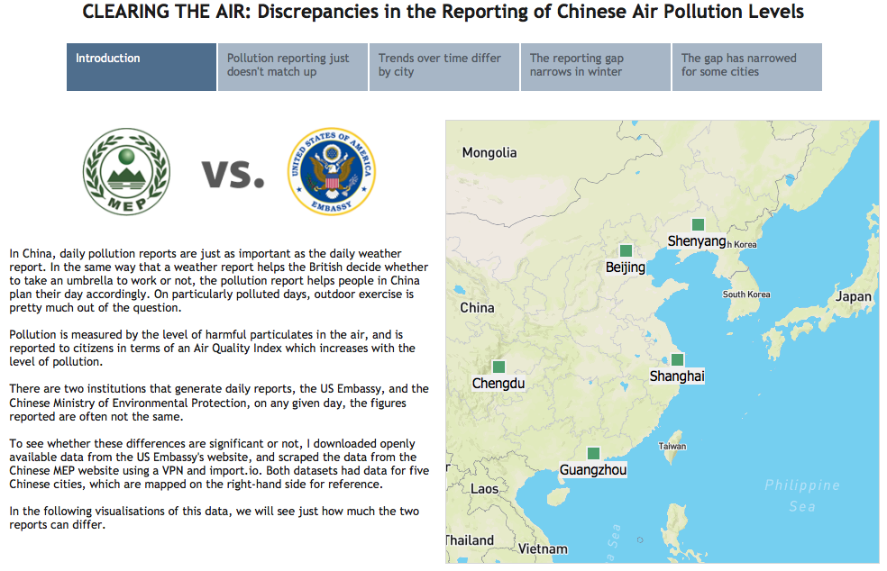
- Based on feedback from the InfoLab team, I included an introduction page with a map of the cities for which data is available, to set the scene and provide some context.
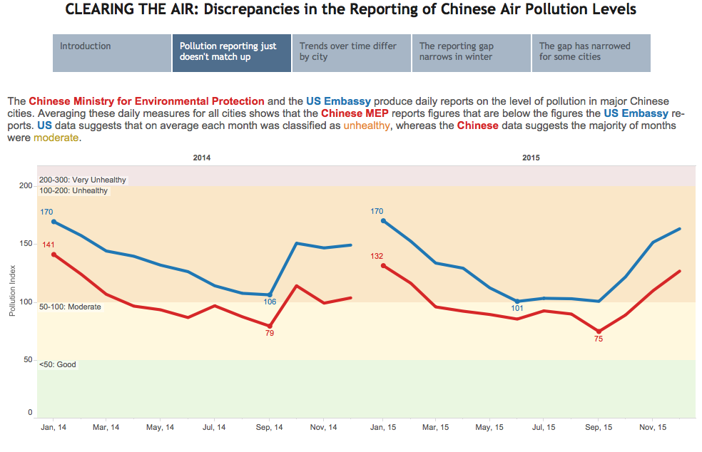
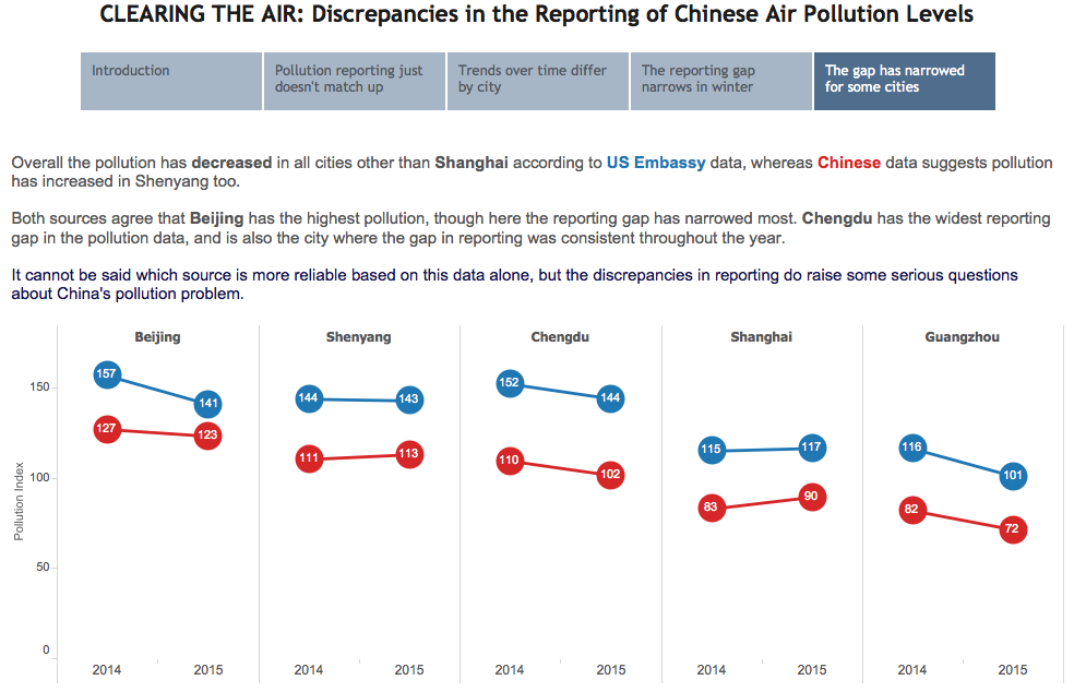
- I used colour in the explanatory text so no colour legend was needed, the pollution zones are included in the shaded background, and we start with an aggregated view of all cities for each year of the data. This clarifies the trend from the very granular daily view I’d chosen initially, whilst retaining the context of pollution severity.
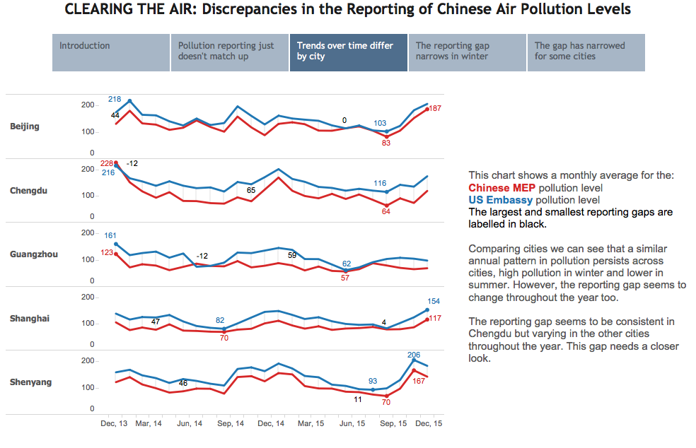
- Then this is split up into the city comparison, with some markers in-between the lines to highlight the gap, and allow labelling of the largest and smallest gaps.
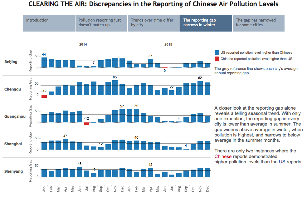
- Next a closer look at the reporting gap, again allowing comparison between cities.
- Finishing with a comparison of each city’s’ performance over time, using slope charts.
There you have it, two very different approaches to one story – Hope you like it! Feel free to comment with further feedback/thoughts.
(Click any of the images to see the viz on Tableau Public)