


Welcome back everyone, as I said in my previous blogpost we will continue with ̶a̶l̶t̶e̶r̶y̶x̶ ̶M̶a̶c̶r̶o̶s̶ Tableau.
After a quick catch up from week 2 we dived into Table Calculations with date and time with Lorna.
In one of the exercises we compared the sales and the moving average sales of the last 6 months in our favorite sample superstore dataset.
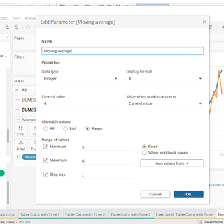
First we have to create a parameter for the moving average:
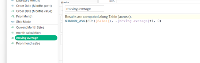
Then we have to do a table calculation.
Next step is to right click on Sum of Sales -> Quick Table Calculations -> moving average
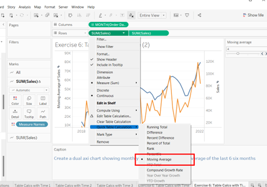
If we drag this onto the canvas, and change the chart to line from bar in the Marks field, we shall have two separate line chart. On showing the sales
To do a Dual Axis, we just have to right click on the second green 'Sum of Sales' field in the 'Row' section and find 'Dual Axis' there. When it's done the important step is to synchronize the axis, so the values are the same for both line chart.
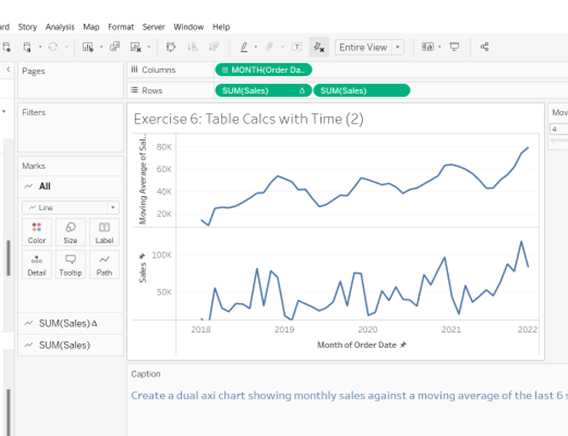
The final look should be similar to this:
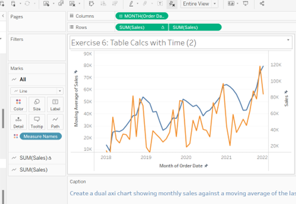
This is very useful to see more insight of our sales during a specific time period.
Peter Hajnal DS|33