


The key to creating a spray chart diagram (otherwise known as a wagon-wheel, network or hub and spoke diagram) is to format your data in a specific way so that each row contains a single point on the map; this usually involves pivoting on your origin and destination fields. Then the rows that are linked (i.e. make up one spoke) should have a unique path identifier that repeats for all other lines (or spokes) of the diagram.
For example, suppose we want to plot the rough positions of the planets in the Solar System. We may have the following table,
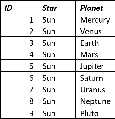
Which has the origin (The Sun) and destination (a planet) on each row. Now if we pivot on the fields Star and Planet to we can restructure our table to get the following,
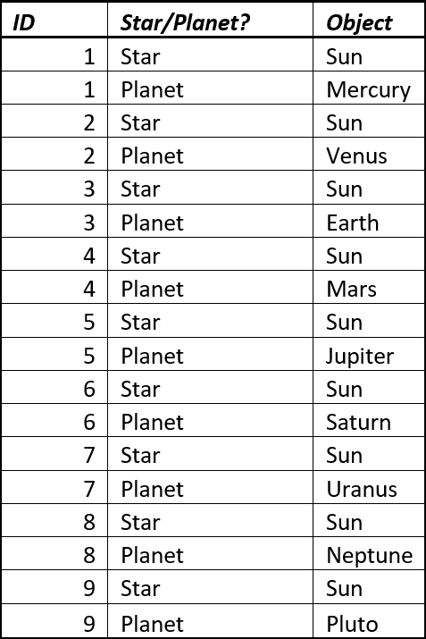
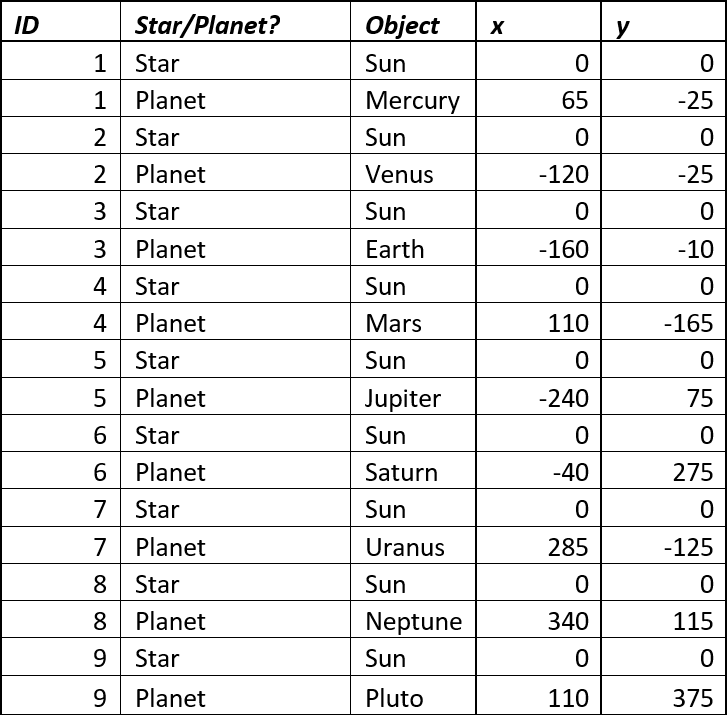
This can be done using the Transpose tool in Alteryx or there are some Excel plugins that allow you to do this automatically. Once your table has a ‘tall shape’ you need to join the location data to it. Notice how the ID is repeated; this is what connects the line that joins the centre (The Sun) to each of the radial points (the planets).
Again this is easy to do in Alteryx using the Join tool, or alternatively in Excel using a vlookup formula. This gives us,
Which we can connect to in Tableau.
The steps to create our hub and spoke are as follows,
- Drag your Y coordinates to Rows and your X coordinates to Columns. You should see a scatter plot populated with a single point.
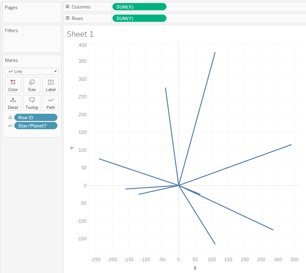
- Next, we break up that single point by adding dimensions to marks card. Row ID goes to Detail and we change our Mark type to line. Tableau joins the dots from left to right and your view should look something like this,
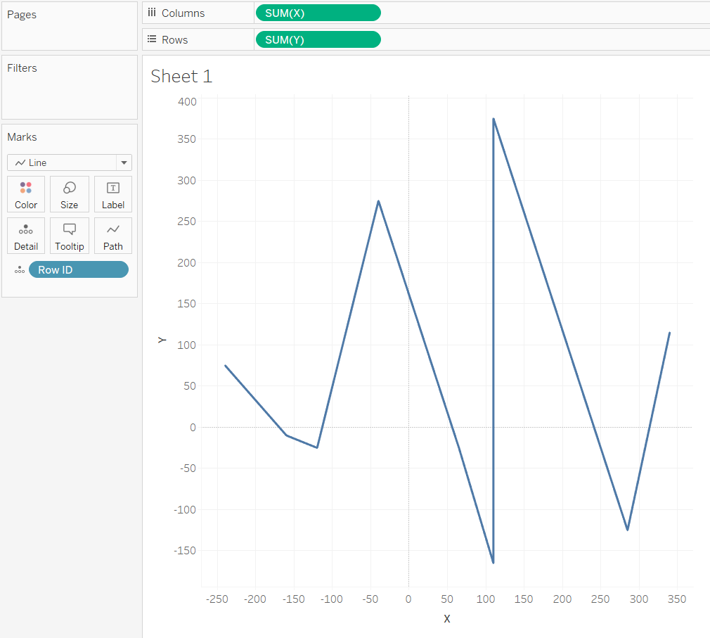
- The next step is to tell Tableau in which order those lines should be connected. In this instance, from the Sun to a planet. In fact, we can use any alphanumeric field which splits up our ID to differentiate The Sun from the planets. In this case, the Star/Planet? field which splits our ID points into pairs consisting of a Star and a Planet will map a path, for each ID from Planet to Star (as Planet comes before Star when placed in alphabetical order). Dragging Star/Planet? to Path and our hub and spoke takes the desired shape,
 Actually, since there are only two point and it doesn’t matter in what order they’re connected (Sun to Planet is equivalent to Planet to Sun), we can just click on Analysis from the menu at the top of the screen and click uncheck Aggregate Measures to get the same effect.
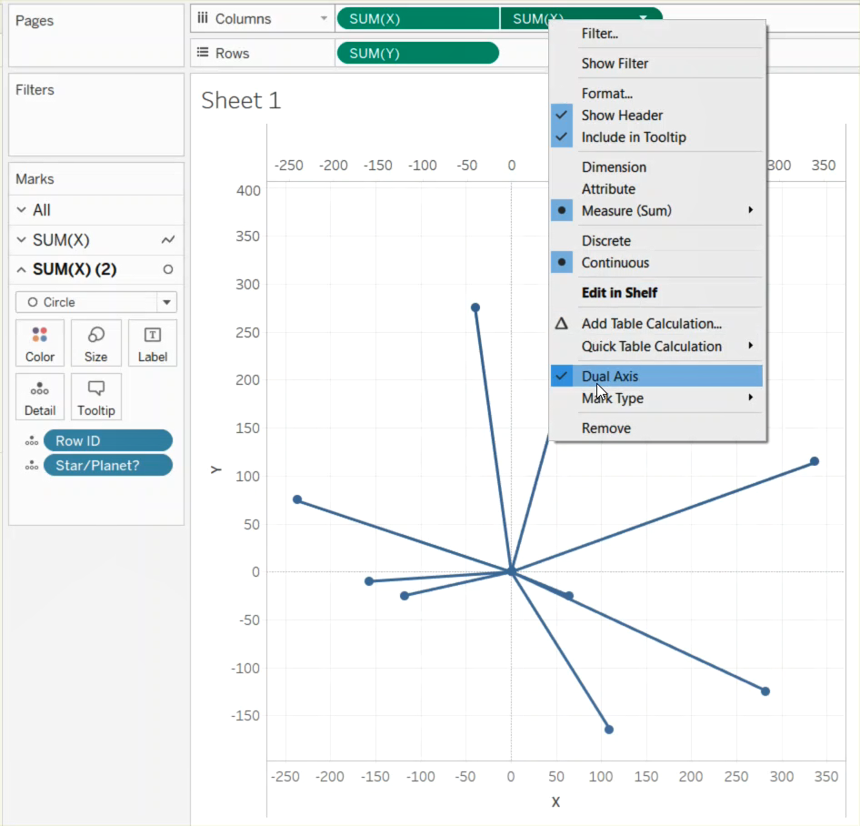
 - Now we might also want to represent the Sun and planets as circles. We can do this by again dragging X to columns (or alternatively Y to rows), right clicking on that same pill, and choosing dual axis. If the circles and lines are misaligned then right click on one of the x axes in the view and select Synchronize Axis to get,
- Finally, with a little bit of formatting, we get our Solar System,

Here I’ve added radius information and dragged that to Size shelf on the Circles mark card, changed the colours, added labels and hey presto! Now we have our spray chart showing the rough positions of the planets as of March 2017.