


Analytics pane allow us to do advanced analysis of a view. It includes analytics tools like reference line, trend line, constant line etc., which are easy to use by just dragging and dropping them into the view.
Where is the Analytics Pane in tableau? You can find analytics pane next to data pane. When you open analytics pane some tools may be greyed out, it means tableau is giving message that this tool is not available for the current visualization.
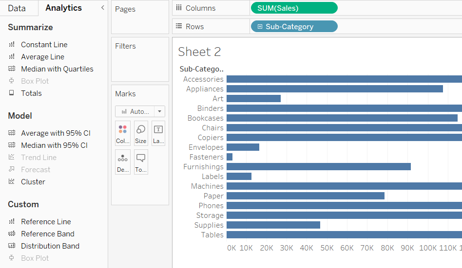
For above visualization Box plot, Trend line and Forecast is not available.
The first two sections of analytics pane, Summarize and Model, give you options for quickly adding a line, band or box plot without requiring much additional formatting. When you add an object from the Custom group, formatting options display after you specify the scope.
Add analytics tool to view- To add analytics object/tool, drag it into the view. When you drag you see these three options-Table, Pane, Cell
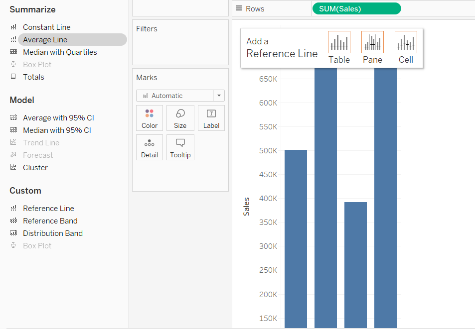
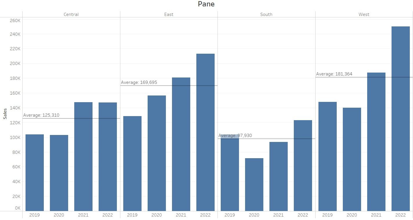
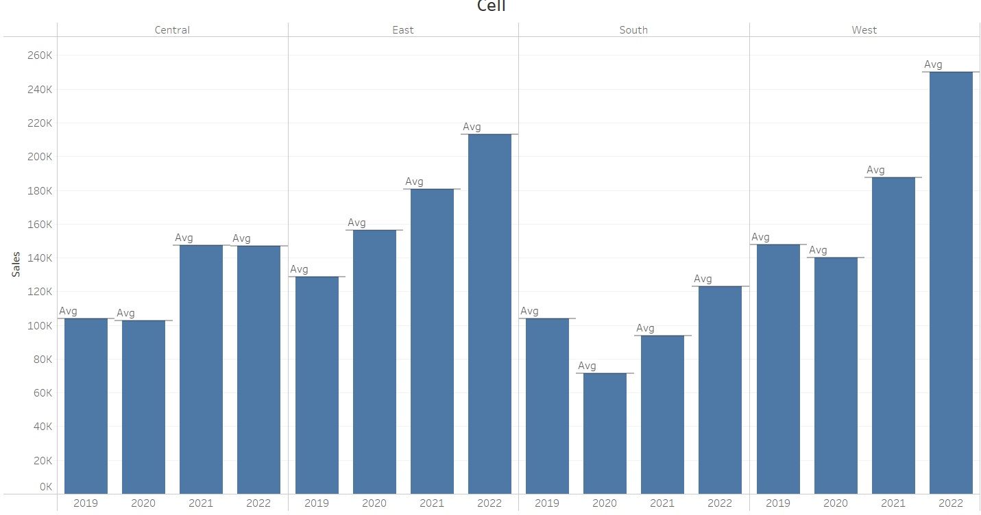
Table vs Pane vs Cell-

Delete/Format/Edit an analytics tool from the view- To delete analytics object you can click "undo" or just click on an item and choose "Remove". From same menu you can choose to "Format" or "Edit" an analytics object.
Analytics tool definitions- There are many items available in analytics pane like constant line, average line and more.
Constant Line- You can add one or more constant lines to the view. You can only add a constant value to an entire table.
Average Line-Adds one or more average lines to the view based on your selection of table, pane or cell.
Box Plot-Adds one or more box plots to the view. You can use box plot to show the distribution of data points and their outliers.
Forecast-It adds forecast to the view. For forecasting there should be at least one measure in the view.
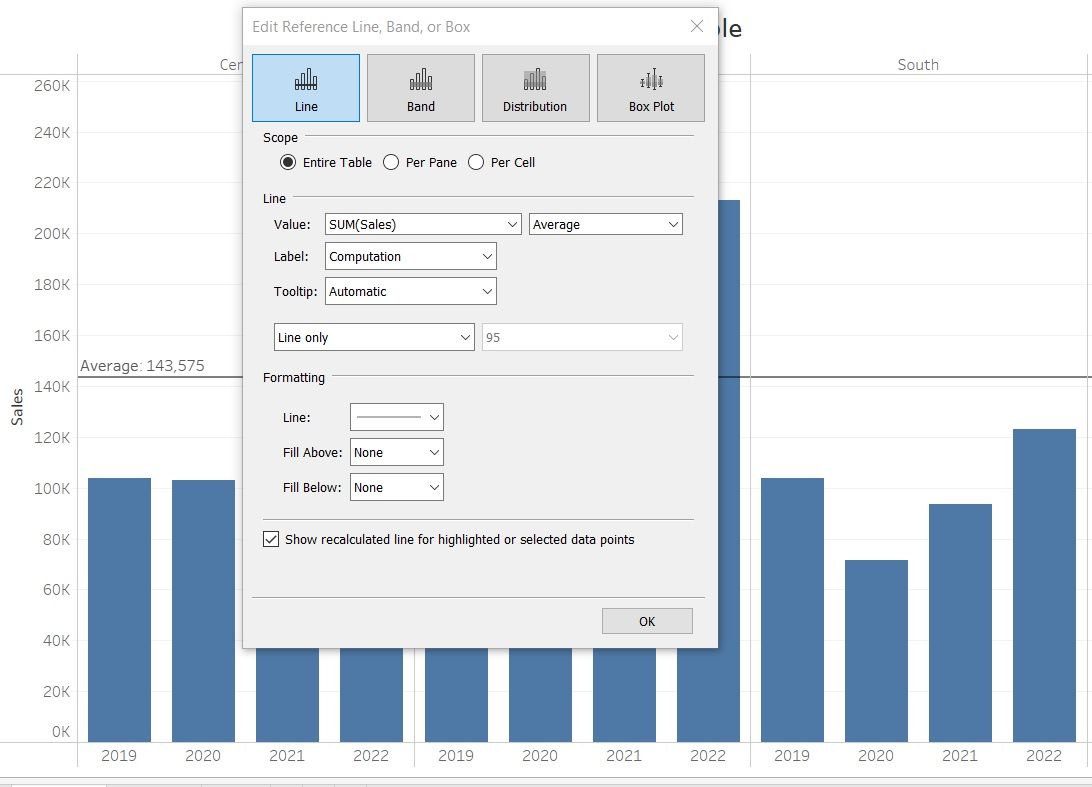
Reference Line- With reference line you can create line for constant, average, minimum, maximum, median, sum and total.
When you create reference line you get these 4 options at the top- Line, Band, Distribution and Box plot. For line and band you get same type of options. In this blog I will cover line and band only.
Line create just line for whatever "Value" we choose. Bands are shaded areas on a chart that highlight a range of values in the view. Similar to reference lines, they cover the area between two relevant values such as average, median, minimum and maximum.
Options for "Band From" and "Band To"-
Value– Allows you to select what aggregation level you would like to view (Total, Sum, Constant, Min, Max, Average or Median). You can also choose if the value for the line/band comes from the measure used or from a created parameter.
Label – Allows the user to choose what is shown on the label of the line/band. This could be a value, a user defined text or just hidden.
Tooltip- Allow you to choose tooltip from "Custom”, "None" or "Automatic" options.
Formatting- It allows you to choose your line style, thickness and color as well as letting you choose if you want to fill in the area above or below the line with a background color. For bands this lets you choose the color of the shaded band.
I hope this blog helps you to understand Tableau Analytics pane.