


A lot of time we get confused with dual axis and shared axis charts, today I am going to show you what is the difference between these charts, how to create them and when we can choose one over other.
Dual Axis Charts: These charts are used to represent the relationship between two variables. More specifically, these charts are useful for demonstrating the relationship between two or more measures with same or different scale.
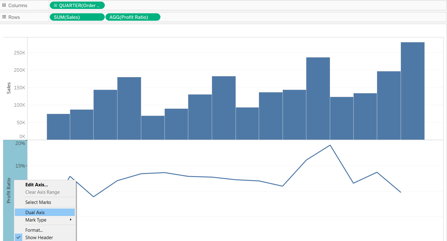
Using tableau dual axis charts, you can compare data series measured in different units or with separate scales of comparison. For eg. In the below example we showing comparison between Sales and Profit Ratio. Sales unit is in dollars whereas Profit Ratio is in percentage.
To create a dual axis chart you just need to right click on y-axis of bottom chart and select "Dual Axis" option.
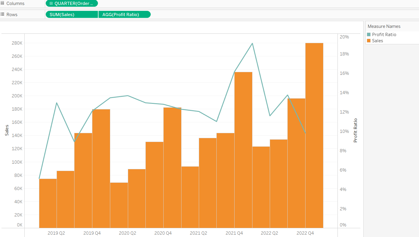
After selecting that option you visualization gets converted into dual axis chart like below one.
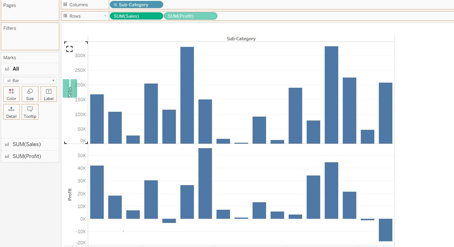
Shared Axis Charts: A shared axis chart in Tableau shares one axis among multiple measures. This chart can be used when the measures have similarly ranged values and can be presented using one mark and one scale.
Shared axis chart can be created by just dragging second measure from rows or columns section and dropping it on Y-axis of first chart.
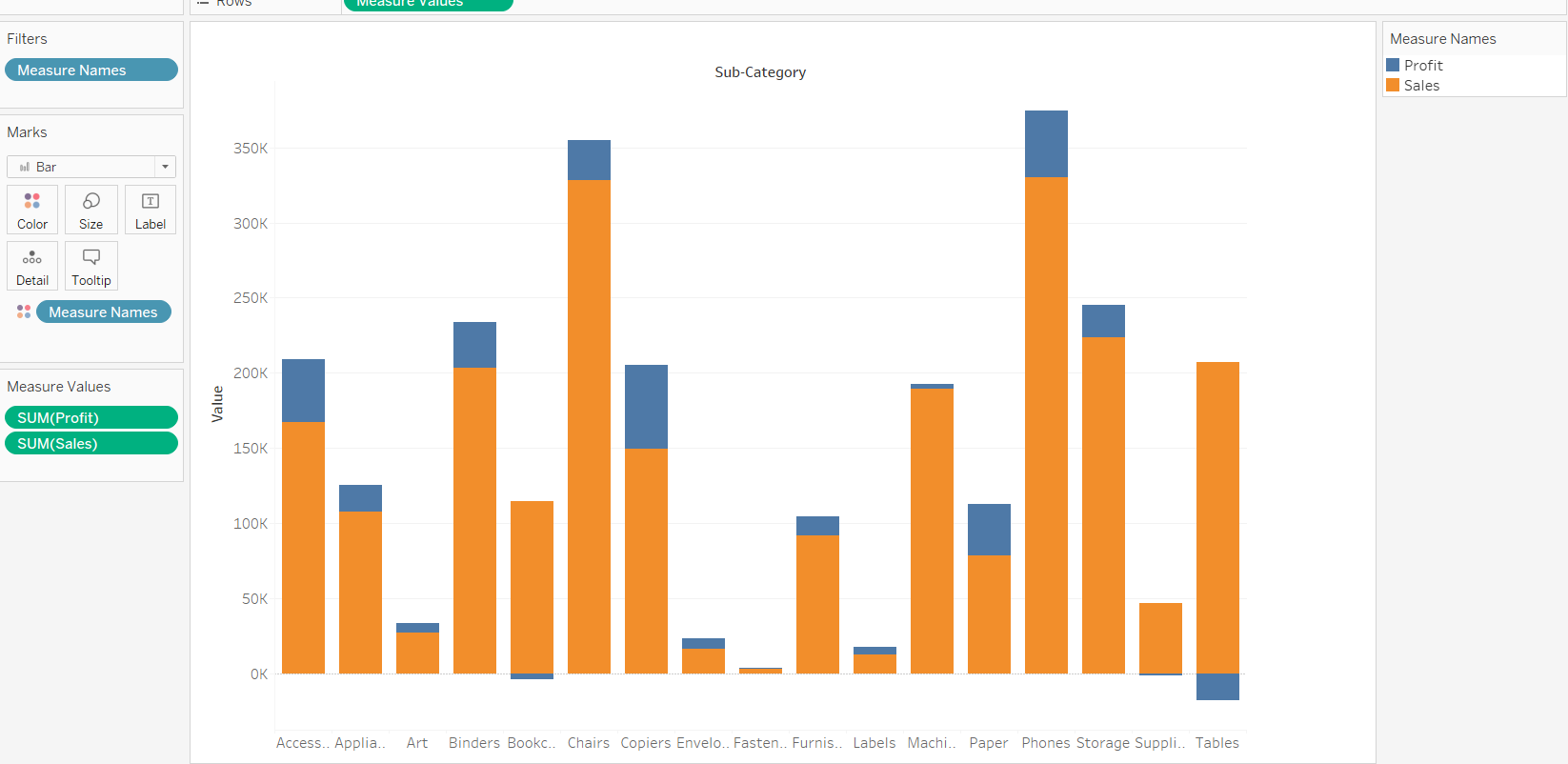
After you drop second measure(here sum(profit)) onto first measure(here sum(sales)) your visualization becomes shared axis chart. If you notice on the Y-axis 'Value' is there. What that value is? That value represent sum(profit) and sum(sales) on same axis. Similarly we have color legend here to show profit and sales value separately.
I hope this blog helps in demonstrating Dual vs Shared and when you choose one vs the another.
Thanks for reading!!!