


A quick guide to get rid of countries or states you don’t need in your visualisation, plus an explanation about how to use it to add Alaska (or Hawaii) to your US map
We have just finished the #DashboardWeek at the Data School. The idea was to create one dashboard a day from Monday to Friday. I need to confess that I used maps in three of the five visualisations, being one of them composed by 28 maps at the same time. 🙂
Sharing all my love for maps, I though it should be great to pull together few very cool things I recently learnt to make more effective and clean maps in Tableau.
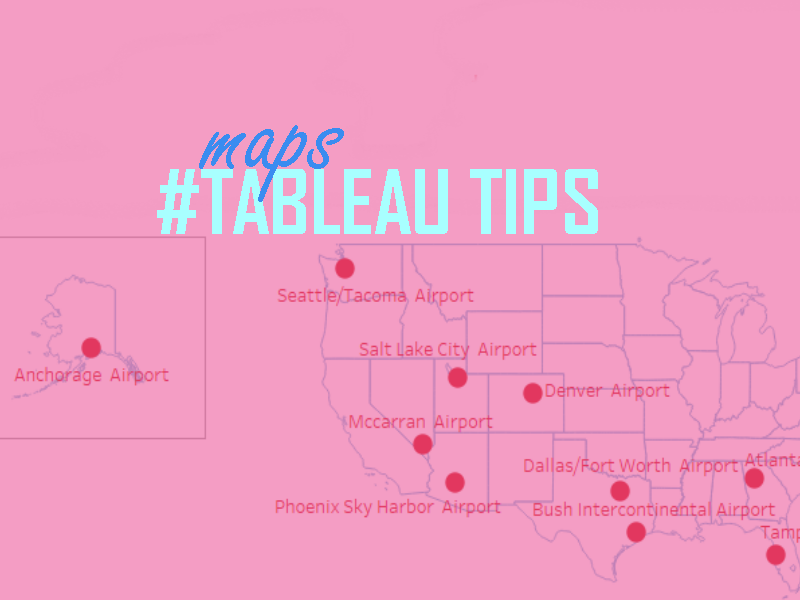
Look the two maps bellow. Both have the same information: the top 10 airports in the US in total number of weapons apprehension. However, the map on the right shows it in a more clear and beautiful way, right?
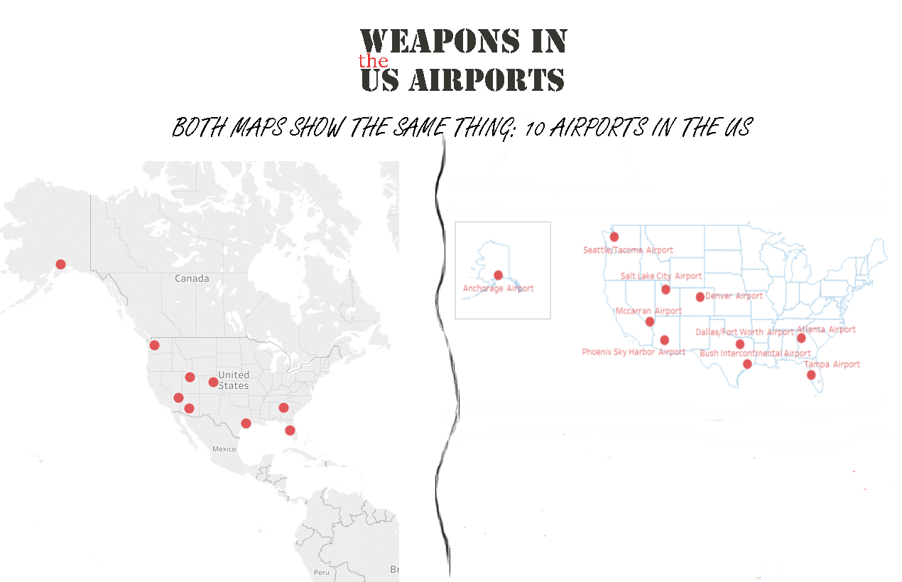
Showing only the US and getting rid of the distractions helps us to focus on the stuff which matters: the airport’s location. Also as Alaska now is inside a square, there is no need to keep the huge area of Canada only to show this American state.
The process to clean the map is easy and can be done in only three steps.
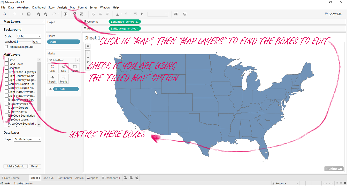
FIRST STEP: Creating a filled map
Click on the geographic dimension you are interested in to turn it into a map. In my case, as I would like to keep only the US, I am using the “States” dimension.
In the Marks Card, change the kind of chart to “Filled Map”.
Then, click in “Map”, then “Map Layers” and untick all the boxes that will appear in the left: “Base”, “Land Cover”, “Country/Region Name”, “State/Province Border”. Once you have unticked all those boxes, you will have only the US shape.
Filter out all the non-continental US states (For it, just drag “States” on the Filter Shelf and exclude those states or you can also select the area in the map and then click “exclude”).
SECOND STEP: Duplicating the map
Now you have a map showing only the continental part of the US, the next step is to duplicate it. Press CTRL and click on the “Latitude” measure then drag and drop the copy also into the Rows Shelf.
It will generate a second map bellow the first one. In the Marks Card of this new map, change the type of visualisation to “Circles” (or either Squares or Shapes if you prefer).

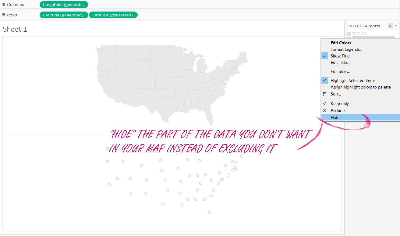
In my case, I used circles to show the airport location. This data was in a set I have previously created, divided between “The Top 10 Airports” and “All the Other Airports”. I dragged and dropped this set onto the “Colour shelf”, and hid “All the Other Airports” from my visualisation.
ATTENTION: You should “Hide” instead of “Exclude” the “All the Other Airports”, once if you exclude them, Tableau will generate a filter and apply to all the data on the screen, which will delete from the map all the states which don’t have at least one airport indicated.
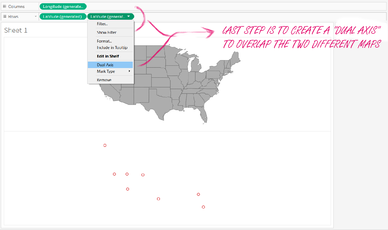
THIRD STEP: Creating a dual axis
Two maps created, top 10 airports marked, all you need to do now is to overlap both maps. It can be done the same way you overlap other kinds of chart: click on the last created “Latitude” measure and choose “Dual Axis”.
BONUS: How to add Alaska or Hawaii to your US map
Basically, you need to do the same process again, now using the filter to include only Alaska (or Hawaii) in the map. Once you have a sheet with it, the only thing you need to do it is to apply Alaska over the continental US sheet in the dashboard.
My final visualisation, you can check bellow: