Seven weeks have well and truly flown past, and each week seems to throw up different challenges.
With training moving at a solid pace, we tackled two key areas; Chris Love returned once more to teach us combining tools and flows into Macros within Alteryx, and visualising survey data with Emma Whyte but a solid chunk of the week was spent working on the project we had been set. An added bonus for us this week, was having Bethany Lyons come in and run a session for us on Level of Detail calculations. Right now, I’m still relatively hazy on how they operate and execute, as well as the how and where to call upon this tool – But I’m sure with practice, this will become a valuable asset to have available as another feather to have in my cap. Bethany’s session was awesome not only due to the explanation of a complicated area of Tableau, but for me personally it was good to discuss with her how to best blog about addressing & partitioning – a post which I am *still* working on!
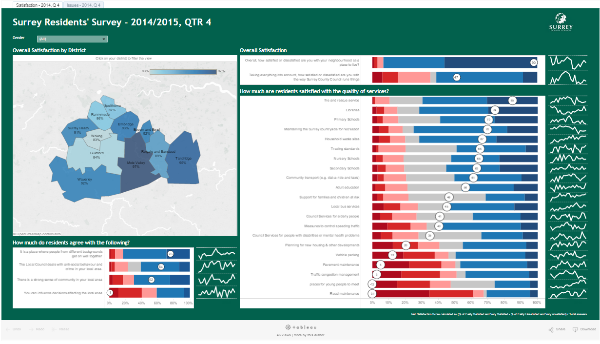
This weeks project for the Surrey County Council was looking at quarterly survey data, and this meant we tackled yet another new type of dataset, which made Emma’s session all that more important. Consulting with her on best practices on how to plan the Alteryx workflow, and the types of views which are most effective in showing this dashboard was an incredible asset to have when looking to build our visualisations.
The remit of the project was to create two visuals – One which would be friendly for the top-level council members, and a second which would be for the residents within the council’s areas. So we split off into two teams, and the part which I am going to discuss in this blog post was created by myself, Niccolo Cirone, Pablo Sáenz de Tejada & Alexandra (Sasha) Hanna.
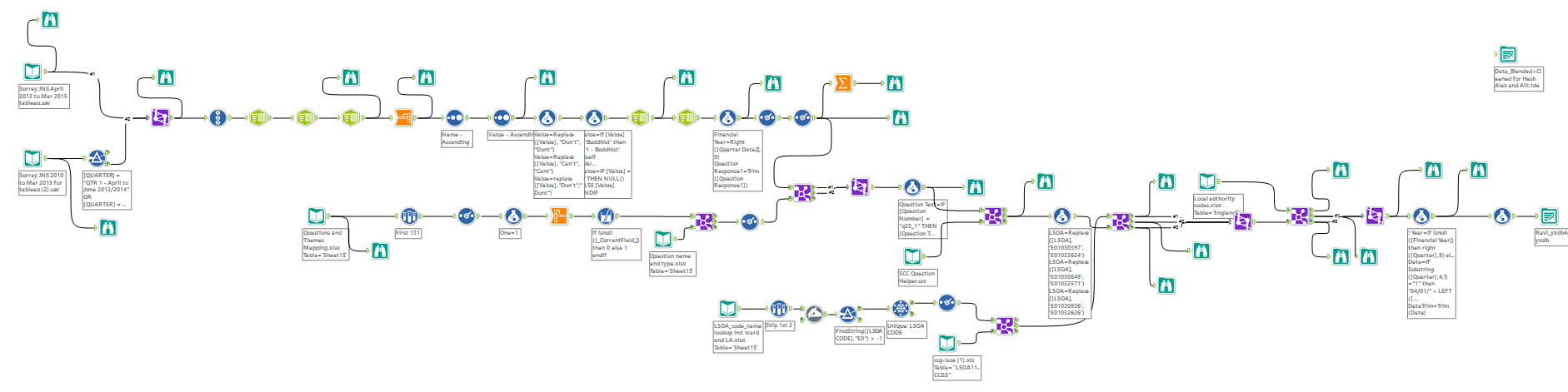
Given that our remit was do work on the data which would be consumer facing, we found ourselves with a distinct split – Given that the dataset was in a .spss file, there was some data preparation to do, so on behalf of both teams (given that we were both working from the same set of data) Pablo and I worked within Alteryx. Once again, this took longer than anticipated – Not due to the same reasons as last week, but because of the additional elements we felt would enrich the data lead to further develop the story we were trying to tell. You can see our completed workflow below.
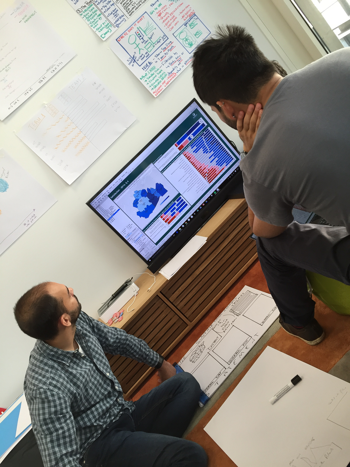
As this was going on, Sasha and Niccolo were working on dashboard design, figuring out which calculations we would need and a rough layout of how we wanted to have our visualisation. This was a process which was slowed by the data preparation, but once this was completed the ideas we hard began to take shape.
Once we had a very, very raw dashboard, we set about developing, adding and formatting into a way which is more aesthetically pleasing and one which fitted with the Surrey County Council. This wasn’t in the project brief, but this was an add-on which we really thought would make the data visualised more pleasing. We added in filters for gender, spark-lines to show the trend of the Net Survey Score over time as the view overall only shows the latest snapshot.
Click the image below to be taken to our final dashboard which we presented last Friday!