


Dashboard week continues with our second visualisation, which was using a dataset from here which was scraped by Andy. Given that we had about 3-4 hours to build, we got stuck in.
Looking at the data is really interesting, after looking at the number of records per dimension and starting to play with the data using really simple visuals really got my creative juices flowing. I say creative juices, I always seem to look to create something clean, simple but somewhat effective. I don’t know – I’ll yet you guys decide.
With the data itself, I haven’t really added much – There’s a screen cap of the before and after.
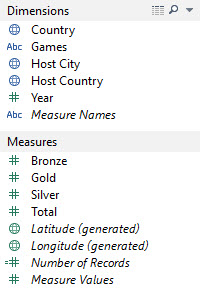
Before Vizzing
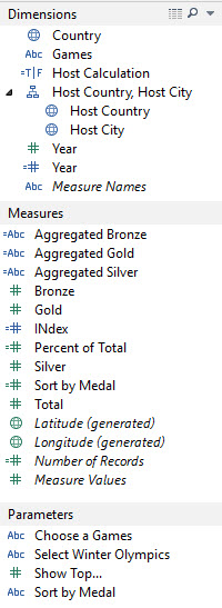
After Vizzing
So these are the fields I created – you can see the ones I created with the little ‘=’ symbol next to the visual cue in the pane (parameters are of course in this case created by the user) and the pills which Tableau generates are in italics.
I threw in a hierarchy to create the map properly – There were some nulls that Andy had thrown in for us to sort out, I duplicated the year to use it as as dimension as Tableau wasn’t interpreting correctly.
I then aggregated bronze, silver and gold medals as calculated field to create the tooltip view for each medal.
The Index field wasn’t really used, but I messed around with rankings before I did sorts – but I don’t think I used it in the final viz.
The percent of total medals won was an interesting things to explore, but then when it came to it I chucked it out and didn’t use the measure at all – I didn’t think it showed too much, as I think I’d want to add in events/athletes in and given the time we had, it wasn’t worth adding all that context just to back up one view.
The sort by medal calculation is linked to the parameter ‘Sort by Medal’ (weird, right?) which helped create the dynamic sort.
The show top parameter was actually created within the country pill, whilst the select winter olympics one is a dud as I ended up using a quick filter anyway (same exact thing with Choose a Games)
So anyway, let’s get down to the visualisation.
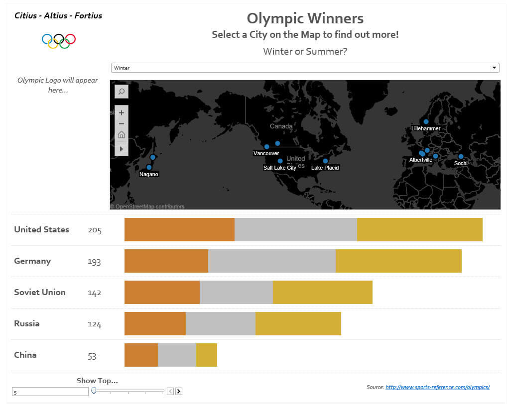
So this shows all the Summer and Winter Olympics since 1972, where you can filter between the summer and the winter, and select the games you want to view. Not sure what year you’re looking at? Just hover over the mark on the map. You can also pick to show the top 5, 10, 15, 20 or 25 countries by total medals won.
Click through the image and check out the visualisation, and let me know what you think!
Thanks for reading!