Our final dashboard was one where we were given just a few hours to download, play with and build. Set on Friday, we looked at the Zillow Real Estate research database and were (as ever for the entire of last week) told to go away and build something.
There’s a plethora of data on here, and I was super tempted to simply dive in and get as much as I could to tell the best story possible (as shown by this screenshot)
I quickly realised that given the time constraints, joining all these different files together was a terrible use of my time, as I really had to start building something to present for our 3pm deadline.
For this, the data I used was simple the number of sales (not value, just the raw number) in the US from the time frame given (June 2008 to July 2015)
The data looked like this.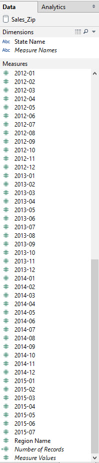
What a mess! This needed some Alteryx love to pivot so that the date fields were all in one column, with the number of sales also split out. When I worked through this, getting an output for data and one for value, the pane to the left of my Tableau worksheet looked like this;
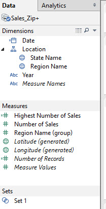 Much better! As you can see, I am now using an extract of the data source as outputted by Alteryx; So let’s go through the pane again. There’s a calculated date field, as the date field I gained from Alteryx (shown here by year) was a string field, an doing an automatic conversion from a string to a date was not working. The calculated field, which Sasha helped me with, looks like this.
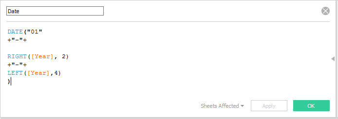
So it’s creating a date field, where the first part is the ’01’ so the first of the month, the second part being the ‘-‘ to split to the month level; then the RIGHT([Year], 2) takes the month part of the date field, and finally the LEFT([Year],4] takes the year part. So this created a wonderful date pill which could be used for some time series analysis.
I created a hierarchy for the state and region (the region is actually the Zip Code, which is quite misleading if I passed this on – I’ll change that shortly) and then the fields which were outputted were the Number of Sales and the long/lat which were generated after I created a geographical hierarchy. So the only measures which I created were the highest number of sales – Which I used just to understand and check whether the dashboard I was creating was correct, but also the Region Name group – As my initial idea for the dashboard was to have a 90210 theme. (comparing the sales of houses in this Zip Code versus the rest)
The set at the bottom was when me and Paul Houghton were trying to figure out a way to use dashboard actions so that it ignores the sparklines I created – This is probably possible using a level of detail calculation, but we were trouble shooting this at 14:40 – Not leaving much time to finish off the dashboard!
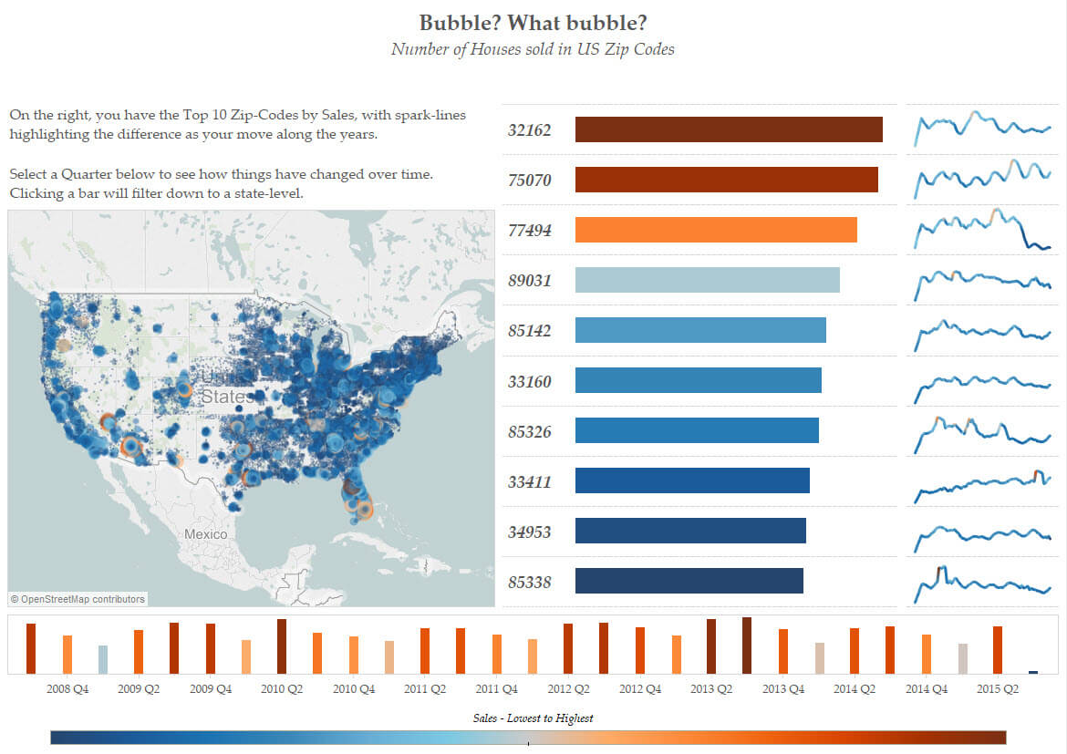
Anyway, my final dashboard of #DashboardWeek was this one below; it shows the number of sales across the United States, and is filterable by clicking on the quarter date. Hovering over the map, the bar and the line will show you more information about that point in time.
Check it out below and let me know any feedback you have!