


There is so much you can do with data.
When I interviewed for this job, Tom Brown told me that he knows less about Tableau now than he did when he first used it. On the eve of our sixth week at the Data School, I am beginning to see where he’s coming from now.
I’ve been largely inactive from blog writing the last few weeks; The week after the conference was our first client project, followed by spatial analytics in Alteryx as well as Mapping in both Alteryx and Tableau. The client project was our first as a team, and a great introduction into using external, fresh data to solve a problem and/or answer questions that the data threw up. Spatial analytics & mapping was also very cool; and threw up a lot of ideas and thoughts on the power of data and the wider development that mass amounts of quantified actions can bring to people’s lives. There’s a long, long way to go though in my opinion.
Our first client project was an interesting one – the main takeaways for me were the process taken to approach and problem solve with the data, for me at least. The beauty of a project like the one we were required to carry out, was that though the client had some key questions and outcomes they wanted, we were given a license to just explore the data and find out any further insights we could garner – these could be unexpected gems that fresh eyes might be able to pick out.
Data School problem solving
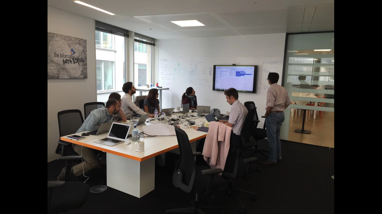
Splitting the tasks initially into parts, we quickly realised there was a lot of overlap between what we were each doing. This gave us further opportunity to work as a team to brainstorm approaches, ideas and walking through the processes to see what outcomes would come out the other side. This aspect was one which was interesting – working with my colleagues and better understanding how they work, and moreover, how we work as a team was satisfying as we flew from idea to result to new challenge to insight. Working with a proper data set threw up questions that a sample data set often doesn’t.
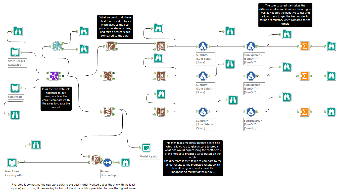
Alongside the project, Mr. Love had been teaching us about predictive analytics in Alteryx – powered by R, it was an area I was really interested in as it made visually simple what I had spent a year or so pulling my hair at when I studied Econometrics. Of course, using SPSS and Gretl for cross-sectional and time-series data respectively seemed so abstract when Alteryx made a workflow seem straight forward.
I’m still learning how to think like Alteryx, so the queries that each module threw up was something that I am still working to understand. My favourite part of Alteryx is still the fact I can break the dataset and make things fail before realising what an output is – In Excel, for instance, I’d have a bunch of versioned files as well as a limited amount of ‘Undos’. The predictive area was really cool though, I think I finally understand properly how weighted predictive models work… Three years after my professor was teaching it to me!
Predictive Analytics in Alteryx
Spatial analytics and Mapping was last week – This was a super tough week for me, and I wasn’t overly happy with my outcome at the end of it. Lessons were definitely learnt! But more on that shortly.
My own personal project problems shouldn’t take away from another awesome week with Love – This time, we used polygons, maps, lines and points – Both within Alteryx as well as Tableau. This was accompanied with a primer on how Alteryx and Tableau interacted with each other, and best practices to ensure that Tableau was interpreting what was being exported to it from Alteryx correctly. I liked this practice, it made you think about how each action you take will impact another, and moved toward a time where we’d be able to write out a workflow from the off.
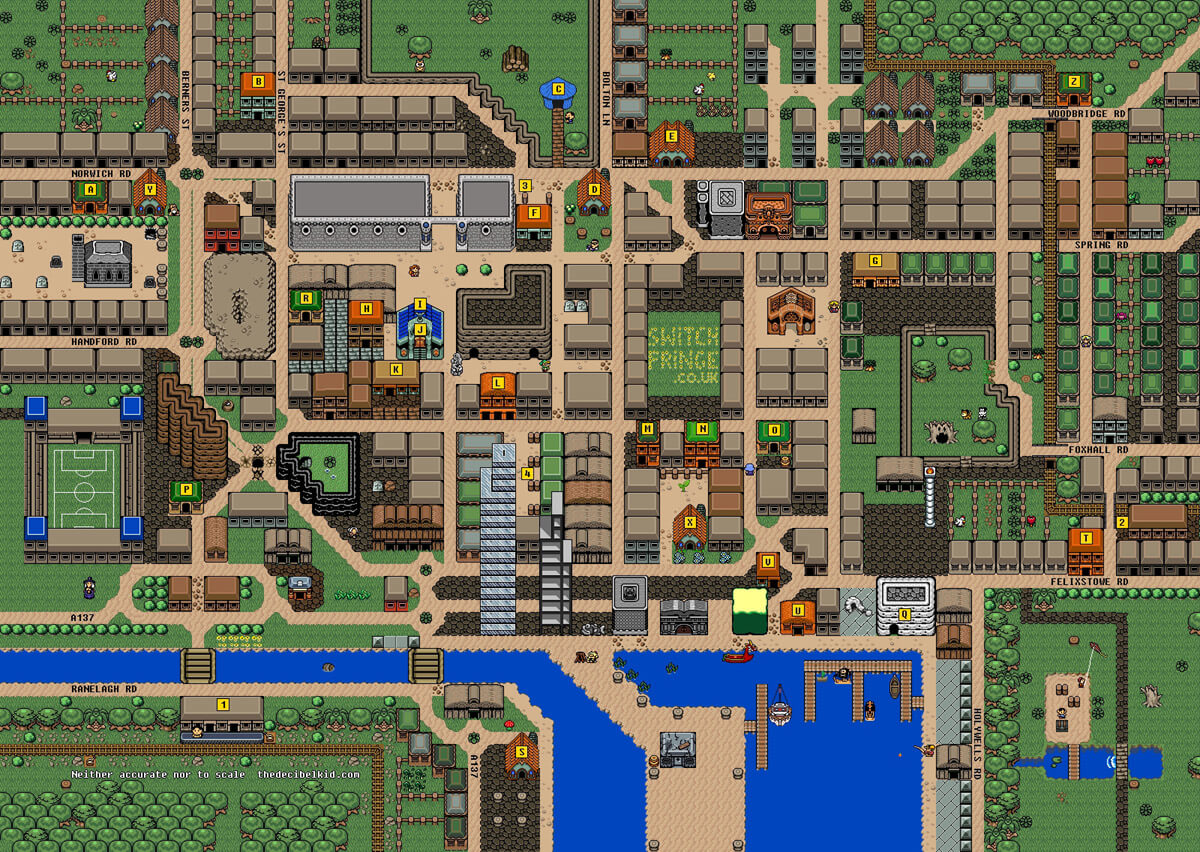
The mapping function in Tableau is awesome, especially due to the customisability of it. Being able to upload your own maps, and background image to run a x/y scatterplot made is fun to use – I used this bizarre map of Ipswich town centre in the form of Zelda to try out the X-Y plotting function.
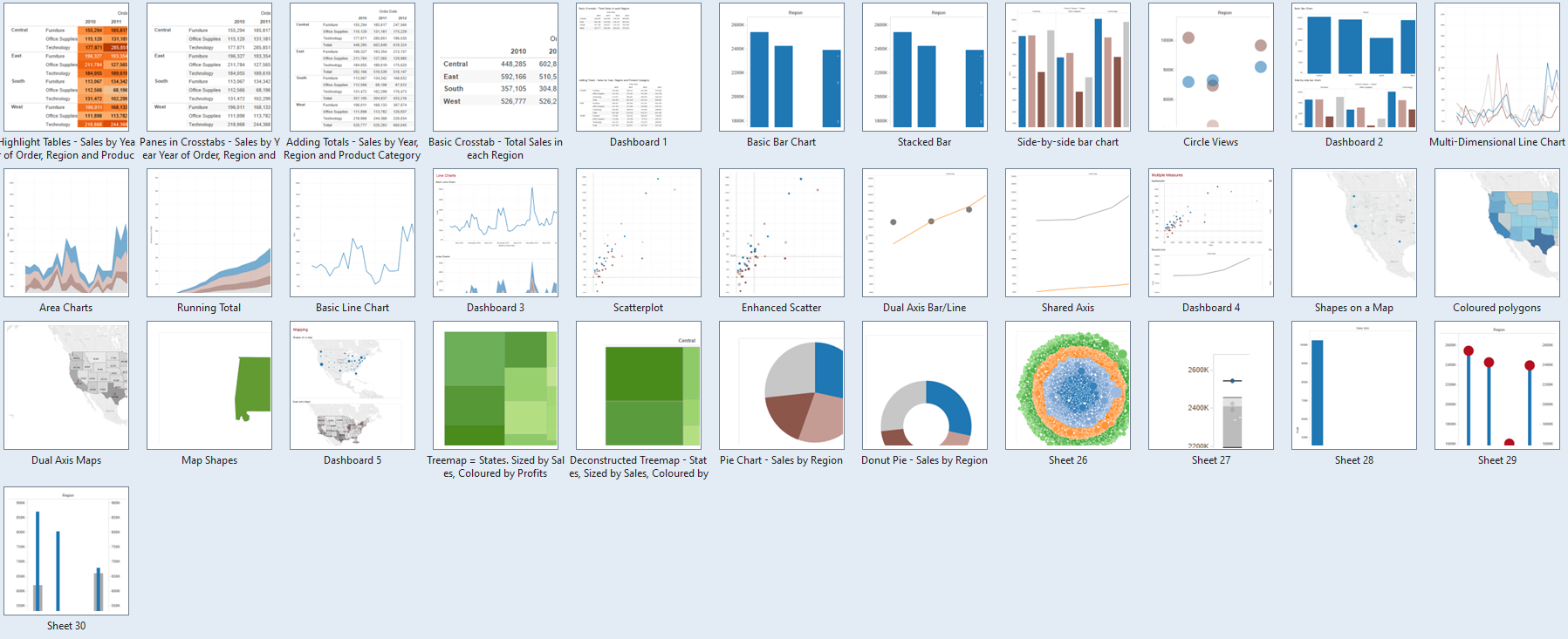
The Tableau experience this week was with my fellow Suffolkian Carl Allchin, who talked through how he used to use Tableau in the Banking industry, as well as a primer on Table Calculations; he followed this up with making good viz choices, where the exercise was to create almost every single chart available on Tableau – Apparently Kriebel has a slide deck of 120… Gotta catch ’em all! (Also, sorry about the tree charts and pies… Carl made us do it!)
Other sessions last week included one on productivity with Director Brown, and effective presentation skills with Brian Prestidge; both sessions honed in on our soft skills, developing some key things that we should be already considering – They were really good sessions, and helped me reflect upon personal performance. Self-development is what it’s all about, right?
One final part of a packed week was Dan Raines of Tableau telling us on how he demonstrated the capabilities – This was a skill which was really interesting to me. So often over the past month have I had the question, “Wait, your job sounds awesome but what do you *actually* do?” – After his talk, I gained an idea of how to structure a demo of Tableau to a layman, and it was really cool to test this out on an old high school friend who I bumped into on the train home on Friday night.
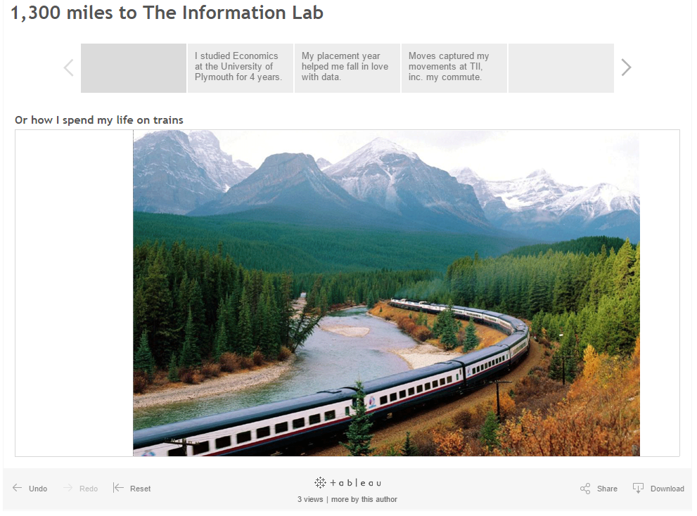
So, back to last week’s presentation. The objective was a seemingly simple idea; using the app Moves, manipulate the data gathered from the app to create a visualisation which shows something, anything. This wasn’t my problem though – I had a clear idea of what I wanted to show in terms of my story; start with where I’d been over the last four years (university, Manchester for my placement etc) but then also include the Moves data to show me getting used to the London commute.. Or something to this effect. The problem was, because I spent so long on data preparation and trying to get the .kml file to work (even though I was told the .gpx file from Moves would have worked), I wasn’t able to fit that much effort into the final part.
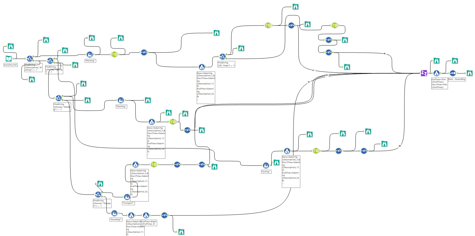
My Chaotic Original Workflow
This was a big lesson for me; my data wasn’t behaving and I ended with a supremely impressive Alteryx workflow, which as really really messy and at the end of it still not what I wanted. The amount of time I restarted and redrew my workflow on the canvas wasn’t what I should have spent my time doing. A big lesson I learnt here; know when to stop – If I had told myself and given myself a deadline to stop any data preparation and create begin with my visualisation creation, I’m sure my dashboard(s) would have been much better than they turned out. With a little help from Craig Bloodworth, I was thankfully able to get some data one hour before we were scheduled to present. You can see my dashboard here; I really am disappointed with it, but it was a lesson I think I needed to learn.
As the weeks go by, I feel myself trying more expansive, creative things with Tableau and Alteryx. Moreover, I feel encouraged to investigate more especially due to the quality of work being produced by those around me. I think that last weeks experience where I was only frustrating myself is a really key lesson on why project planning and spending time at the start of a project to think, ‘Right, what am I actually wanting to achieve from this – What is my end goal’ enables a very clear direction, with a view of how to amend and adjust depending on constraints such as time.
We’re hurtling through this process at a speed which is so thrilling, and being able to look back in pride at the amount we have achieved I hope will be as rewarding as I envisage in my head. The quality of teaching, the co-learning environment between all of us students and the overall scheme is one which I am so glad I stumbled across.
And to think there’s so much more to learn!