


Today we had a morning session on accessibility/ inclusion and what that means in terms of dashboard design. We discussed the different challenges that people could face when using a dashboard. This could range from a persons level of literacy, motor skills, visual capabilities and also people who were neurodivergent.
One of the tasks we were given during the session was to try and use the tool on our computers to listen about a Tableau dashboard that we had found on our server. The narration tool can be accessed by selecting ctrl Window Enter to open the narration window.
What were some of the issues using the narrator: When selecting tab the cursor would jump around erratically and not follow a logical pattern. The narrator was not able to read what the chart was showing only the titles.
I wanted to make my dashboard focused around using the narrator tool on our laptops and seeing if I could be effective at carrying this out.
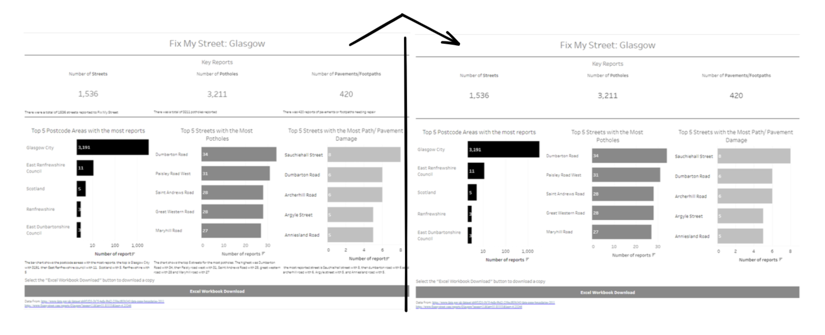
One error that I occurred when testing out the narrator was that it was reading my tableau dashboard from the bottom of the page up and then right to left which was the opposite to what I would expect. I then found that once this was uploaded to Tableau Public it then read it in a better format.
When using the narrator tool on our laptop it is unable to read any of the contents of the chart e.g. tables or figure labels. The main bulk of detail that the narrator reads out is the chart titles and captions to the worksheets.
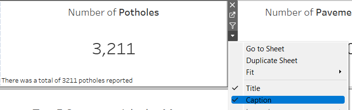
When creating the dashboard I wanted to focus on the visually impaired so wanted to keep my dashboard uncluttered and clear to read. Because I would need to write descriptions in the title or dashboard for the narrator to pick up I decided to write the captions in white font so that they would not show up on the dashboard. I did this to keep my dashboard clean looking but also because if the person who was viewing the dashboard could clearly see the KPI's and charts they would not need to see the captions as well.
Overall I found that this worked well, however if I were to do this again I may focus on using the titles more for descriptions rather than captions because the titles were read out first.
I also found that the narrator sometimes has issues with reading plain text boxes which I used for the title and that it would prefer to read actual dashboard titles. I found that because I used a textbox for my title the narrator was reading out the saves file name of the dashboard rather than the title.
I did want to add some more interactivity to my dashboard however the captions that I used for the descriptions of the chart would no longer match what the chart was showing. If I had further time to spend on the project I would defiantly look more into using dynamic titles which update to correspond to what the chart is showing.