


It’s been some time since I last blogged but, ahead of Tableau Tip Week at #DS2, I thought it was high time I wrote something again… and what better topic than one of my favourite pieces of work!
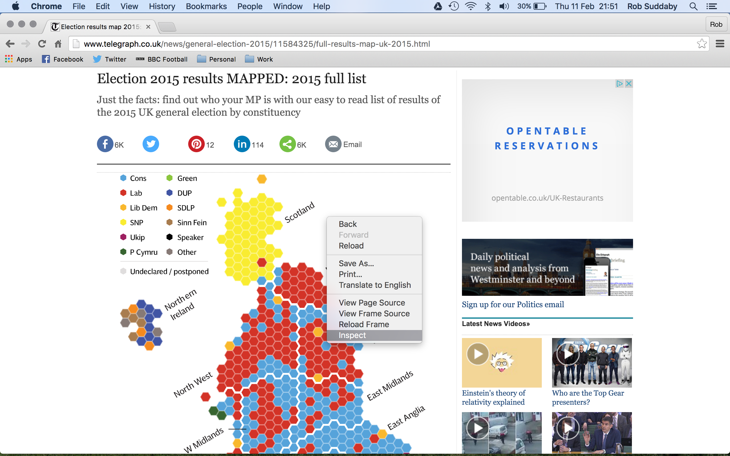
I’ve been interested in hex maps – a form of proportionate mapping where each section carries the same weight as all others – for a while and the best application I have seen of them was during the BBC’s coverage of the 2015 UK General Election; a prime example of where smaller geographic regions, such as the Boroughs of London, carry the exact same sway as huge swathes of Scotland.
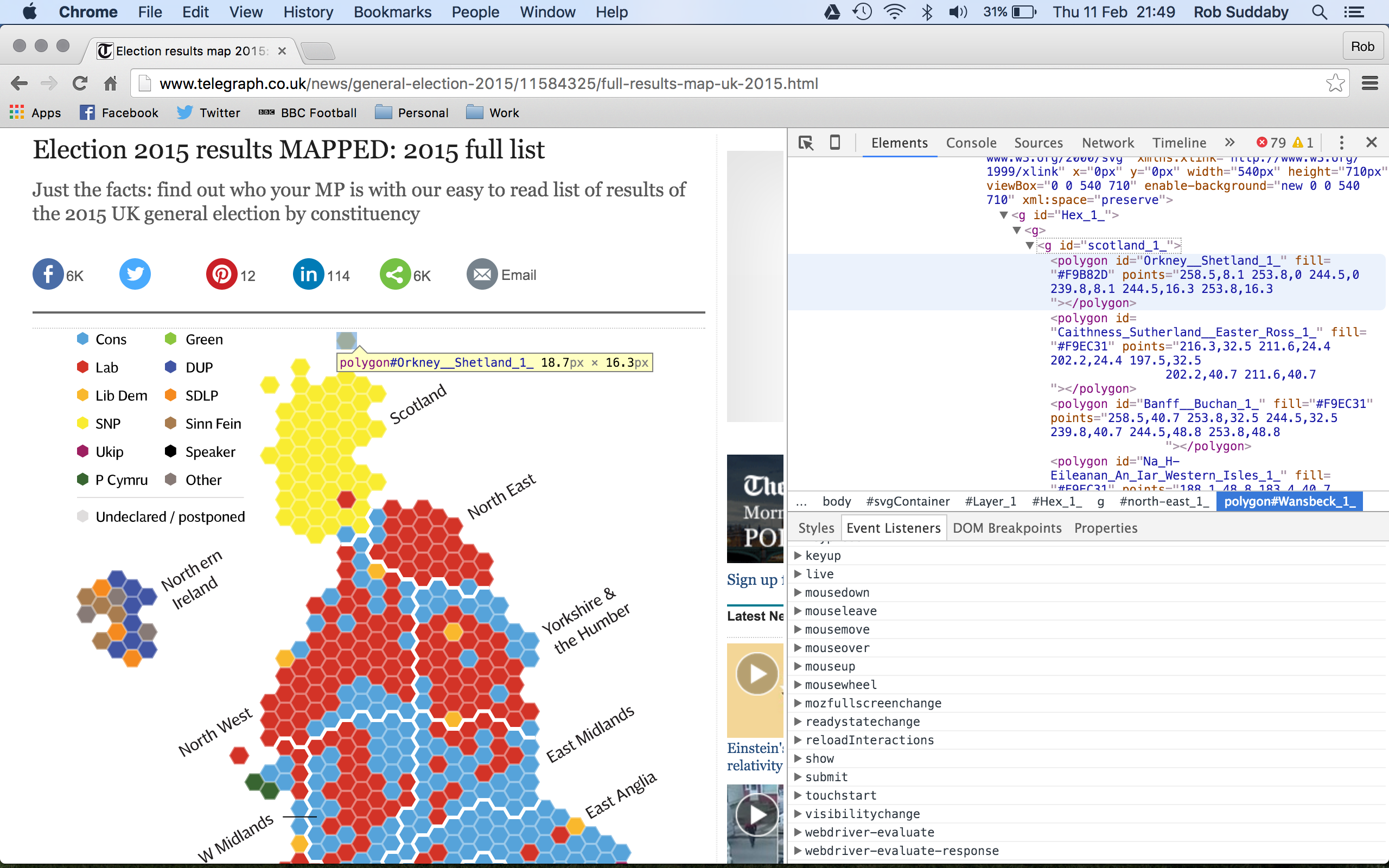
I was keen to try and recreate this in Tableau but I didn’t fancy plotting 650 points on a map and a Google search for an existing template came up short. However, I did come across a version of the above on the Telegraph website and, from a client project we carried out recently, I knew that it can be possible to find important details about the content of a webpage by using the right click option, inspect.
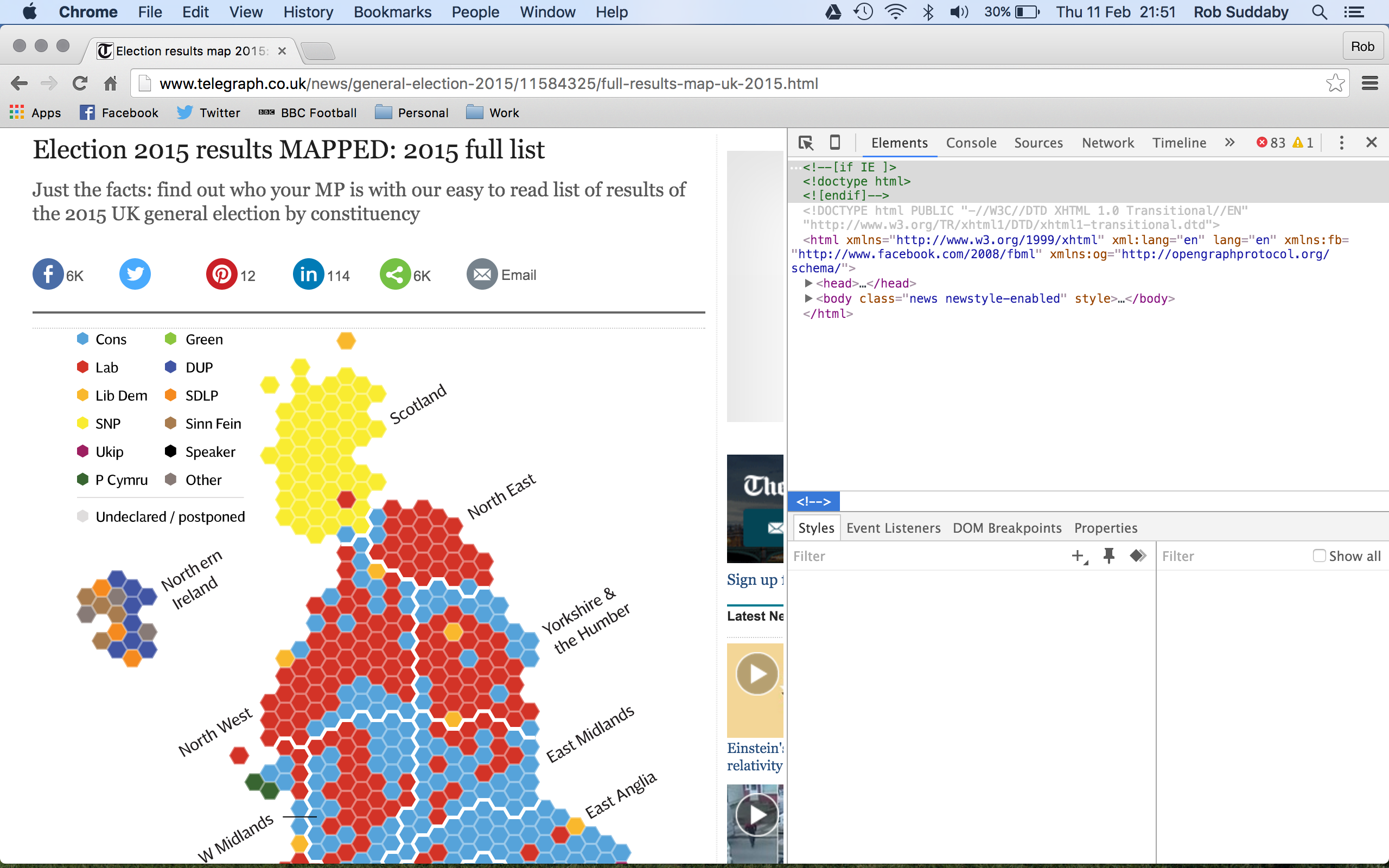
Clicking this option brings up the XML code behind the content where you can look through and, literally, inspect it. Because of the interactive nature of the visualisation within the webpage, I figured that it was probably dynamically generated within the webpage itself and, therefore, the details could potentially be scraped.
I’m no web developer but I’ve built up some knowledge of what I’m looking for within the XML hierachy and so I figured that I could search for keywords within the elements to see if I could find any details of how the map was drawn.
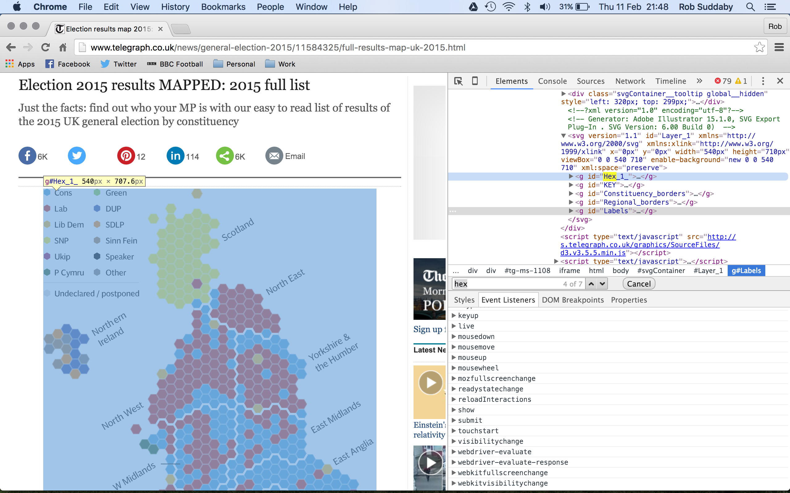
A stroke of luck – a search for the word hex brought back a result and that piece of code highlighted the map, a surefire sign that I’d found what I was looking for. Further inspection within the dropdown arrow of the code revealed a list of regions and within that was the source code I was looking for!
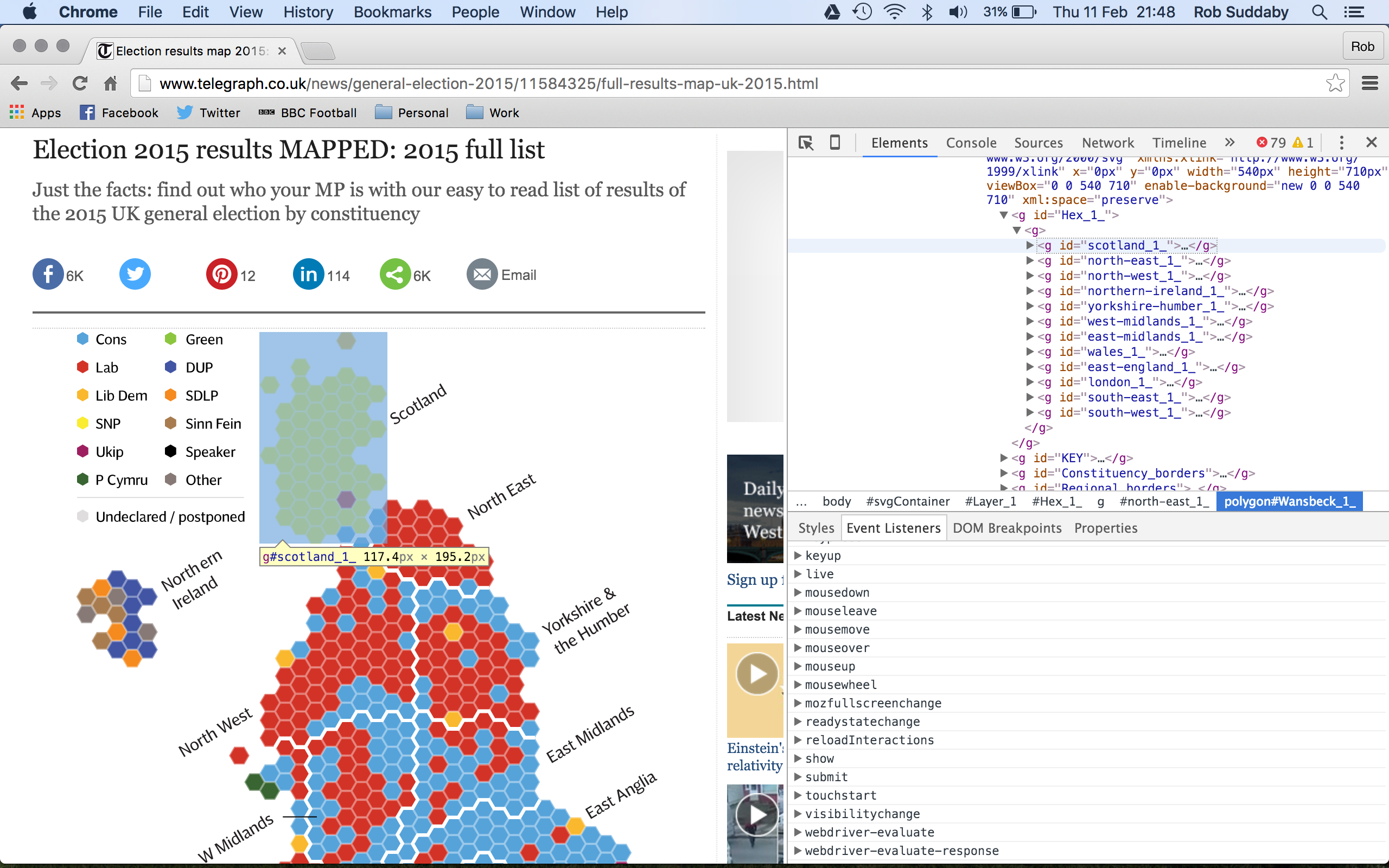
From here, I was able to copy and paste each of the region’s source code from within the inspect window into Excel but it left me with a long string of code that I needed to decipher and split out.
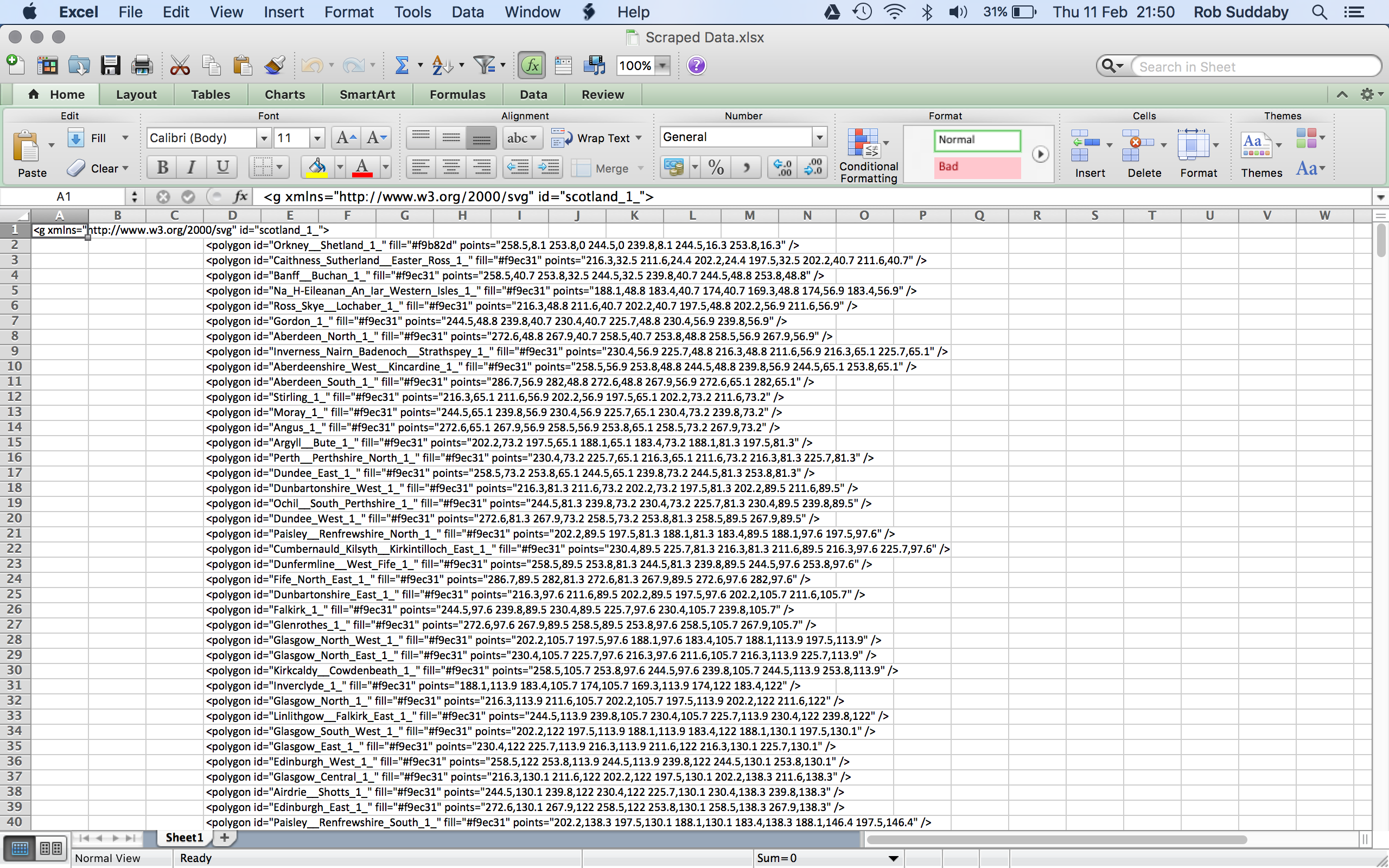
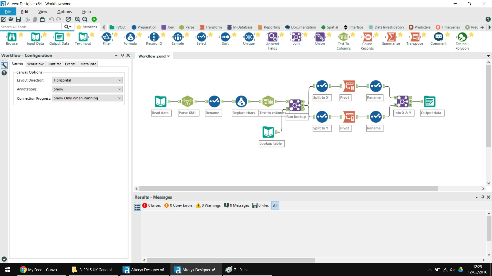
From within the code, I could see the constituency name and 2 sets of similar numbers, most likely the X and Y co-ordinates used to draw the polygon. I decided to push the data into Alteryx to parse out each column of data, adjust constituency names to match my other dataset and pivot the data into a list of constituencies, X and Y columns and the path needed to draw the polygon (i.e. point 1 to 2 to 3 and so on).
From here, I was able to put the data into Tableau and lo and behold, the code I found within the inspect window was indeed the hexbin co-ordinates required to draw the map! You can see my final visualisation below, I’d love any thoughts on the visualisation itself or the process I took to create it.
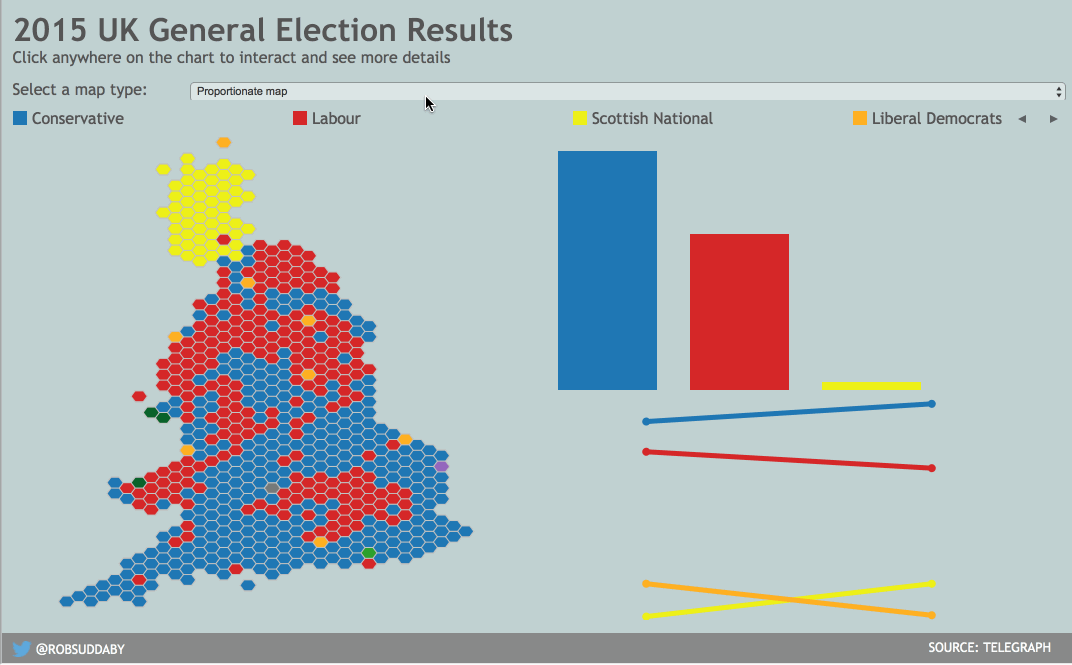
Click on the image above to interact with the visualisation
I’ve made the data available below for anyone wishing to use themselves. Simply load the data into Tableau, place AVG(X) on rows and AVG(Y) on columns, reverse the AVG(X) axis and you then have a shape map from which you can personalise as you wish. To replicate my hexmap exactly, change the mark type to Polygon and then drop Path onto path and something to the colour mark and add a colour border to differentiate between bins, happy Tableau-ing!