


I had a bit of spare time today and decided I wanted to try my hand at a few how-to posts I had come across in the past few days. It also gave me an opportunity to work a little closer with the English Premier League database released by Opta and Manchester City in 2012.
First off, fellow #DS2’er Anuka covered an awesome little tip in her first blog post on Friday; how to create little hover graphs which can flash up further information about a datapoint when you hover over or select a mark.
For this, I created a scatterplot of player data looking at average number of touches and passing accuracy across the entire 2011/12 season. I then wanted to replicate Anuka’s hover graphs but this time looking at the passing accuracy trend for that player across the season. You can see the results below, I think it’s a really neat tip and, even though 9.2 will bring this kind of functionality in the tooltips, it definitely has its place!
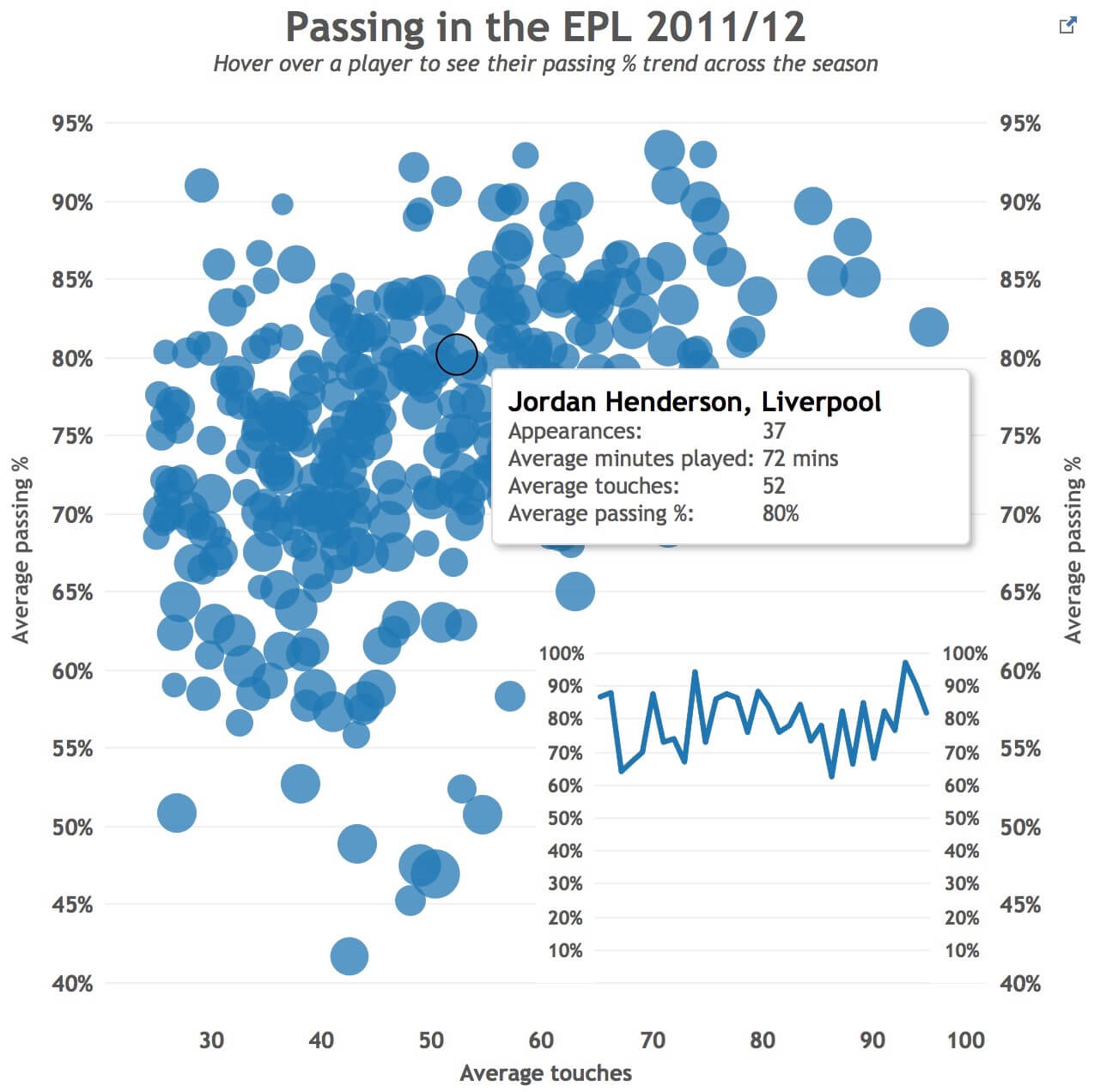
Click on the image to interact
Secondly, I watched Coach Kriebel’s multi-faceted video tutorial on how to create what he refers to as DNA charts, how to build multi-row views and how to use parameters to bring additional functionality to your viz. Using the same dataset and maintaining the focus on passing, I thought it would be interesting to look at the range of passing volume by individual players across the season.
It still requires one little tweak which my colleague Nai has offered to help me with on Monday but again, I’m really pleased with it and it really drove some insight into how much possession Brendan Rodgers’ Swansea team had and the huge volume of passes they made across certain games.
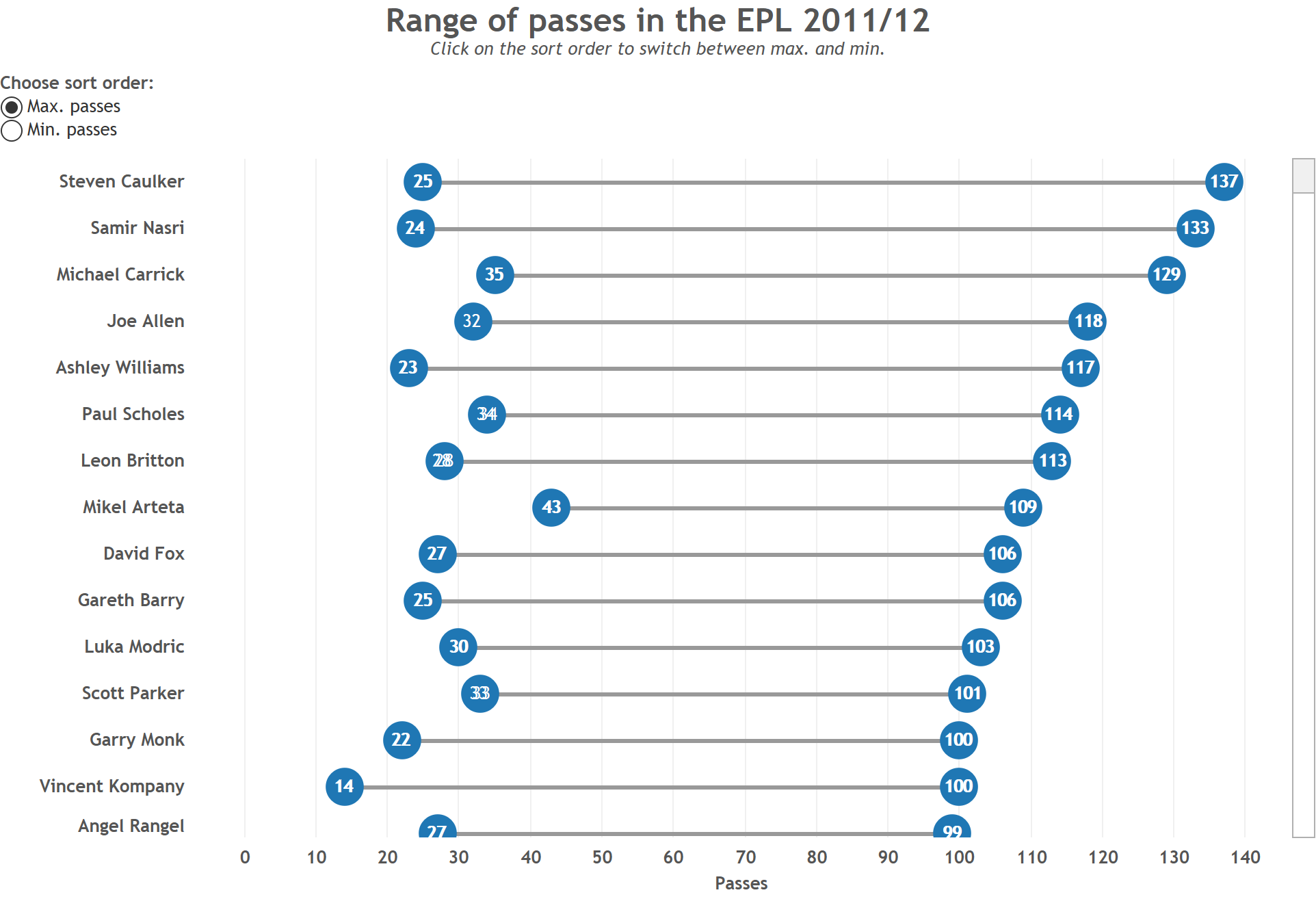
Click on the image to interact
I really enjoyed learning these tips and tricks and discovering new functionality in Tableau which I can now add to my ongoing armoury. As always, any views or suggestions would be much appreciated!