


A step-by-step guide on how to make dynamic reference bands and colouring based on your window average.
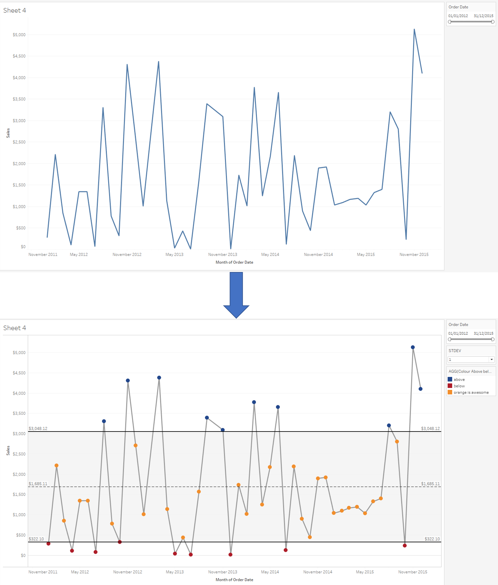
Reference bands and references lines can be useful for spotting outliers in your data over time, and making them dynamic to adapt to your time filter and 1, 2 or 3 standard deviation make these charts extremely flexible for people to use. Thanks Carl Allchin for sharing this type of viz with us!
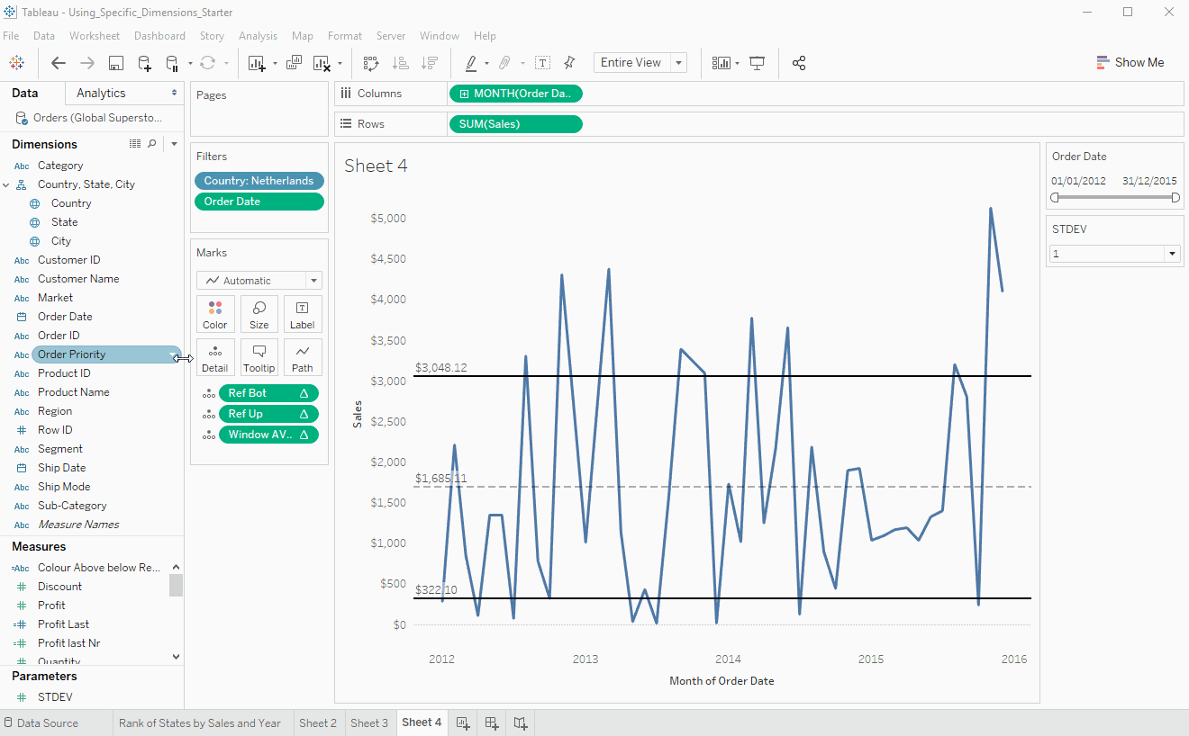
The example below uses the global superstore data, using the sales data of the Netherlands.
1. Step-by-step guide
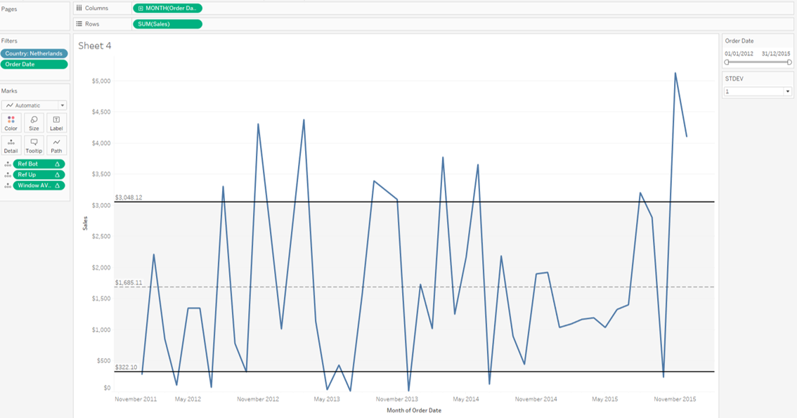
Create the initial view from above by dragging the order date pill using your right mouse button onto columns, select the continuous month(order date).
Add sum of sales to rows, add country to filter (select the Netherlands), add order date to filter (range of dates), show filter.
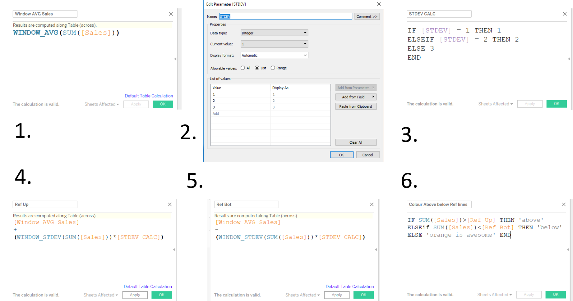
In order to prepare to add reference lines, we start with creating the necessary window average and window standard deviation + parameter.
- Window_avg(SUM([Sales])) computed along table across will average your sales numbers based on your filter.
- Create a parameter STDEV to switch between the standard deviations, data type: integer, list: 1, 2, 3. Right click on the parameter: show parameter control
- Link the parameter to a calculated field STDEV CALC: IF [STDEV] = 1 then 1, ELSEIF [STDEV] = 2 THEN 2, ELSE 3 END
- Create your upper boundary for your reference line: [Calc 1.] + (window_stdev(SUM([Sales])) * [Calc 3.])
- Repeat step 4 for your lower boundary: ” – ”
- Prepare your dynamic colour: IF SUM([Sales]) > [Calc 4.] THEN ‘above’ , ELSEIF SUM([Sales]) < [Calc 5.] THEN ‘below’, ELSE ‘orange is awesome’ END
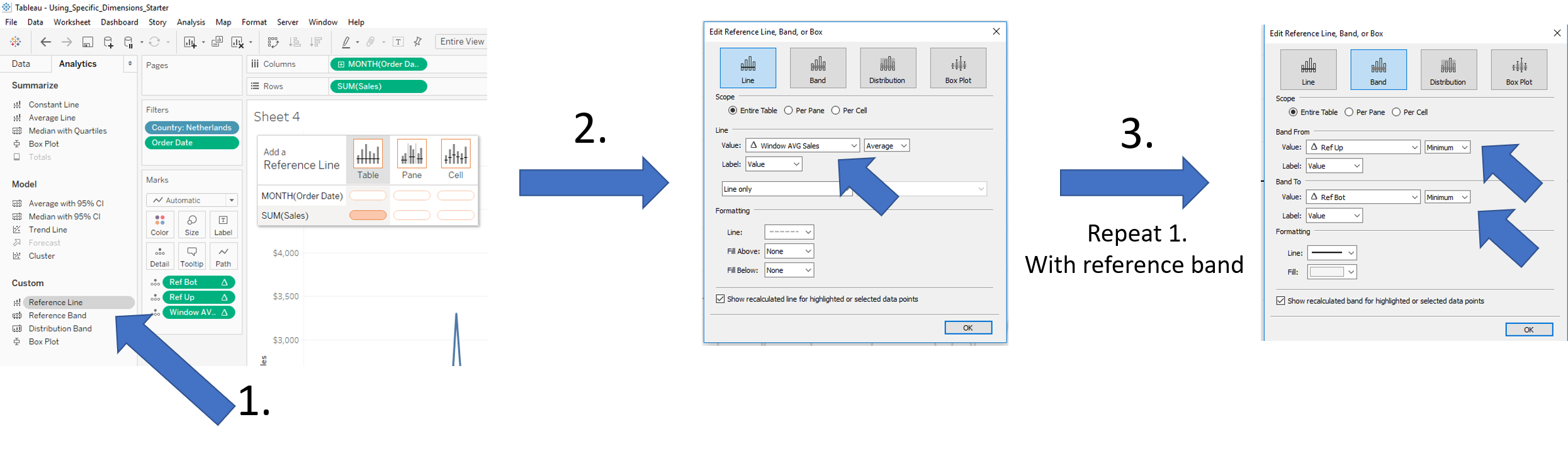
Add the three calculated fields to detail, go to the analytics pane and drag reference line (1.) to Table SUM(Sales).
Set the value of the Reference Line to the calculated field Window AVG Sales (2.), change the label to value and format your line to your preferences (dashed in this instance).
Repeat step 1. but this time by selecting Reference Band, set the your upper reference (step 4. in image above) and and lower reference (step 5. in image above).
Your dynamic viz should be all set by now and look similar to the chart below:
In order to make it visually easier to understand it might be helpful to add points to the chart by creating a dual axis chart and by adding the dynamic colour pill. Below a quick recording on how to get to the final chart.
That’s it for now, feel free to contact me about any of the content on Linkedin or Twitter @RobbinVernooij