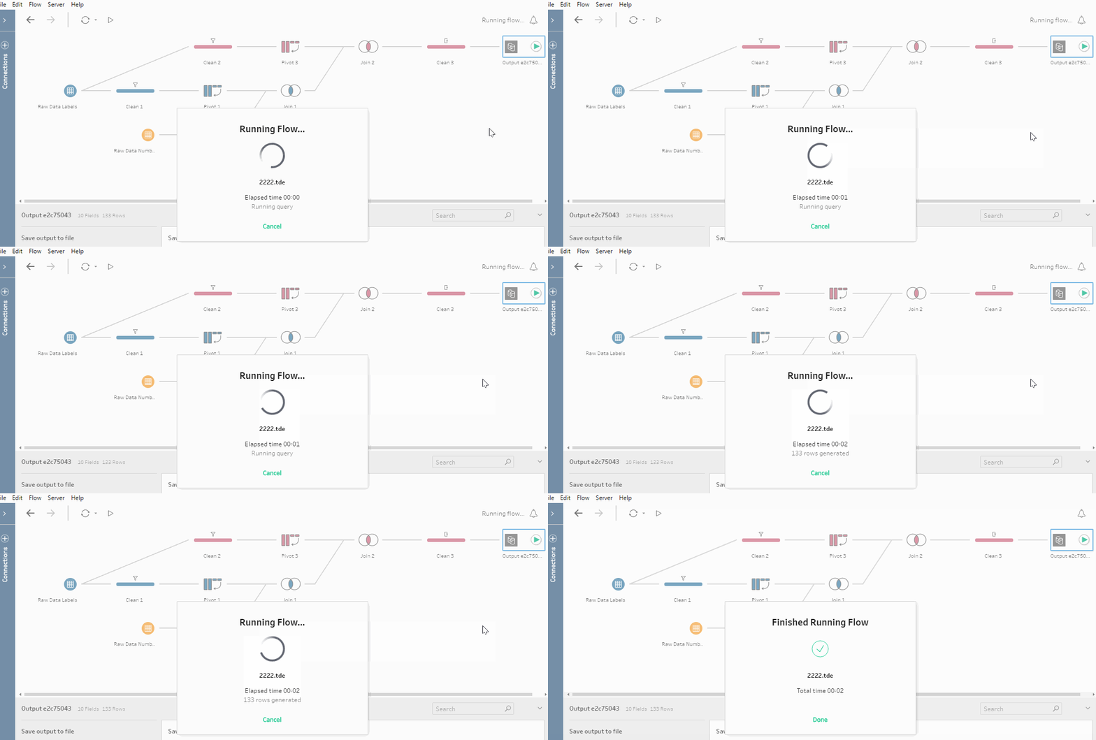
My first impression of Project Maestro, Tableau’s data prepping tool.
Today we had a first look at Project Maestro (V0.4) with Tableau Zen Master Emma White looking at survey data. Very much impressed after a first look. Below a few ‘positives’ and ‘negatives’ after a morning of checking it out.
- I found it to have a very intuitive user interface, making it quick and easy to learn.
- Documentation is available in the software to get you going as well as online reference documents about the tools accessible to clean and transform your data.
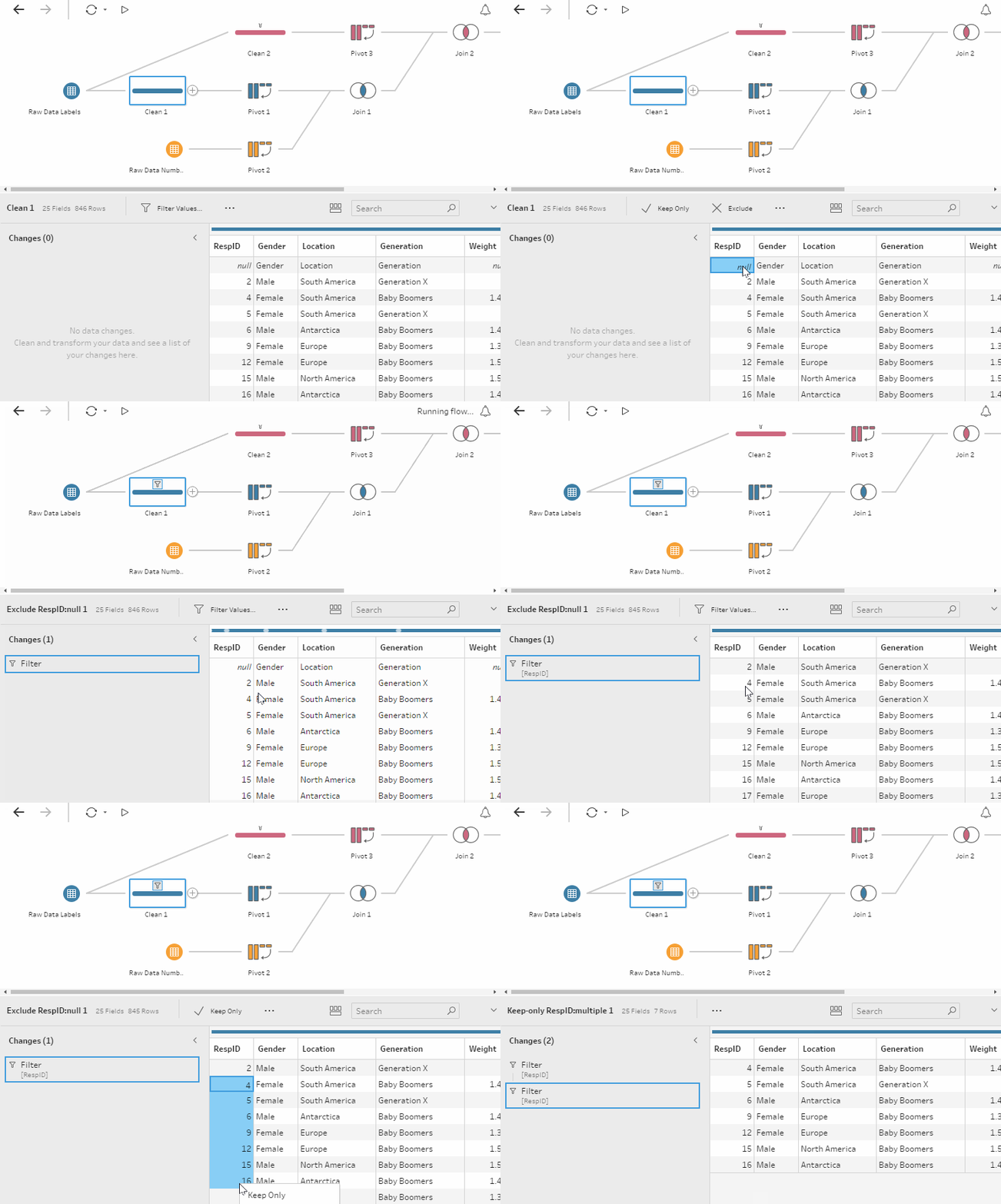
- It works on a visual basis, reminding you of Tableau, where the operation options such as filter, changing field names or field types are easily accessible without having to place new tools on your screen. For example, the include and exclude options found in Tableau can be used to remove unwanted rows:

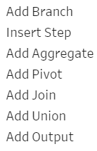
- After importing data, it provides you with the available actions you can carry out on the data set, it is limited, but provides you with the basic tools to get a clean data set ready for Tableau in many cases:

- The workflow organises itself, which is aesthetically pleasing, but gets in the way when you are trying to organise a workflow to your own preferences.
- Currently, there is no copy paste option available, which would be great to have as an option.
- Likewise, there are currently fewer data type connections available, compared to Tableau, which is hopefully something that will be expanded on in the future.
Overall a great first impression of Project Maestro. Will definitely start using and testing it from now on.
That’s it for now, feel free to contact me about any of the content on Linkedin or Twitter @RobbinVernooij

[Featured image: 46137]
