


A walk-through on how I got my head around Tableau calculations.
Ever felt like you have no idea where to start when using calculations in Tableau? Below, I will try to explain what helped me see the light!
Personally, I struggled to understand the flow of calculations when I started using Tableau, to the point I started to doubt my scientific background. Once I got my head around my problem, I realised that my background is the reason I couldn’t follow the calculated fields!
I was so used to applying calculations directly to numbers on my screen (scattering corrections, normalisation, averages, other pre-processing algorithms and statistical models) to the extent that when I started using Tableau and tried to create calculated fields based on dimensions (definitely not used to that, what the hell are those?!) and measures, I felt like an idiot when asking my colleagues over and over again on what to do.
Only after eventually going into Table calculations and actually seeing the calculation happen to numbers or text on my screen, I realised that not being able to see the calculation immediately applied to numbers was the underlying issue. This, combined with the new concept of Dimensions threw me off.
My tip to people who are having troubles with understanding the way Tableau calculations work, would be to start at Table calculations and see how the calculations effect the numbers in a Table format. Likewise, when moving to Calculated Fields, use a Table to check your calculations!
I will try to replicate my ”AHA IT ALL MAKES SENSE NOW” moment by giving you a few examples. Going from Table calculations to calculated fields.
1. Table Calculations
Let us start with looking at a simple Table created with the Super![]() store sample data. Sales by Category for 5 US states. Add Totals by double clicking on Totals under the analytics pane (step 1-2) and add a Table calculation to the SUM(Sales) (step 3-4) to show the percentage of total.
store sample data. Sales by Category for 5 US states. Add Totals by double clicking on Totals under the analytics pane (step 1-2) and add a Table calculation to the SUM(Sales) (step 3-4) to show the percentage of total.
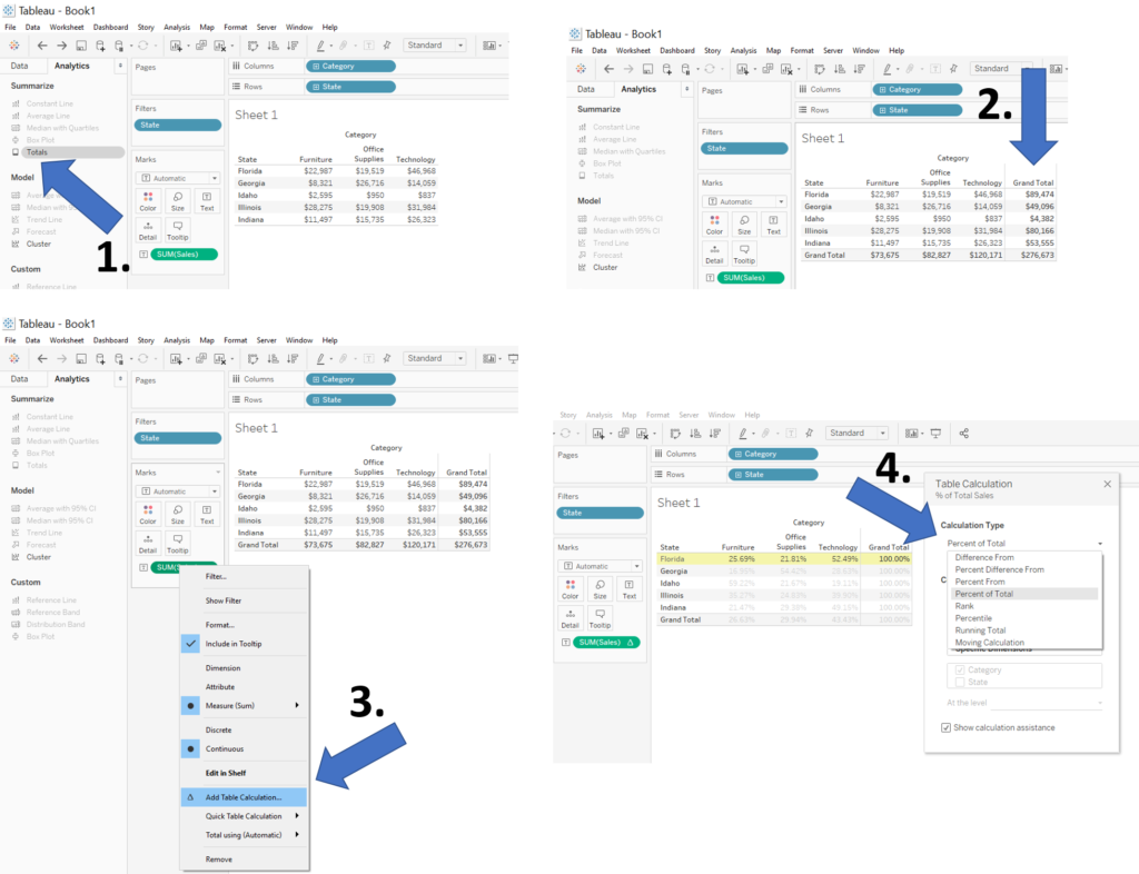
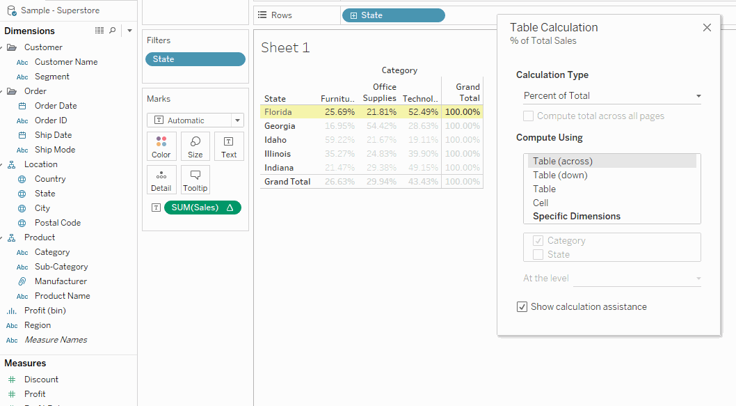
By cycling through the Compute using, you easily visualise how the calculation is applied to your table.
![]()
![]()
![]()
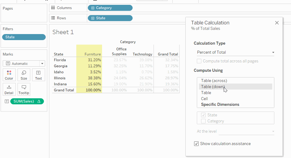
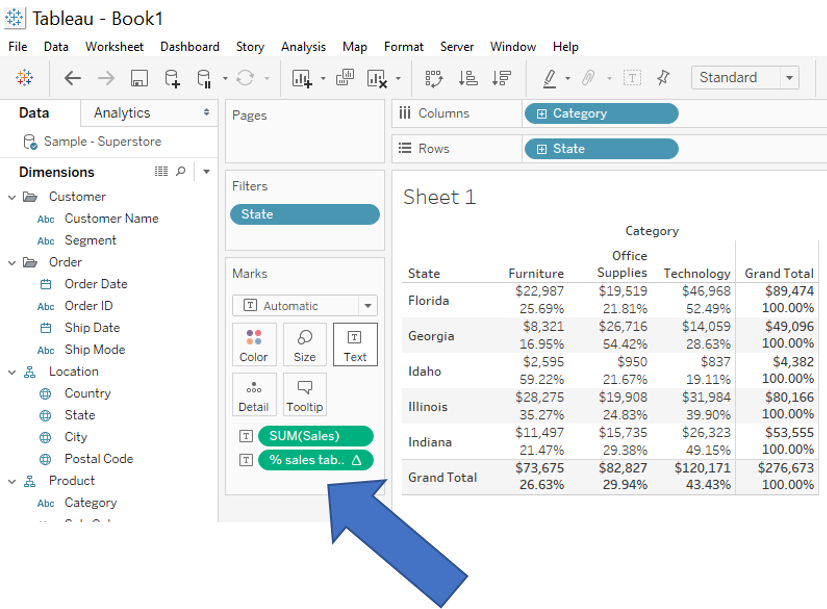
You can save the calculation once you find the one you were looking for. Lets select “Table (across)” and drag the field into your measures. By then editing the calculation you can view the simple calculation applied to your table.
Having it stored under your measures allows you to add it to the table together with the total sales numbers.
2. Calculated Fields
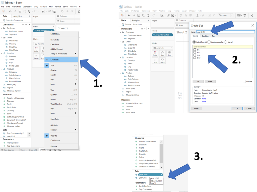
For me, playing around with several different table calculations and looking at the equations was an eye opener. To the point I can now easily create a calculated field to do exactly what I want. So lets try to create a similar table to the above using calculated fields and looking at the year 2016 and 2017.
First, drag Order date to your filter and right click, create set (step 1). Select 2017 only and name the set (step 2). Repeat step 1 and 2 for the year 2016 and you end up with the two sets we want (step 3).
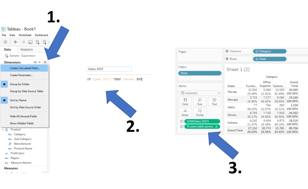
Next, create the a calculated field (step 1), by defining IF [year 2017] THEN [Sales] END, it will always return the sales for the year 2017 (step 2). Repeat step 2 for the year 2016.
To recreate a similar table as in 1. Table Calculations, duplicate your sheet and drag your new Sales 2017 measure onto the table text and likewise add your saved % sales table across (step 3).
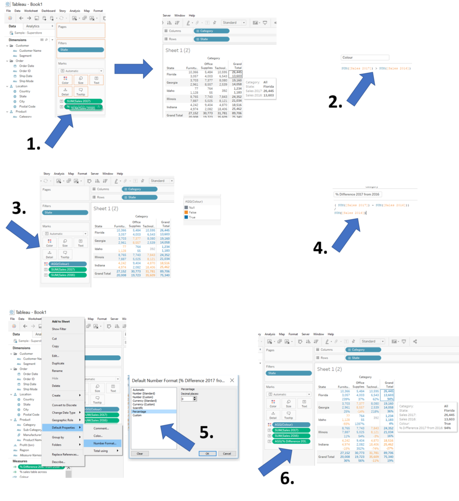
Next up is comparing the year 2017 and 2016. Drag Sales 2016 on top of the % sales table across to replace the measures (step 1). Having to look at each individual number to check the differences in year is not very convenient so we can add a colour based on the difference between the sales in 2017 and 2016.
Step 2, create a new calculated field to say SUM( [Sales 2017] ) > SUM( [Sales 2016] ), to create a true false filter based on the statement: if the sales in 2017 is higher than 2016, then TRUE, if not then FALSE and if there is no 2016 sales then NULL. By adding this calculation to the colour, you can more easily tell the difference between increases or decreases (Step 3).
The colour on its own doesn’t provide us the direct measure of how much it has changed. We might want to look at the % difference from previous year. Lets create another calculated field!
( SUM([Sales 2017]) – SUM([Sales 2016]) ) / SUM( [Sales 2016] ) (Step 4) and change the default number format to % by right clicking on the calculated field – default properties – number format (step 5). Drag your calculated field to the text and BOOM! (Step 6.)
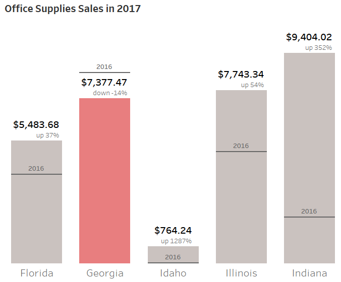
You likely don’t want to present this table as a final product, however, I find it very useful to inspect my calculated fields in a table format in order to understand what is Tableau is doing and verify my results!
It then becomes very easy to turn it into simple but effective visualisations.
That’s it for now, feel free to contact me about any of the content on Linkedin or Twitter @RobbinVernooij