A brief intro to the Modulo operator and how it can help you split up your sheet into small multiple grids (trellis) without loosing your rank order.
Today at the data school, we worked through old #WorkoutWednesday exercises to further enhance our Tableau skills. I can highly recommend these challenges to expose yourself to new ways to explore and visualise data (find the latest WW here!).
I got particularly stuck and frustrated on WorkoutWednesday Week 47, 2017 as I thought I had this all sorted within the hour, but soon realised it required a technique I just never seen before. Whilst I normally would just break up such a chart into 4 different sheets and combine them in a dashboards, the challenge did not allow you to do so!
In the end I managed to get it sorted, but it required some nifty tricks and an operator used in calculated fields which I never seen before! I will try to share some of the things I picked up whilst doing this workout.
1. The Modulo Operator
If you have been using Tableau calculated fields, or have a basic understanding of Maths, we have all seen and used operators to multiply (*), divide (/), add (+), subtract (-), square root (SQRT), to the power of (^), etc.
However, I never came across what is called the Modulo operator (%) before (actually, not true, likely zoned out during the lecture). There are several ways to explain it, but I like to refer to it as the following:
‘I want to check how many times a particular number fits in another and return me how much is left after’
So if we take 10%3, it will find that 3 fits 3 times (9) in 10 and returns us the leftover value = 1
You might wonder what use this has, apart from the particular Tableau multiple grid use case. There are several other use cases I came across, for instance:
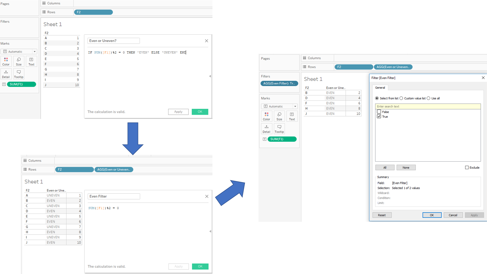
- Checking whether a number is even or uneven (there is no function in Tableau to do this, yet, Nicco blogged about it a while ago!). Check out my example below to either identify even and uneven numbers and how to filter as well.
- Converting a time field in seconds to hh:mm:ss (check out this post on the Tableau community forum by Michael Hesser)
- Small multiple grids/maps/trellis, explained in different ways be others, such as Ryan Sleeper, Jevon da Costa and Chris Love (creator of many things).
- And possibly many more, have a go!
2. Multiple Grids, my approach
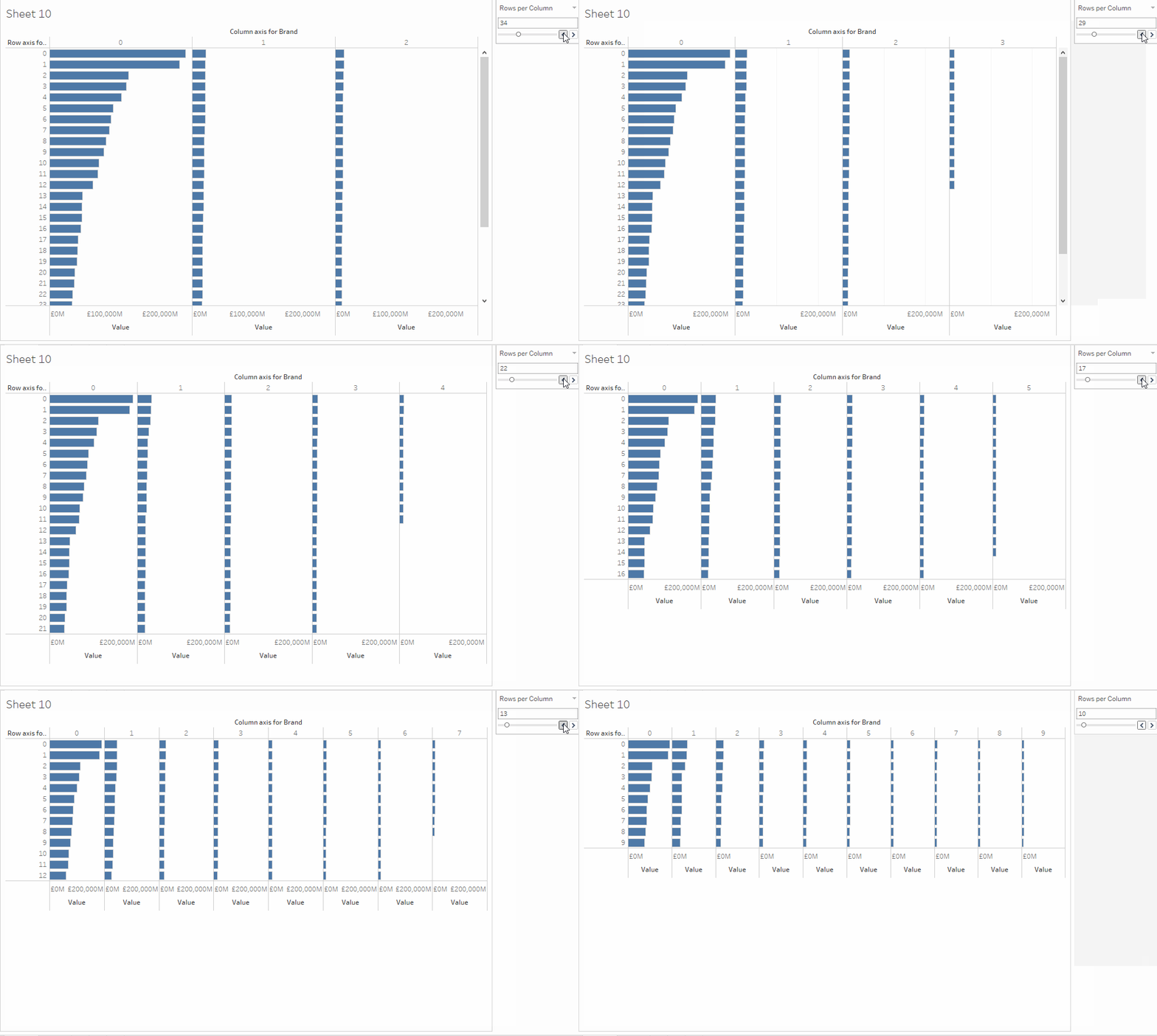
As mentioned above, I was struggling with this particular part so I wanted to take the time and work my way through it without copy pasting others. The short gif below is the result of my efforts, maintaining the order of a Dimension (sorted by a Measure). It allows you to divide your Dimension up into different columns and rows to your liking and header names can be replaced to your liking but left it at an integers for now.
So how do we achieve this? I will walk through my example using the data set provided for the WorkoutWednesday Week 47 2017 sourced from the Financial Times.
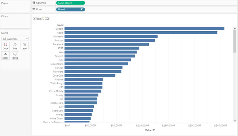
It is a very simple data set with the top 100 companies (Brands) and their calculated value for 2017. Let us start by making a simple bar chart, sorting the Brands by SUM([Values]), descending. This allows us to see the top Brands but you would need to scroll down to find the others.. So what if you want to display them all in one chart (likely because someone asked you to do so..) we need to work on it.
You could create groups or calculated fields to divide them into different groupings but you cannot visualise them next to each other, unless you create an axis (x and y) for the Dimension to sit on. The problem is, if we keep Dimension on our column or row, it will always sort them top to bottom.
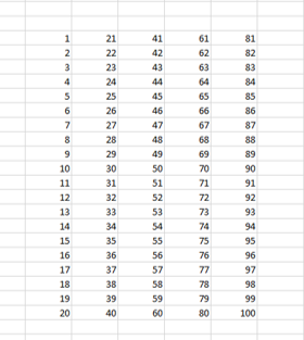
The solution lays in creating two new dimensions for your Brand to sit on, based on your Rank (table calculation). Why? Imagine we are trying to create a 5 column by 20 row grid for the data. For this to work, we need to assign our measure to something (our new dimensions) in order to link them.
First of all, we will create the rank in a calculated field:
RANK_UNIQUE(SUM([Value]),’desc’)
Why Unique? Keep the grid above in mind, if we use normal Rank and one of the values is equal to another value, Tableau will assign the same Rank Number to them. When we then create a grid, these numbers will stick together. Rank unique will avoid this by continuing to rank equal values with different Rankings.
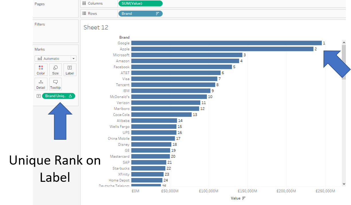
To continue with our 20 rows x 5 columns, we create our Row and Column axis as follows:
Column axis: INT([Brand Unique Rank]/20) #returns 5 unique numbers for the columns due to the integer rounding
Row axis: [Brand Unique Rank]%20 #returns 20 unique numbers for the rows
# and 5×20 = 100!! whoopwhoop
Now if we place these onto the columns and rows, change the pills to discrete, the table calculation to compute using Brand, and put Brand on detail, we are very close to what we want! But do you spot the miss match??
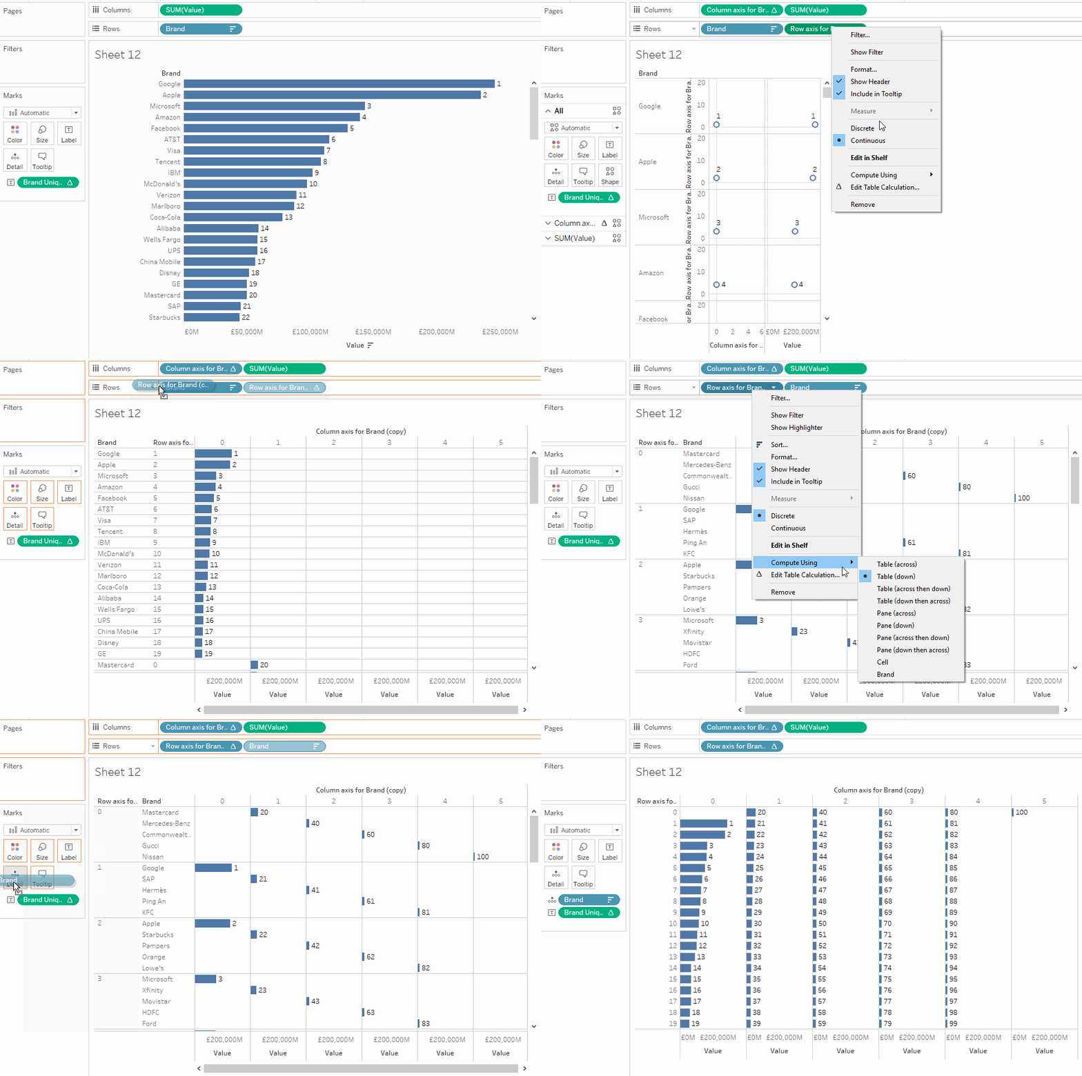
I intentionally left this in, as this was the error I made myself when working through this exercise. Let me try and explain it with by taking the grid example I showed above with the unique_rank.
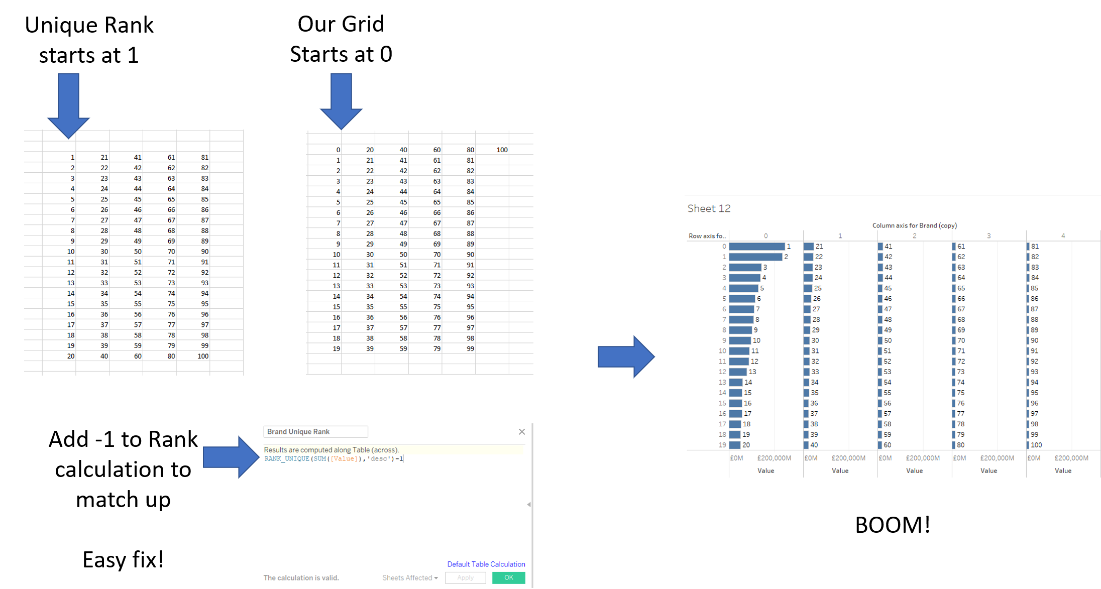
That’s your grid all done! Now if you like to have a dynamic grid like the GIF I showed above, simply replace the ’20’ in both axis calculations with a parameter (data type: integer) and you’re good to go.
If you wish to rename your grid with strings of your choosing, you can incorporate them into your axis calculations by using IF statements:

That’s it for now. Feel free to contact me about any of the content on Linkedin or Twitter @RobbinVernooij
