


Data visualisation is often built for the "standard" eye, but for individuals with dyslexia and dyscalculia, traditional dashboards can be a source of significant stress. Dense grids, vibrating white backgrounds, and a reliance on complex mental math often make them overwhelming or unusable.
In this project, I tackled a specific brief: Redesign a London Tourism Dashboard to support users with cognitive disabilities. The goal was to transform overwhelming data into an intuitive, calm, and usable experience.
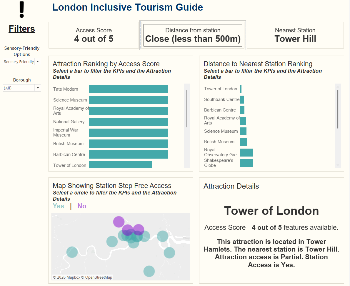
The Dashboard: London Inclusive Tourism Guide
How I Optimised for Cognitive Ease
To solve the challenges of visual blurring and numerical overload, I incorporated several specific design choices:
- Simplifying Data with Scores: I consolidated complex metrics into a single "Access Score" (e.g. 4 out of 5). This provides an instant "health check" for an attraction without requiring the user to parse individual datasets.
- Visual vs. Numerical Ranking: I intentionally removed numbers from the bar charts. Instead of reading and comparing digits, the user can intuitively judge which attraction ranks higher based solely on the length of the bar.
- Dyslexia-Friendly Color Palette: I used a teal and purple palette, which provides high contrast for clarity but is softer on the eyes than harsh primary colors.
- The Cream Background: Instead of a stark white background, which can cause halos or flickering text for dyslexic readers, I used a light cream to reduce glare and improve focus.
- Minimising Cognitive Load: I stripped away gridlines and unnecessary labels to keep the focus on the data itself.
- Increased Scaling: I enlarged the bars, map circles, and font sizes to ensure elements are distinct and easy to interact with.
- Simplified Filtering: I replaced long, overwhelming multi-select lists with focused, high-level filters to prevent "decision paralysis."
- Alt-Text & Voice-Overs: Every chart includes a hidden summary in the metadata. This allows screen readers to provide a spoken narrative of the trends, perfect for those who find visual data processing difficult.
- The Attraction Detail Panel: Acting as a safety net, this section provides a plain-English, easy-to-digest written summary of the selected attraction. If the charts still feel overwhelming, the user can simply read the text for a clear final answer.
Final Thoughts
Accessibility isn't just about screen readers; it’s about how the brain processes information. By stripping away the noise and focusing on visual hierarchy, we make the data and the dashboard more inclusive and accessible.