


A bump chart is a nice way to visualise the preferences or sales over time. For that you have to rank a specific dimension. In my example, I used data that provide information on inflows to and outflows from Hamburg (data source: https://www.govdata.de/web/guest/suchen/-/searchresult/q/Wanderungen+Hamburg/f/groups%3Asoci%2Cstate%3A02%2C/s/relevance_desc/start/01.01.2020).
I decided to use a bump chart for this visualization because I wanted to see if the migration behavior from or to Hamburg changes over time. In this way, one can get an impression of whether, for example: Preferences change. Especially of migration data it is a popular form of presentation.
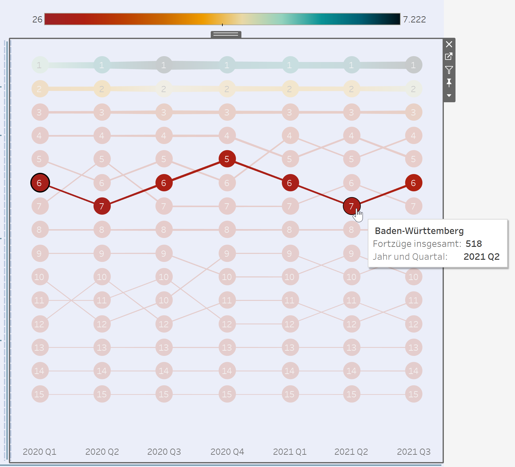
The visulaization shows the excerpts from Hamburg to various federal states. It can be seen that Baden-Württemberg was always among the top 7 places to move to (from Hamburg). Over time, however, there have also been some changes. It’s not highlighted in this view, but you can also see that the first three places were ranked on the highest positions all the time from the beginning of 2020 to the third quarter of 2021.
1. To create such a bump chart you have to drag a date in the columns, and a measure in the rows. The measure in the rows will show how high the dimension, that has to be in the marks field on detail or color, is ranked.
2. For the ranking you can right click on the measure in the rows an select the “Quick Table Calculation” with the option “Rank”.
3. To relate the ranking by the values to the dimensions, you should right-click on the previously created Table Calculation and select the "Edit Table Calculation" option and click on the "Specific Dimensions" as the dimension that it is in your case.
4. To have the best ranked dimension on the top, you should reverse the axis.
5. For the circles with the number you have to create a dual axis with the table calculated field.
6. To get the numbers in the view you can click on the circle instead of path in the marks card options. After that you put the table calculated field from the rows to the label option (strg + drag&drop) in the marks card. And then you just have to fine tune, that it is in the centre of the circle.
7. Then you can put the measure in the marks card on size too, to show underline/ show the value in comparison to the others.
That’s it 😊 Now you have a bump chart that shows you a ranking over the time.