


In our first task at The Data School, we were tasked with taking some visualisations that had already been made and sketching out how we would change them to answer different questions.
As a avid Tottenham fan (thanks dad!), I was tasked with exercising my demons, courtesy of this match report viz by Ravi Mistry, depicting our Champions League Final loss to Liverpool in 2019. I was fortunate enough to be at the game in Madrid, and have to this day still not been able to face watching it back - so these stats were certainly eye opening! After a 1st minute Mo Salah penalty, Liverpool were able to let Spurs try to break them down and play on the counter attack - making Spurs' look far more impressive than it was from a statistical point of view.
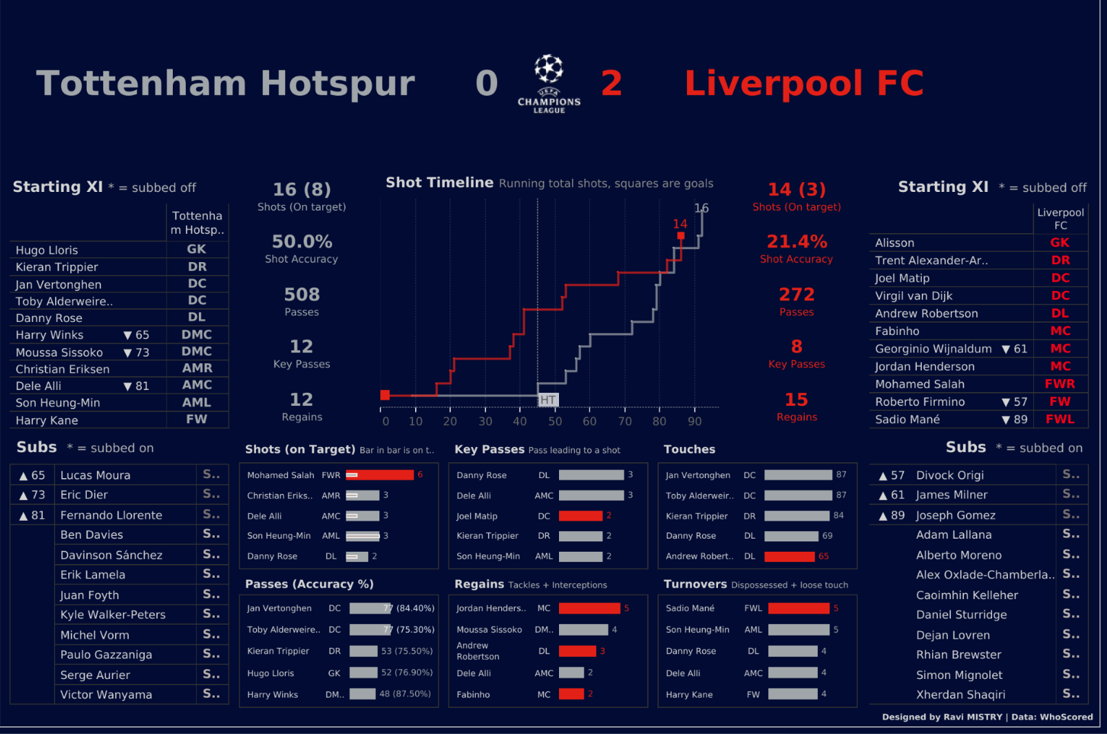
If you covered the score and showed this to a non football fan, they may be forgiven in thinking that Spurs won easily. Spurs seemingly dominate in Shots, Shots on Target, Passes and Key Passes - however from my memory as a fan this was certainly not the case. As a result, my viz redesign attempted to give some context to these numbers, and give a clearer picture as to why Tottenham never really felt in the game. Here is my creation below.
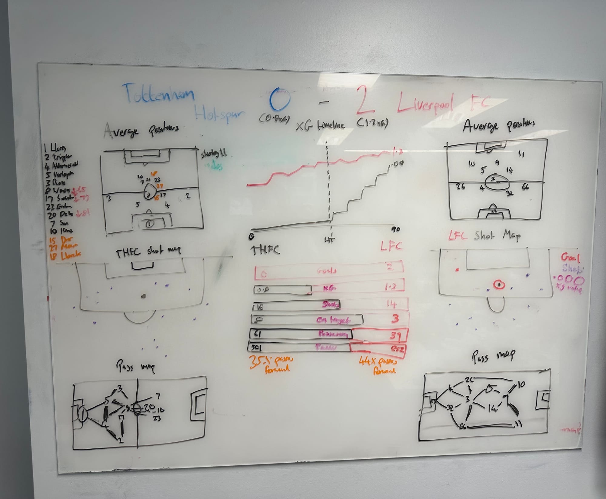
I wanted to follow a very similar layout to Ravi, as I think what he had already looked very clean. The first key change was to change the shot over time line chart for a cumulative xG over time chart. This gives more context to the quality of the chances Spurs were creating in comparison to Liverpool, which you would not see from the pure shot data alone (although Liverpool's 1st minute penalty of 0.75 xG certainly plays a big part in their total).
For the team lineups, I would use use of average positions as opposed to the list layout. The positions show not only how much deeper Tottenham were, explaining the large number of passes from the centre halves and lack of progression, but also indicate where the subs played when they came on. I personally found this hard to work out in the original viz, so wanted to change it up.
I also felt that shot maps would give more detail to the xG chart. I found shot maps from the game and copied them as close as I could in my sketch. Here you can see the majority of Tottenham's shots created were not from very advantageous positions, with low xG.
Personally I would also remove the individual player statistics and replace this area with the team statistics. My thoughts were if someone read the viz as a non football fan they would think of these metrics as positive for Tottenham, however when your whole back 4 have the most touches in a game this may actually indicate a lack of progression through the thirds into midfield. This is backed up by such a low percentage of forward passes compared to Liverpool.
Finally I think the passmaps are super important in highlighting which players connected well on the pitch, as well as indicating the spacing between each player when in possession of the ball. It is clear to see Liverpool played with far more structure and spacing between players in their 4-4-3, synonymous with Klopp's time at the club.
Overall, I hope that by using statistics that dive deeper into some football intricacies, this blog was able to show the important of the inclusion of visualisations that are able to provide additional context to base stats such as possession or number of shots. In the words of the great Franz Beckenbauer - "Possession means nothing when the opponent takes its chances".