


Day 2 of Dashboard Week brought the challenge of analyzing UK Street Crime data from September 2023 to September 2024. The task required building an interactive Alteryx app to explore the data and creating a Tableau dashboard to visualize key insights. Here's how I tackled the day.
Preparing the Data
The data, available on the UK Police Data website, was split across multiple CSV files. Using Alteryx, I applied a wildcard union to input and combine these files into a single workflow.
The dataset included two main tables:
- Street Crimes – Containing granular details of reported crimes.
- Outcomes – Summarizing results of reported crimes but with less detail.
Given the overlap and reduced granularity in the Outcomes data, I decided to focus solely on the Street Crimes table for my analysis.
Building the Alteryx App
Developing the Alteryx app was a great opportunity to deepen my understanding of app functionality and spatial tools within Alteryx. The app allowed users to:
- Select specific date ranges.
- Filter by crime type.
- Focus on geographical areas using spatial features like maps.
This hands-on experience clarified how spatial capabilities in Alteryx could elevate user interactivity in data analysis.
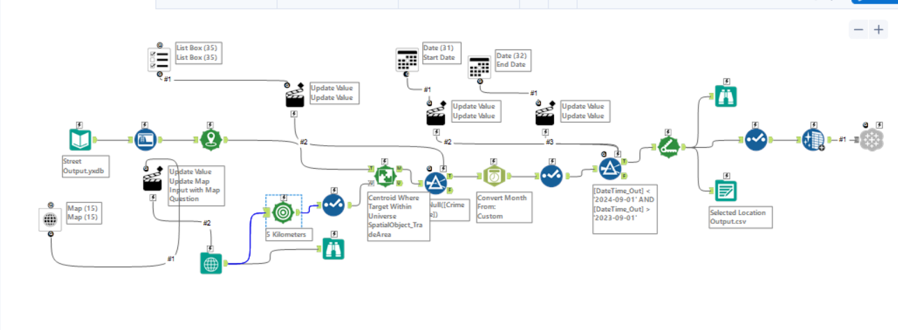
Overcoming Challenges
One of the toughest parts of the project was connecting the processed data from Alteryx to Tableau Server. Initially, this seemed daunting, but after discovering and installing the Alteryx Tableau Output add-on—a tool I didn’t know existed—it became much more manageable. Once the add-on was set up, entering server credentials and uploading the data was straightforward.
Designing the Dashboard
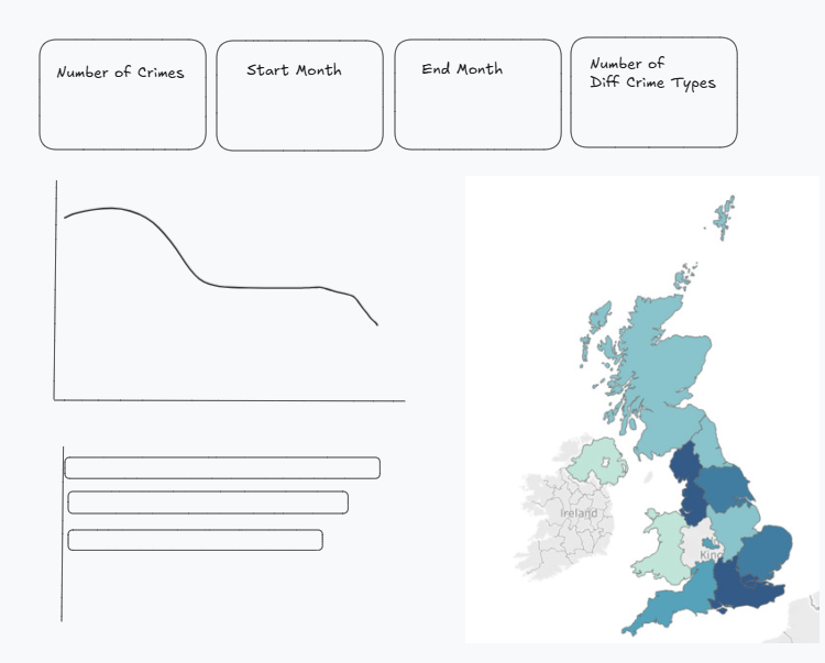
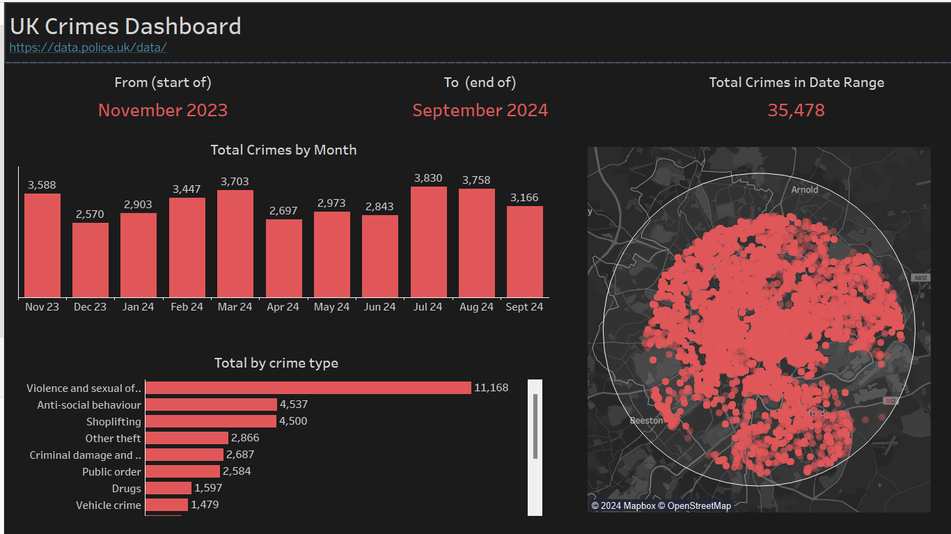
The goal was to create a KPI-driven dashboard that was simple, informative, and visually engaging. To achieve this, I incorporated some of Tableau's spatial features, such as a buffer tool, to enhance geographic analysis.
Key elements of the dashboard included:
- Total Crime Count – Providing an overall view of reported incidents.
- Crime Locations – Displayed on a map to highlight hotspots.
- Monthly Trends – Visualizing how crime fluctuates month by month.
- Crime Breakdown – Summarizing totals by type of crime for detailed insights.
By keeping the design clean and focused, I ensured the dashboard communicated the data effectively while leveraging Tableau's advanced visualization tools.
Final Thoughts
This task was a good blend of technical exploration and problem-solving. The finished dashboard combined simplicity with meaningful insights, showcasing crime trends and locations interactively.
Through this exercise, I not only improved my skills with Alteryx apps and Tableau spatial features but also gained practical knowledge of integrating these tools with Tableau Server.
Here’s the final dashboard:
Dashboard Week continues to be a steep learning curve, but I’m excited to see what challenges Day 3 will bring!