


Welcome to the Tableau Next Blog Series!
In this 5-part series, I’ll walk you through the end-to-end process of working in Tableau Next — from loading data all the way to building a functional dashboard.
Looking for a summary of what Tableau Next actually is? Follow this blog: What is Tableau Next?
This blog is about building visualisations using your Semantic Model. It’s based on the latest version available in July 2025.
What We'll Cover
- Visualisation Builder UI
- Creating a Bar Chart
- Creating a Stacked Bar Chart
- Creating a Line Chart
- Creating a Discrete Line Chart
- Creating a Table
- Creating a Pie Chart
- Filters and Forecasting
Visualisation Builder UI
To create a visualisation, click the Add button (top right) from within your Workspace, then select New Visualisation.
You’ll be prompted to select a specific Semantic Model from a Workspace. You’ll also get a summary of all Data Objects and Calculated Fields in the model. Hit Select to begin.
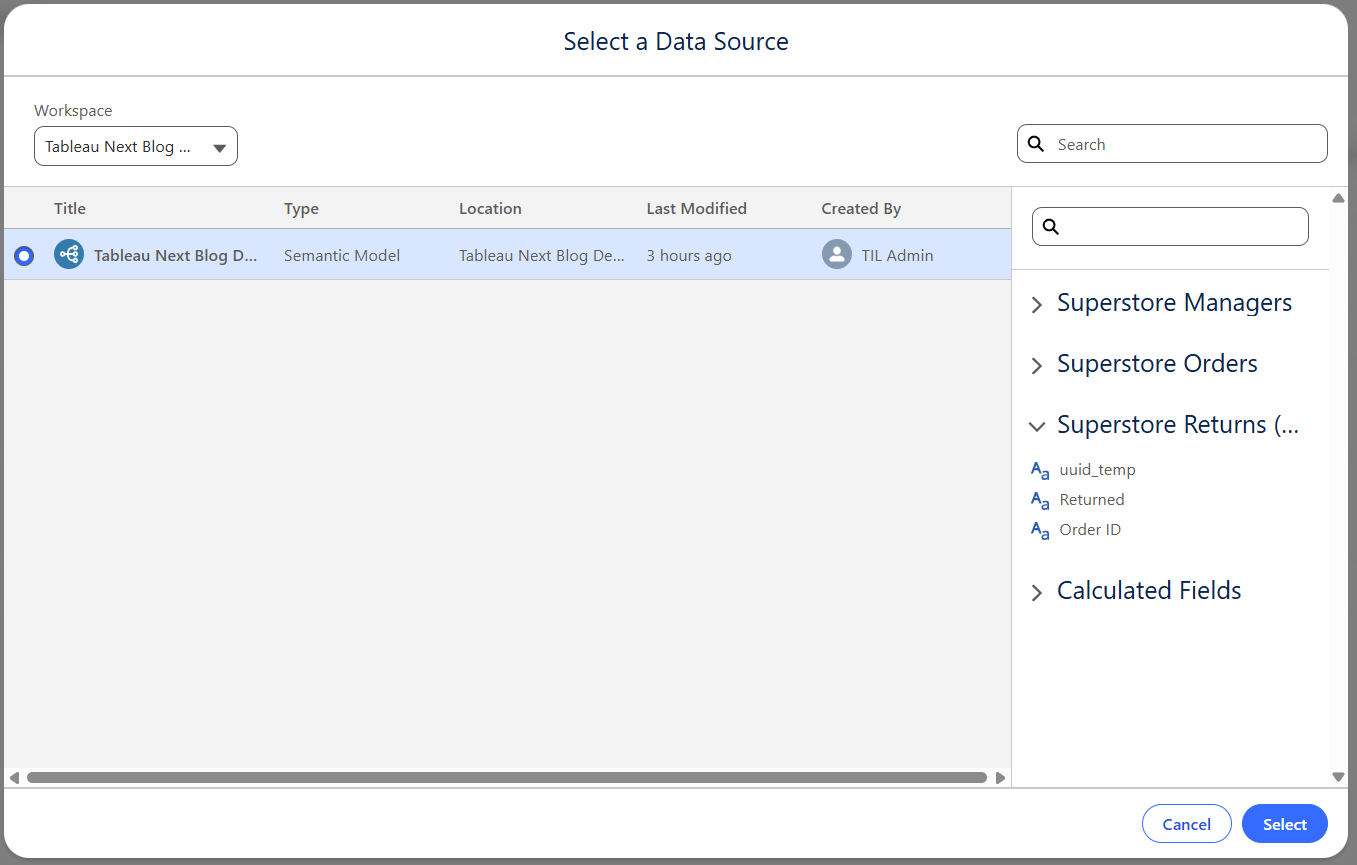
This is the interface that will open up. Let's breakdown each section.

- 1. Data Pane
Contains your Data Objects, Logical Views, and Calculated Field.
Use the + button to create new calculated fields.
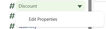
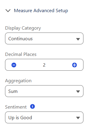
Click the dropdown next to any field to edit its properties.
- 2. Shelves
Drag dimensions and measures here to build your visualisation (e.g., Columns, Rows, or Marks).
- 3, Main View
This is where your chart appears when you place fields on the Shelves or Marks pane.
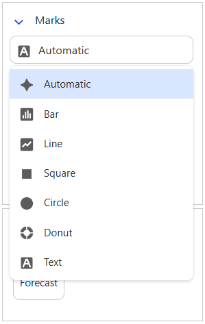
- 4. Filters, Marks, Analytics
- Filters: Add fields here to allow filtering your charts.
- Analytics: Allows forecasting (covered later).
- Marks: Used to customise the chart (change chart type, add colour, labels, tooltips, etc.).
- 5. Tool Bar
Provides shortcuts for:
- Switching between Visualisation and Table
- Clearing your build
- Showing the Action Panel
- Swapping Rows/Columns
- Sorting
- Adjusting the fit of the chart to the screen
- 6. Suggest
Not sure where to start? Use the Show Me panel to see which fields are needed for different chart types.
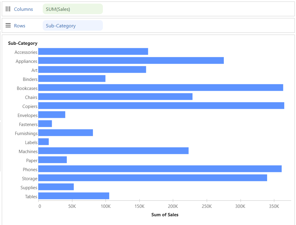
Creating a Bar Chart
To build a bar chart, you need:
- One Dimension (blue pill)
- One Measure (green pill)
Example: Drag Sub-Category to Columns and Sales to Rows.
Best practice: Sort the bar chart in descending order using the toolbar.
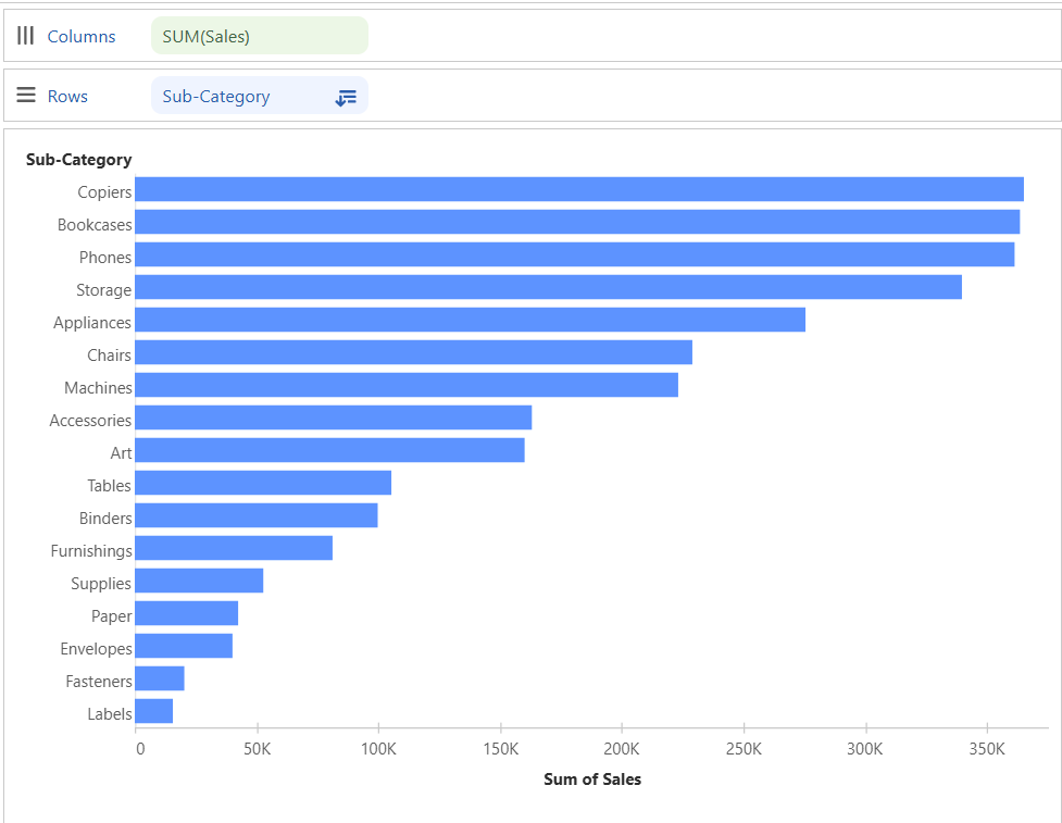
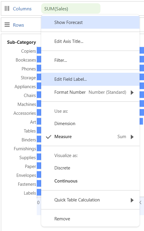
Rename your axis by right-clicking the Sales pill and selecting Edit Field Label (change "SUM(Sales)" to just "Sales").
Change the name of your chart from New Visualisation to something meaningful like Sales by Sub-Category. Save it from the top-left.
Creating a Stacked Bar Chart
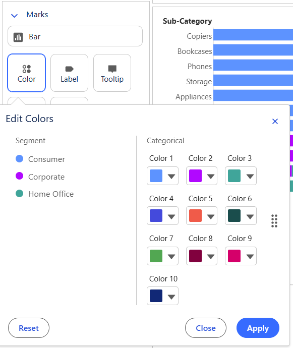
Follow the same steps as the bar chart, but now drag another Dimension (e.g., Segment) to Colour under the Marks pane.
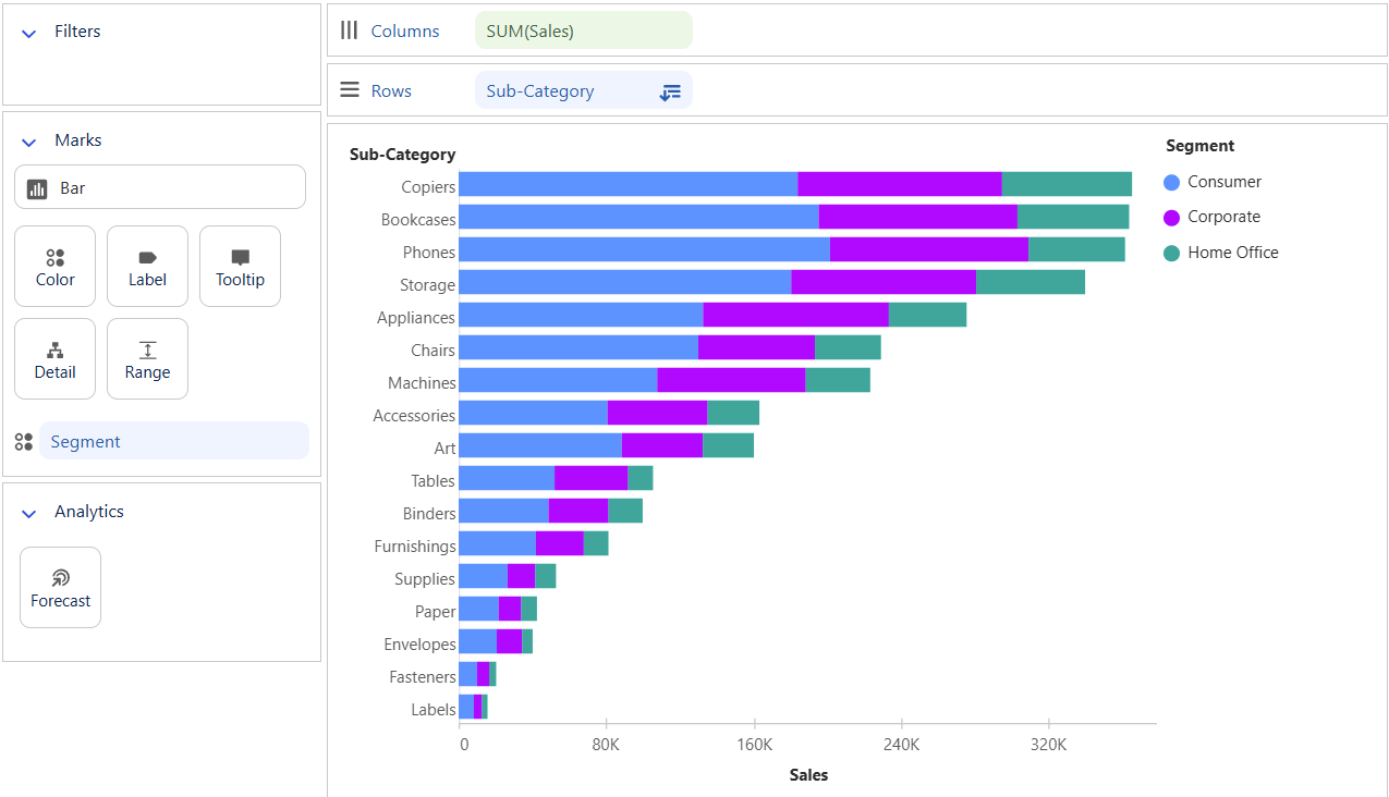
This creates a stacked bar and also adds a colour legend.
To customise colours, click on the colour square and choose your palette.
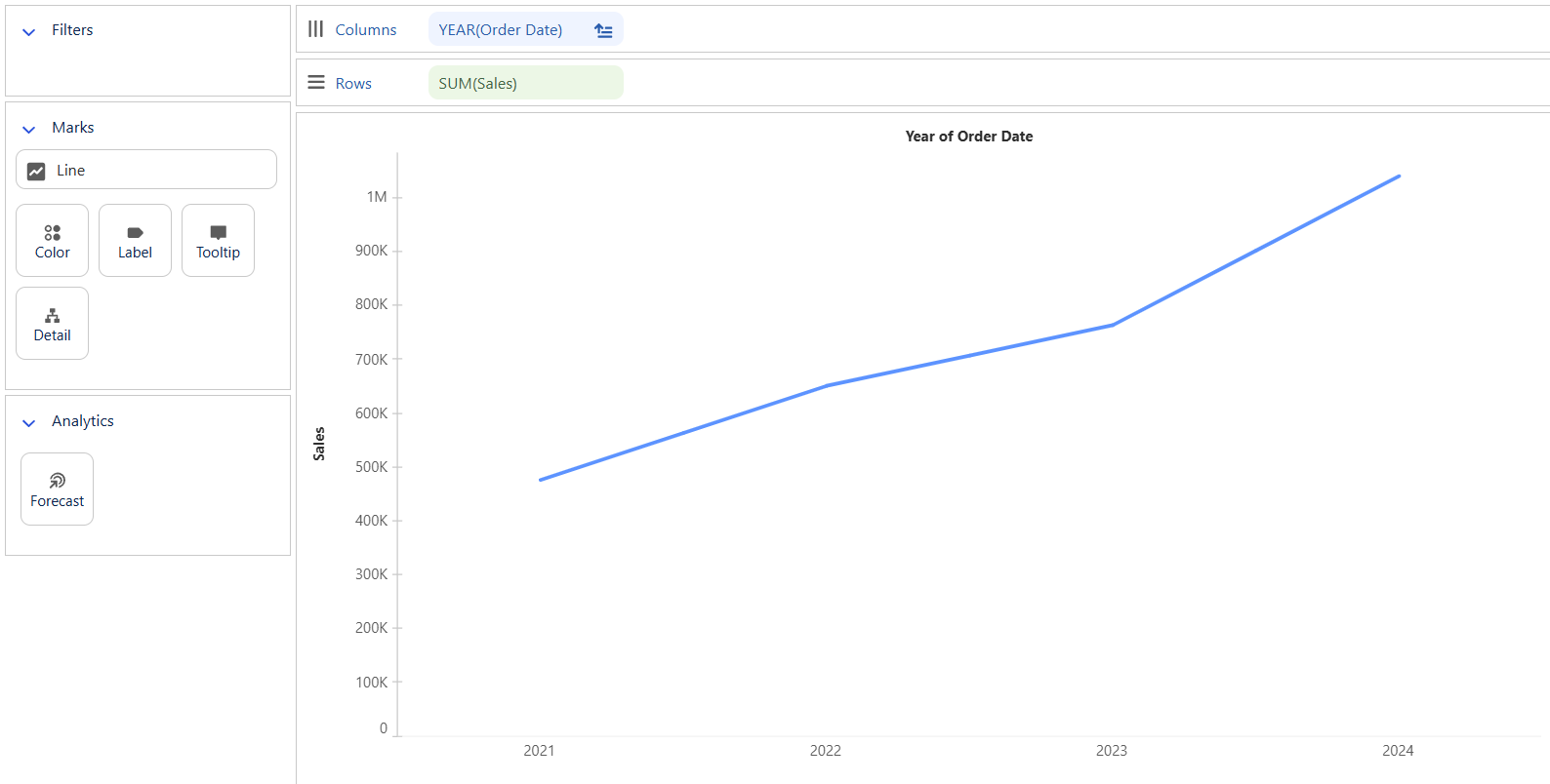
Creating a Line Chart
You need:
- One Date field
- One Measure
Example: Drag Order Date to Columns and Sales to Rows.
To adjust the granularity (e.g., change from year to month), click the dropdown arrow on the Order Date pill and choose between:
- Date Part (discrete, blue pill: Jan, Feb, Mar)
- Date Value (continuous, green pill: Jan 2024, Feb 2024)
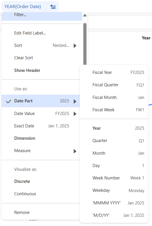
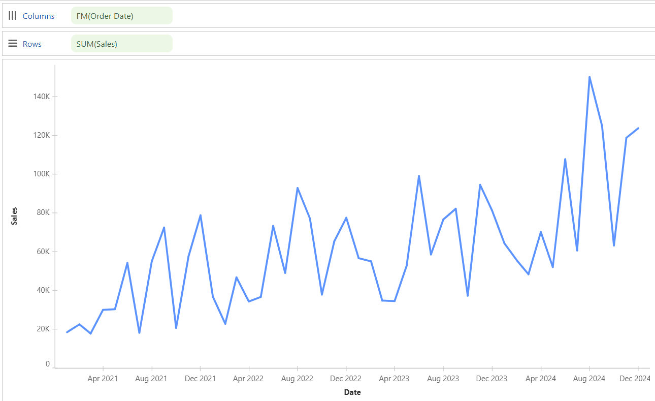
Let's go with Fiscal Month under Date Value to update the chart.
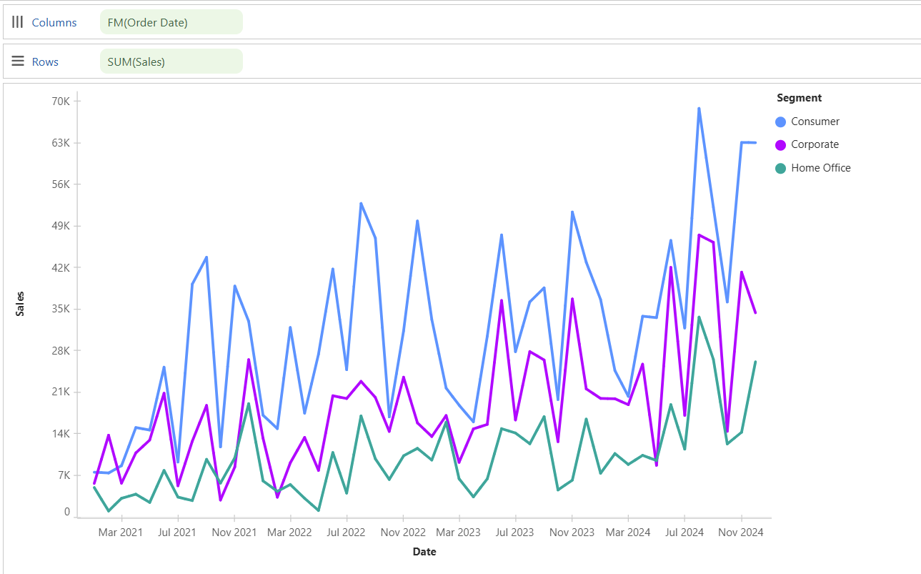
Creating a Discrete Line Chart
To convert a standard line chart into a discrete one:
- Add another Dimension (e.g.,
Segment) to Colour.
Now you’ll see separate lines for each segment.
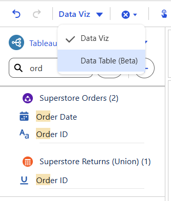
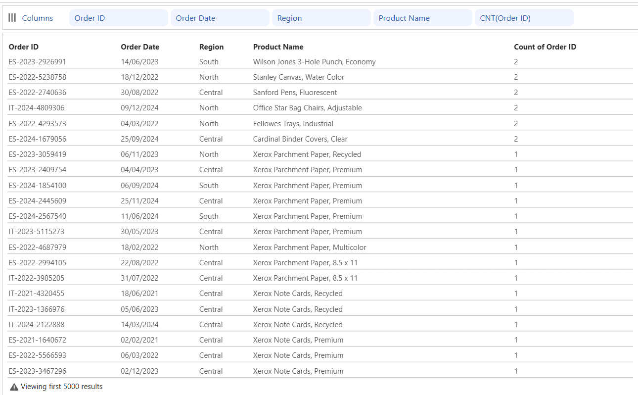
Creating a Table
To create a Table, Switch the view from Visualisation to Data Table using the toolbar.
Add your desired fields to the Columns shelf, in the order you want them.
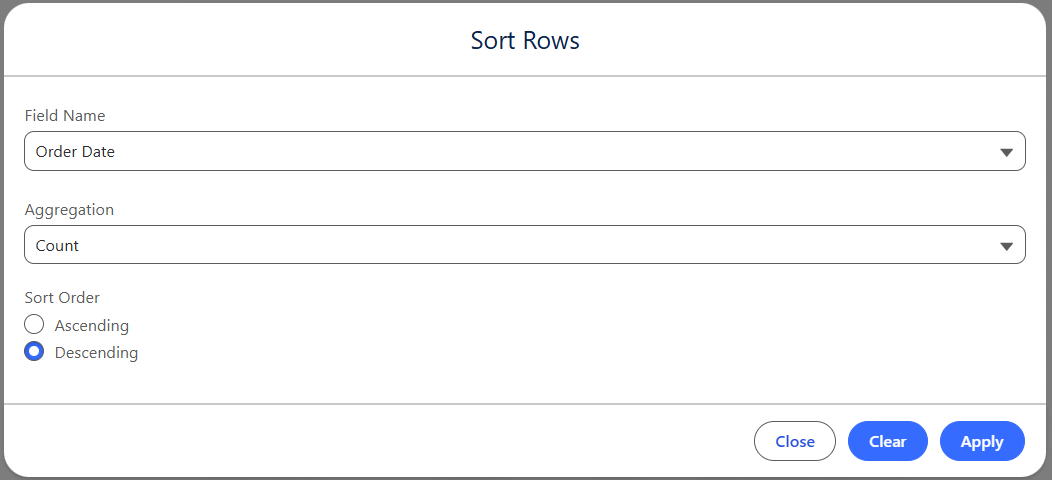
Use Row Sort from the toolbar to define sorting logic.
Creating a Pie Chart
You need:
- One Measure
- One Dimension
Steps:
- Set Marks Type to Pie
- Drag
Salesto Angle - Drag
Regionto Colour - Drag both
SalesandRegionto Label
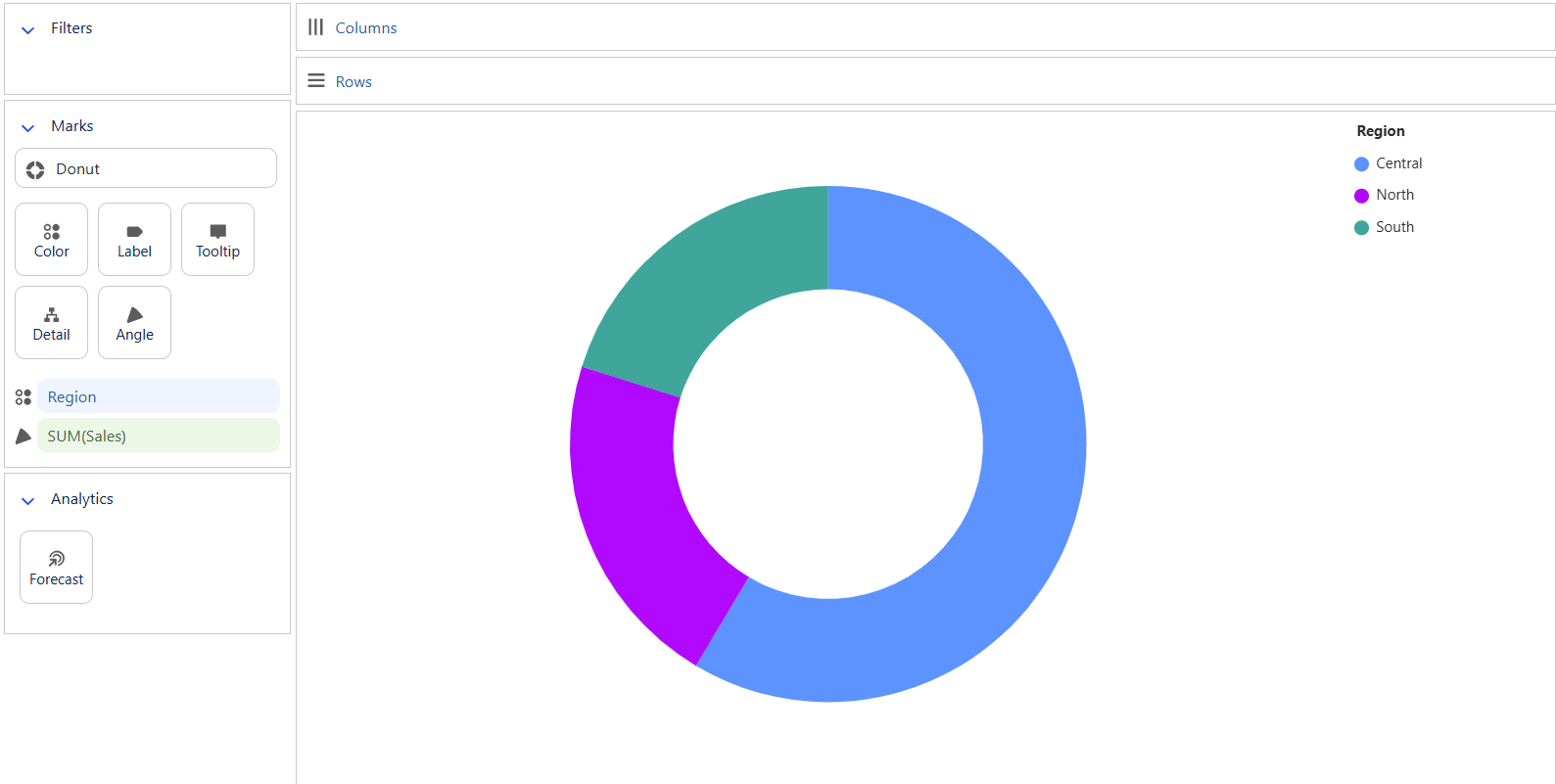
Drag both Sales and Region to Label to label your Pie Chart.
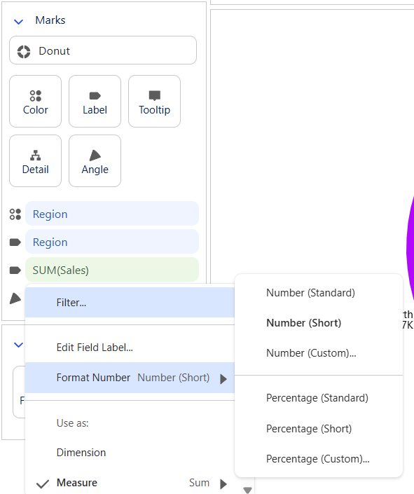
Click the dropdown next to the field on the Label shelf and choose Short Form or a custom number format.
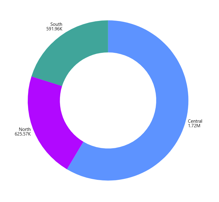
And this is your end result
Filters and Analytics
Adding Filters
Any field added to the Filters pane will allow the user to slice the visual.
Example: Add Order Date to filters in your stacked bar chart.
You’ll get multiple filtering options (e.g., Last X Years, Range of Dates). Try them out to understand how each behaves. For now, go with Last X Years.
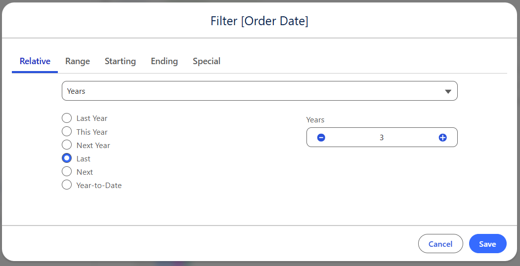
To edit the filter logic later, click the dropdown next to the field in the Filters pane.
Analytics - Forecast
Currently, Forecast is the only analytics option available. It only works with visualisations that include a time field.
For example, in a line chart showing Sales by Order Date, drag Sales into the Forecast area.
At the time of writing this blog, forecasting didn’t work consistently — likely due to Tableau Next still being in early stages. Expect improvements soon.
You Did It!
And that’s it — you’ve officially built your first set of visualisations in Tableau Next using the Semantic Model. You now got charts, filters, and even some customisation under your belt.
Next up in Part 4: We’ll put a few visualisations together into a functioning Dashboard.