As today is DS36's first day in the Data School, I thought I would give them some tips on working through a Makeover Monday.
Before applying to the DS, we tend to tinker around with these for a little longer than the challenge timeline but in the DS, we stick to working through these in ~1 hour so let's focus on how to break up your time:
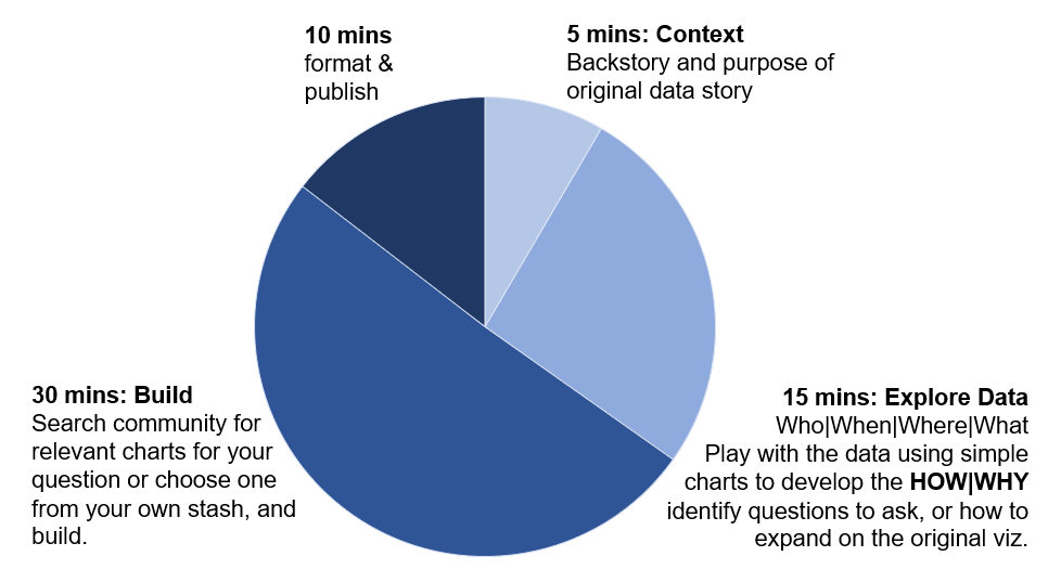
In summary, here's one way of doing it:
5 mins: Context Backstory and purpose of original data story
15 mins: Explore Data Who|When|Where|What. Play with the data using simple charts to develop the HOW|WHY and identify questions to ask, or how to expand on the original viz.
30 mins: Build Search for relevant charts for your question or choose one from your own stash, and build.
10 mins: Format and publish.
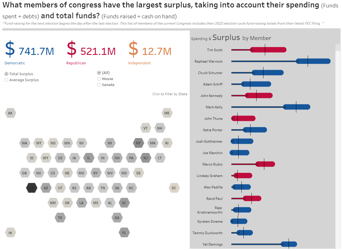
Let's dive into them a bit using an example 2022 Week 44:
CONTEXT
Who provided this data? What is the context of this dataset? What's this article about? Why is it important? What would someone want to know next? What is not clear to me from the current visual?
This is important to keep in the back of your mind when considering who might find insights from this data useful. Quite often, the original article (or client) will already have some existing points of discussion and that can get you going.
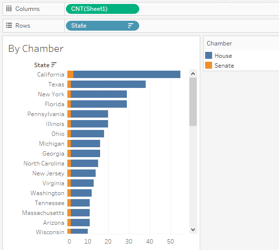
In this instance, we just have a search/sort function to explore the data, so it seems the most important intended purpose is to allow the user to inspect the finances of different members. So then questions about their spending start to emerge- how much money are these different members getting? Who is getting more, how are they ranked?
EXPLORE THE DATA
Using simple aggregations and adding dimensions and measure is helpful to answer the Who|When|Where|What questions, see groups hierarchies and get an idea of the relationship between the metrics. The data types that you have, will determine what you can explore and visualise.
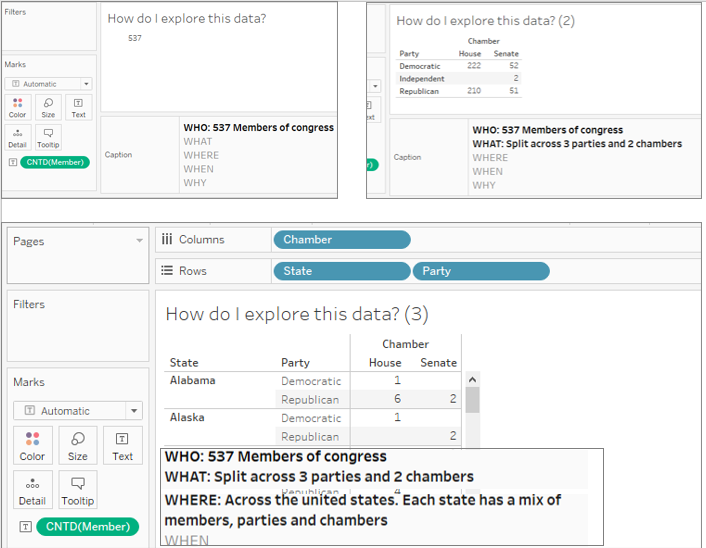
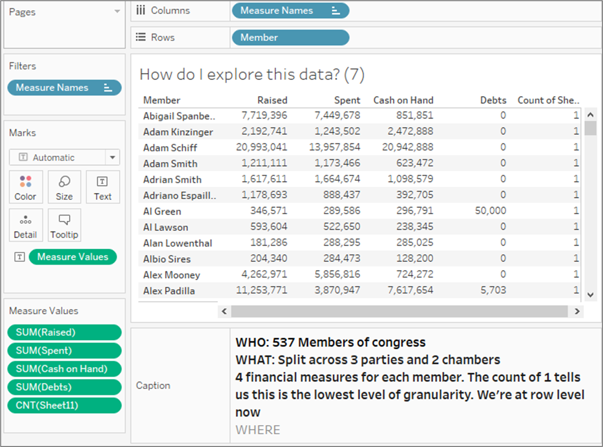
Play with Charts.
Can I rank? Can I map? Can I group? What are the splits? What kind of averages, subtractions, normalisations can I make with the measures?
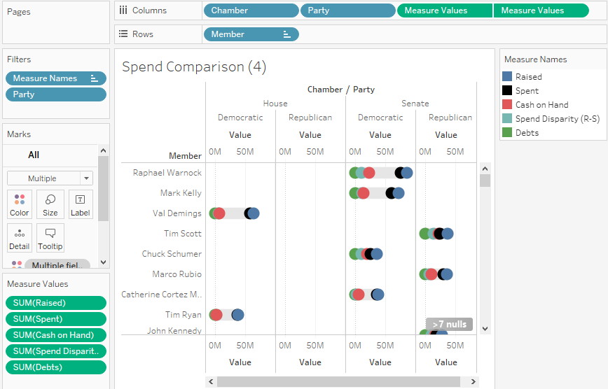
This involves combining multiple measures to see what potential stories emerge. Rather than the 2 dimensions of simple charts or tables, adding 3rd and 4th metrics start to deepen the story. Think mostly about insights rather than aesthetics, and iterate quickly.
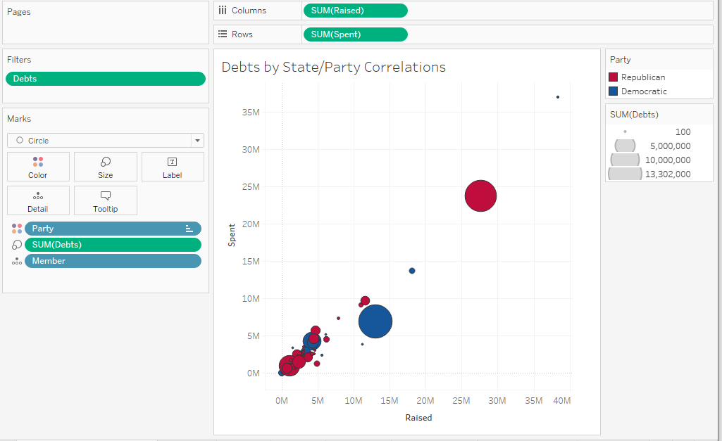
From playing with the charts below, it seems that there aren't any major stories emerging between the dimension for example the state or chamber, or with correlations between party and spending. Some interesting disparities start to emerge when looking at the difference between different metrics.
BUILD
Regroup on what opportunities your data provides eg. Looking at location over time, or comparing ranks, splicing groups, variance between metrics etc. Skim the internet using these search terms to find examples of visualising these questions and try one of those charts for yourself.
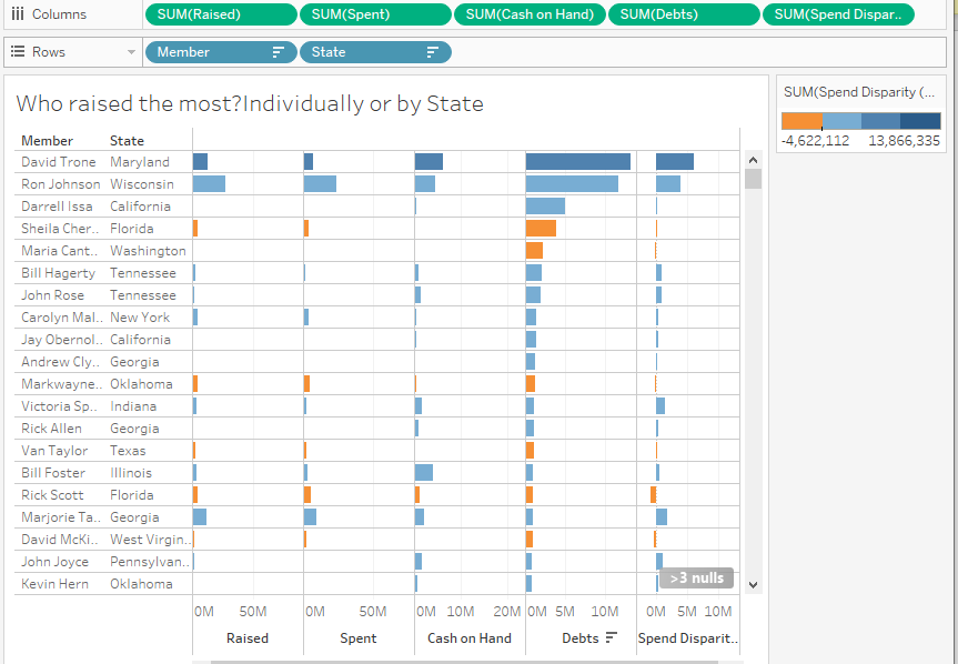
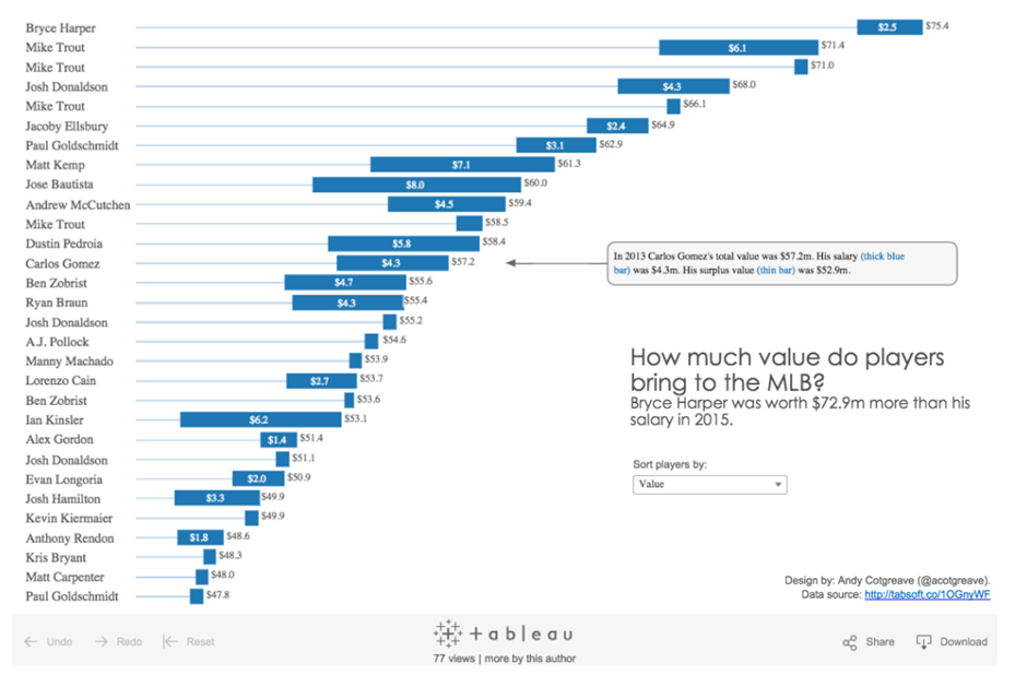
Based on the stories I could see emerging above, I knew I wanted to rank measures. I then looked for inspiration on 'ranking measures by dimension' I included 'dimension' because I knew I had location and party lines, but didn't need to see any charts that would rank over time, eg. bump charts and such.
Of the relevant examples I found, Andy Cotgreave's MLB example felt most appropriate for focusing on a single metric 'Surplus' that could be ranked while still being able to compare the overall size of the Total Funds.
FORMAT & PUBLISH
Check your colours, titles & tooltips are intuitive for the viewer to grasp your point quickly and clearly.
In the final chart, I changed shapes and added some of the preliminary test charts as filters and tooltips for additional control and context.