


In this post what I’d like to talk about is an iterative design process and how crucial it is to the field of visualization, using one of my own pieces of work that I really struggled with. Hopefully this can shed some light on what I’ve learned so far about finding a creative process that works.
Iterative design refers to what is basically a cyclical way of working, you have an idea, prototype it, build it and then submit it for review, repeating this process continually until you arrive at something that you’re ultimately happy with, or at the very least something you don’t hate. Below I’ve broken down some useful tips that I picked up when trying to follow this way of working.
Set a clear scope
Before committing to any ideas, it’s crucial to outline the scope or the purpose of the visualisation. One of the missteps that I made was to just glance at the data and then dive straight and try to create very elaborate visuals. Instead the following is a much more sensible way to go:
- Get to know the data, have an explore and see what jumps out.
- From the offset ask yourself “What question does this dashboard propose to answer?” as this question is the scope of your analysis.
- Come up with a very rough sketch on paper to get a feel for what charts could potentially be used and where. At this stage ask your question “Who are my audience and how do I expect them to interact with the dashboard?
Fail fast
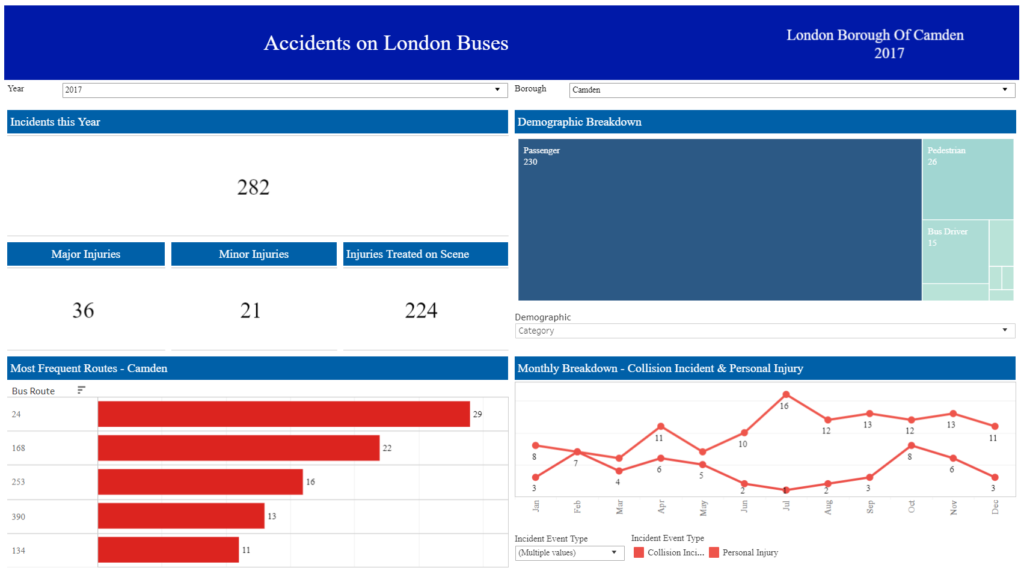
The image above is my first attempt at a dashboard aimed at visualising data about accidents on London buses, and while it’s far from being the worst thing that I’ve ever created, there are lots of things about it that don’t really work. My choice of charts was being dictated more by a desire to get as many different kinds in as possible rather what would communicate the information most clearly.
This is the result of me coming up with a rough sketch of what the dashboard could look like, that I sort of liked and then doggedly trying to make the finished product match it as much as possible. When I published this, I wasn’t very happy with it but at the time was convinced that I wouldn’t be able to come up with anything else.
- The lesson here is that it’s important to cycle through lots of different ideas before you go all in one. It gives the opportunity to really play around and see what works and what doesn’t, and this is especially useful if you’re really struggling to find a direction to go in. Luckily because of the drag and drop interface in Tableau it’s incredibly easy to do so there’s no excuse not to. It’s unlikely that the very first idea you come up with will the best one so don’t be afraid to scrap something if it’s not working, at this point it’s about getting out as many potential ideas as possible and it really helps later on in the process.
- Don’t be afraid to discard things. This ties into the bullet point above and generally it’s the point that now you have worksheets coming out of your ears, it’s tempting to just throw them all in and be done. Instead though, shuffle them around, decide which ones work and which don’t, which ones make the message clear and which dilute it and make it harder to convey. At this stage you should use the scope that you defined as a barometer to influence your judgement.
This wraps up the first part one and hopefully it gives an idea about some of the steps that can be taken to make designing dashboards easier.