In this blog post I’m going to give a brief introduction into sparklines, what they’re useful for and then a step by step guide on how to create them as well some useful tips I’ve picked up during my training on how to make them that little bit more informative.
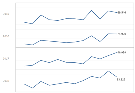
A sparkline is essentially just a line chart, so it tracks a given measure over time, but normally the Y axis is hidden because the purpose of them is to show at a glance the trend over time. To keep my guide simple I will show how to create sparklines as shown below, using the Tableau default Superstore data set.
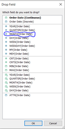
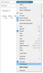
The first step is to right-click and drag the order date field into the columns shelf and then select the MONTH(Order Date) option as shown below. It will be a discrete dimension by default so click on the drop down icon on the pill and select continuous to make it a continuous measure, which is required to create this chart.
The next step is dragging the order date field into the rows shelf, as default it will stay as a dimension and remain at the year level, which is what we need as we want to create one sparkline for each year.
Finally drag the sales measure into the rows shelf and this should automatically create a line chart for each year.
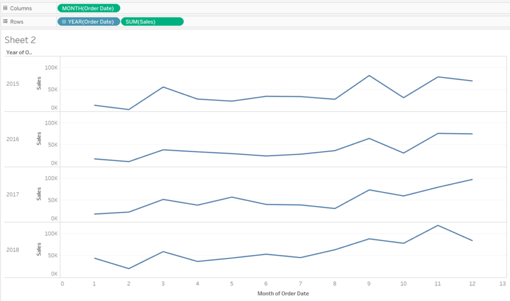
Now that our sparklines have been built the last step is to apply some formatting so that they look like the example I showed at the start of the post. The first step is to right click the axis at the bottom of the page, click edit axis and uncheck the option to Include zero, then exit right-click the axis again and uncheck Show Header. Currently the axis goes from 0-13 rather than 1-12 but this will be useful later. Repeat the same step for the axis showing sales.
Labelling the Min and Max Points
A useful addition to the sparklines could be to add a mark that shows the min and max points of each line. While this can be achieved by turning on mark labels, I will show a slightly different method that will help these points to stand out a bit more.
First create a calculated column with the following formula.
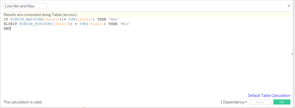
This creates a flag that will find the minimum and maximum point for each of the line charts. Next drag the sales measure into rows once again, this will create a duplicate of the line chart. In the mark shelf change mark type of the second chart to circles. Then drag the calculated column for the min and max onto colour and size.
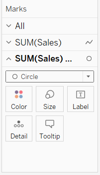
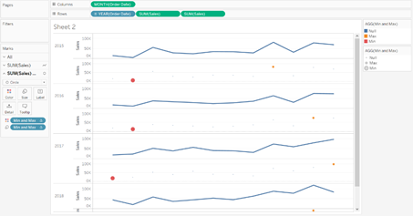
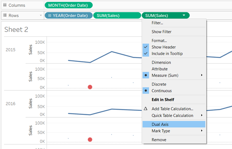
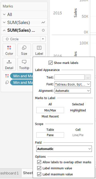
Change the colour of the min and max points so that they match and then adjust the size as necessary. Right-Click the second Sales pill in the row shelf and select dual axis, then click the text icon in the shelf, make sure show mark labels is checked and for the option Marks to Label select Min/Max.
Labelling The start and end of bars
To label the start and end of each line remove the second sales pill from rows. Next create a calculated field to work out the start and end of a line using the following formula.
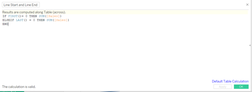
Drag this field into the row axis, select dual axis and choose a mark type of circles and turn on mark labels. Before hiding the axis using Show Header, select the option to synchronise the axis. Once the colours have been formatted as desired the graph should look as below.
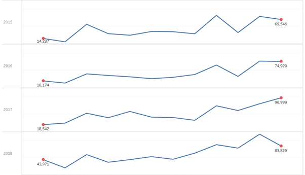
Just to recap, in this post I went over how to create sparklines, as well as some useful tips on how to make them pop a little bit more. Hopefully it’s provided a useful baseline for how they can be created and used effectively within Tableau.
